Knockout Alerts
Components to display bootstrap and bootstrap-like alerts.


Getting Started
Install from bower:
bower install ko-alerts --save
Or install from npm:
npm install ko-alerts --save
Load module:
// app.jsrequire; ;Alert Component
Options
options.title
Alert title. Displays in <strong>. Optional.
options.message
Alert message.
options.type
Alert type (ie. success, warning, danger, info). Can be any string.
Alert will have class of alert-{type}.
Defaults to info.
options.dismissible
Boolean. Determines if close button should be visible and adds class of alert-dismissible.
Defaults to true.
onClose
Callback function to be invoked when the alert is dismissed by the user.
The following arguments are provided:
options: alert propertiesalertViewModel: alert viewmodele: click event
Alert will not hide itself if you provide a custom onClose function. You can do that by setting the alert's visibile observable to false.
{ alertViewModel;}Alerts Component
Your ViewModel:
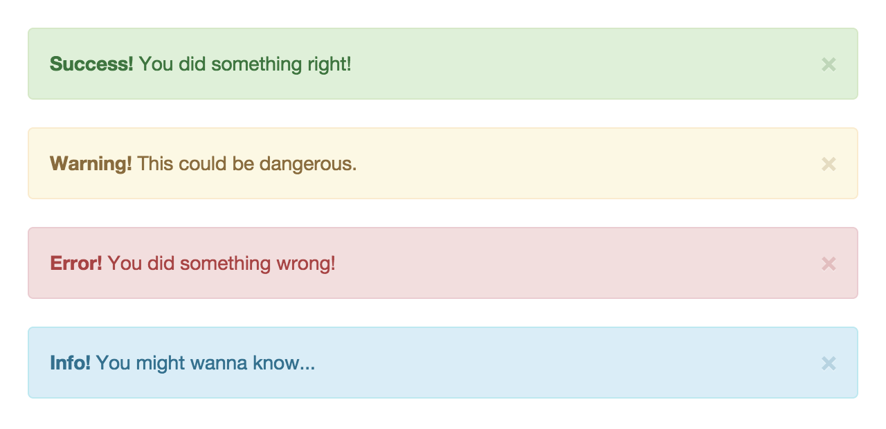
{ thisalerts = ko;}Screenshots
License
Copyright (c) 2015 Marius Craciunoiu. Licensed under the MIT license.