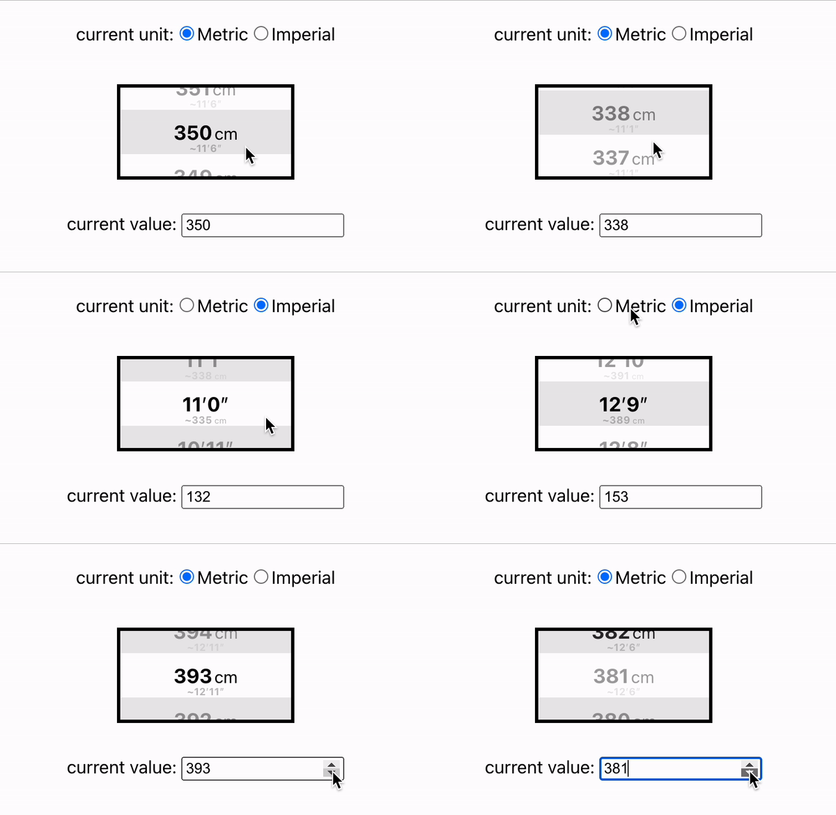
react-length-picker 📏
A simple length picker that works with metric and imperial units
Teaser
Live Demo
https://stackblitz.com/edit/react-length-picker-demo
Install
npm install --save react-length-picker
Or if you use Yarn:
yarn add react-length-picker
Usage
import { LengthPicker } from "react-length-picker";

// ...

return (
  <SomeReactComponent>
    <LengthPicker
      unit={"metric"} // set current unit (metric vs. imperial)
      defaultLength={350} // set default length
      metricMin={300} // set minimum value for metric scale (in cm)
      metricMax={400} // set maximum value for metric scale (in cm)
      metricStep={1} // set interval/step for metric scale (in cm)
      imperialMin={118} // set minimum value for imperial scale (in inches)
      imperialMax={157} // set maximum value for imperial scale (in inches)
      imperialStep={1} // set interval/step for imperial scale (in inches)
      // ...and many more optional props - see props section below
    />
  </SomeReactComponent>
);
Props
| prop | required | default | type | description |
|---|---|---|---|---|
| ascending | no | true |
boolean |
Defines the order of available values. true could lead to a range like [300, 301, 302, ..., 400], while false would make it [400, 399, 398, ..., 300]. |
| containerHeight | no | 80 |
number |
Defines the height of the length picker. |
| containerStyle | no | undefined |
React.CSSProperties |
Let's you add additional css style to the main container. |
| containerWidth | no | 160 |
number |
Defines the width of the length picker. |
| defaultLength | no | 350 |
number |
Defines the default value when the length picker is mounted. Make sure it is within the min-max range of the current unit. |
| entryContainerStyle | no | undefined |
React.CSSProperties | ((index: number, currentMetricValue: number, currentImperialValue: number, isActive: boolean) => React.CSSProperties) |
Let's you adjust the style of one individual height entry within the list. It can either be a standard css style object, or also a function that returns one. The function itself receives two properties representing the entry's index as well as if it's currently in view, allowing you more styling flexibility. |
| entryContentStyle | no | undefined |
React.CSSProperties | ((index: number, currentMetricValue: number, currentImperialValue: number, isActive: boolean) => React.CSSProperties) |
Same as above, but refers to the entry's content, not its container. |
| entryHeight | no | 40 |
number |
Defines the height of one individual list entry. |
| imperialFormatter | no | (check the source code for seeing the default function) | ( isPrimary: boolean, inches: number, feetAndInches: FeetAndInches, index: number ) => string | number | React.ReactNode |
Let's you format imperial list entries. The function has access to the following props: isPrimary, indicating if the imperial unit is currently the active one, inches, representing the corresponding length in inches, feetAndInches, and object that separates inches from feet, and index, representing the entry's index within the list. |
| imperialMax | no | 157 |
number |
Defines the max value for the imperial length range. |
| imperialMin | no | 118 |
number |
Defines the min value for the imperial length range. |
| imperialStep | no | 1 |
number |
Defines the step value (interval) for the imperial length range. |
| metricFormatter | no | (check the source code for seeing the default function) | ( isPrimary: boolean, inches: number, feetAndInches: FeetAndInches, index: number ) => string | number | React.ReactNode |
Let's you format metric list entries. The function has access to the following props: isPrimary, indicating if the metric unit is currently the active one, centimeters, representing the corresponding length in centimeters and index, representing the entry's index within the list. |
| metricMax | no | 157 |
number |
Defines the max value for the metric length range. |
| metricMin | no | 118 |
number |
Defines the min value for the metric length range. |
| metricStep | no | 1 |
number |
Defines the step value (interval) for the metric length range. |
| onLengthChange | no | () => {} |
(length: number) => void |
Defines the callback function when the length is changed via the length picker. |
| onUnitChange | no | () => {} |
(unit: Unit) => void |
Defines the callback function when the unit is changed via the length picker. The Unit type can be either "metric" or "imperial". |
| unit | no | "metric" |
Unit |
Defines the current unit of the length picker. The Unit type can be either "metric" or "imperial". |
Ideas / Open Tasks
- Add possibility to also override css styling for
SecondaryListEntry - Improve TypeScript (some redundancy in various interfaces, use inheritance etc.)


