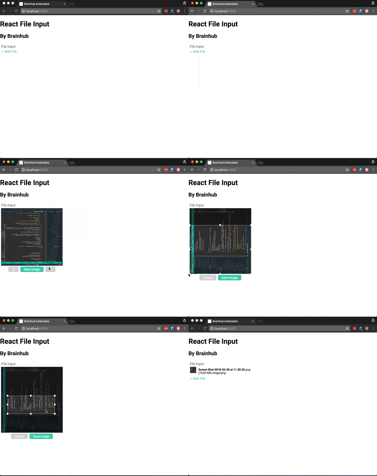
react-file-input
A File Input, width drag'n'drop and image editor.
Why?
An image is worth thousand words
Installation
npm i @brainhubeu/react-file-inputOr if you prefer
yarn add @brainhubeu/react-file-inputUsage
The basic usage is very simple, the only important prop you have to pass is onChangeCallback:
import React from 'react';
import FileInput from '@brainhubeu/react-file-input';
import doSomethingWithMyFile from '../utils/doThings';

const MyFileUploader = () => (
  <div>
    <FileInput
      label='Awesome Uploader'
      onChangeCallback={doSomethingWithMyFile}
    />
  </div>
);

export const MyFileUploader;
And your set and ready to do something with your file.
See the reference below for more advanced usages.
Usage with Redux Form
Probably you are not crazy enough to handle your forms like in 1999. Chances are that you are using redux-form. If so, it's your lucky day, because you can use our FileInput with redux-forms. Here's a basic example:
// MyFileInput.js
import React, { PureComponent } from 'react';
import FileInput from '@brainhubeu/react-file-input';

export default class MyFileInput extends PureComponent {
  constructor(props) {
    super(props);

    this.onChange = this.onChange.bind(this)
  }
  onChange({ value }) {
    const { input } = this.props;

    input.onChange(value);
  }
  render() {
    const { input, label } = this.props;

    return (
      <FileInput
        label='Awesome Uploader'
        onChangeCallback={this.onChange}
        onDragEnterCallback={input.onFocus}
        onDragLeaveCallback={input.onBlur}
      />
    );
  }
}
// MyGreatForm.js
import MyFileInput from './MyFileInput'
...
<Field name="myField" component={MyFileInput}/>And that's it. Prepare some coffee and enjoy.
Styles
The Component comes with custom css. You must import them using our component (if not things will look wrong). Of course you could also override them ;)
// index.js
import React from 'react';
import { render } from 'react-dom';

import App from './App';

import '@brainhubeu/react-file-input/dist/react-file-input.css';

render(
  <App />,
  document.getElementById('app')
);
Or if you prefer from your stylesheet directly:
@import "~@brainhubeu/react-file-input/dist/react-file-input.css";

// very good css here...
Customize styles
You can customize the styles of the different components passing classnames as a prop:
| propName | description |
|---|---|
| className | Custom className |
| dropAreaClassName | Custom className for the DropArea
|
| fileInfoClassName | Custom className for the FileInfo
|
| imageEditorClassName | Custom className for the ImageEditor
|
Those classnames are for the top main components. But if you want to override child styles you can writing some css. Here's how you can do so:
.myCustomClassName {
  .brainhub-file-input__label {
    font-size: 10px;
    color: #ccc;
  }
}
Take a look on the styles and selectors here: https://github.com/brainhubeu/react-file-input/tree/master/src/styles
Reference
FileInput
State
The internal state of the FileInput is important to you, because the callbacks will be call with it as argument.
| name | type | description |
|---|---|---|
| value |
File or null
|
Selected file |
| image |
string or null
|
If file is an image, the image in base64
|
Props
| propName | type | required | default | description |
|---|---|---|---|---|
| className | string |
no | '' | Custom className |
| dropAreaClassName | string |
no | '' | Custom className for the DropArea |
| fileInfoClassName | string |
no | '' | Custom className for the FileInfo |
| imageEditorClassName | string |
no | '' | Custom className for the ImageEditor |
| dragOnDocument | boolean |
no | true | Listen for drag events in the whole document |
| dropOnDocument | boolean |
no | false | Allow to drop on document |
| label | string |
yes | Label for the input | |
| metadataComponent | React Component |
no | null | Custom component for the metadata. Props: name, size, extension, type
|
| thumbnailComponent | React Component |
no | null | Custom component for the image thumbnail. Props: children (<img> node with the thumbnail) |
| displayImageThumbnail | boolean | no | true | Whether to generate a thumbnail for image files |
| cropAspectRatio | number |
no | 0 | If cropTool is enabled, the aspect ratio for the selection. 0 means the selection is free |
| cropTool | boolean | no | false | Wheter to render a crop tool for image files |
| scaleOptions | {width: number, height: number: keepAspectRatio: boolean} |
no | null | Scale option for file images. keepAspectRatio refers to if the original aspect ratio should be kept when appliyin scaling |
| onChangeCallback | function |
no | null | Callback invoked when a file is selected. It is called with the current state of the component |
| onDragEnterCallback | function |
no | null | Callback invoked when drag enters. It is called with the current state of the component |
| onDragLeaveCallback | function |
no | null | Callback invoked when drag leaves. It is called with the current state of the component |
Example
To run the example, type:
cd docs-wwwand
npm run develop
// or
yarn develop
if you want to run a local version of react-file-input, please use:
npm run develop:local
// or
yarn develop:local
And go to http://localhost:8000
License
react-file-input is copyright © 2018-2020 Brainhub It is free software, and may be redistributed under the terms specified in the license.
About
react-file-input is maintained by the Brainhub development team. It is funded by Brainhub and the names and logos for Brainhub are trademarks of Brainhub Sp. z o.o.. You can check other open-source projects supported/developed by our teammates here.
We love open-source JavaScript software! See our other projects or hire us to build your next web, desktop and mobile application with JavaScript.


