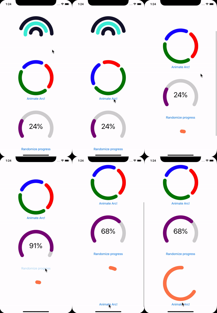
Animated Arc for building circular progress bars and donut charts with native performance!
Installation
Install @callstack/reanimated-arc
yarn add @callstack/reanimated-arcInstall react-native-svg peer dependency
yarn add react-native-svg@^10.0.0Library supports
react-native-svgin versions from9.13.4to last of10.0.0. It seems to not work well on Android with11and above
Install react-native-reanimated peer dependency
yarn add react-native-reanimatedExamples
Example app lives in example directory
Usage
With animations working out-of-the-box using ReanimatedArc
import React, {useState, useCallback} from 'react';
import {SafeAreaView, Button} from 'react-native';
import {ReanimatedArc} from '@callstack/reanimated-arc';

const App = () => {
  const [arc, setArc] = useState(50);
  const animate = useCallback(() => {
    setArc(Math.random() * 360);
  }, []);

  return (
    <SafeAreaView>
      <ReanimatedArc
        color="coral"
        diameter={200}
        width={30}
        arcSweepAngle={arc}
        lineCap="round"
        rotation={arc / 2}
      />
      <Button title="Animate Arc!" onPress={animate} />
    </SafeAreaView>
  );
};

export default App;
With full control over the animations using ReanimatedArcBase
import React, {useRef, useCallback} from 'react';
import {SafeAreaView, Button} from 'react-native';
import {ReanimatedArcBase} from '@callstack/reanimated-arc';
import Reanimated, {Easing} from 'react-native-reanimated';

const App = () => {
  const arcAngle = useRef(new Reanimated.Value(50));
  const animate = useCallback(
    () =>
      Reanimated.timing(arcAngle.current, {
        toValue: Math.random() * 360,
        easing: Easing.inOut(Easing.quad),
        duration: 800,
      }).start(),
    [],
  );
  return (
    <SafeAreaView>
      <ReanimatedArcBase
        color="coral"
        diameter={200}
        width={30}
        arcSweepAngle={arcAngle.current}
        lineCap="round"
        rotation={Reanimated.divide(arcAngle.current, 2)}
      />
      <Button title="Animate Arc!" onPress={animate} />
    </SafeAreaView>
  );
};

export default App;
ReanimatedArc
ReanimatedArc component will automatically animate changes of arcSweepAngle and rotation props. It do not accept reanimated nodes as values for those props.
Properties
| property | type | description | default |
|---|---|---|---|
| diameter | number |
Diameter of the arc | required |
| width | number |
Width of the arc stroke | required |
| initialAnimation | boolean |
Whether to perform initial arc animation | true |
| animationDuration | number |
Animation duration in milliseconds | 800 |
| easing | Reanimated.EasingFunction |
Animation easing function | Easing.linear |
| arcSweepAngle | number |
Angle defining part of the circle to be shown | 360 |
| rotation | number |
Rotation of the arc in degrees | 0 |
| color | string |
Color of the arc | 'black' |
| lineCap | 'round' | 'butt' | 'square' |
Line ending style | 'round' |
| hideSmallAngle | boolean |
Wether to hide arc for angles less than 1 | true |
| style | StyleProp<ViewStyle> |
Additional styles of the container | undefined |
ReanimatedArcBase
This component provides ability to control arc by reanimated values or nodes.
Properties
| property | type | description | default |
|---|---|---|---|
| diameter | number |
Diameter of the arc | required |
| width | number |
Width of the arc stroke | required |
| arcSweepAngle | number | Reanimated.Node<number> |
Angle defining part of the circle to be shown | 360 |
| rotation | number | Reanimated.Node<number> |
Rotation of the arc in degrees | 0 |
| color | string | Reanimated.Node<string> |
Color of the arc | 'black' |
| lineCap | 'round' | 'butt' | 'square' |
Line ending style | 'round' |
| hideSmallAngle | boolean |
Wether to hide arc for angles less than 1 | true |
| style | StyleProp<ViewStyle> |
Additional styles of the container | undefined |
Notes
Please note that if arcSweepAngle, rotation or color would be primitive value (not Reanimated node), property would not be animated.
If you want to have those values automatically animated please use ReanimatedArc component
| property | notes |
|---|---|
| color | Animating color is buggy on android. We used Reanimated.concat to compose rgb color. Reanimated.color is not yet supported by react-native-svg
|
| lineCap | For some reason on android angles with value of 90 180 and 270 with round cap appears without rounded end. Using 90.1 180.1 270.1 is a workaround for now. |
| hideSmallAngle | When lineCap="round" is used, arc of angle 1 is a dot, which is visually bigger than 1 deg. Prop can be used as a workaround for this issue. |
Caveats
It's likely that library will have performance dropdown in some specific cases, especially on android. See Donut example as a reference.
This is a monorepo
Contents of actual library can be found in reanimated-arc subdirectory
Example app lives in example directory
Development
Library has a great development experience. Follow these steps to set up environment:
- Run
yarnin root directory to install dependencies - Run
yarn --cwd reanimated-arc build:watchto start building library in watch mode - Run
yarn --cwd example startto start packager. It is required to start packager separately because otherwise it has incorrect working directory. - Run
yarn --cwd example androidoryarn --cwd example iosto start example app
Made with ❤️ at Callstack
Reanimated Arc is an open source project and will always remain free to use. If you think it's cool, please star it
Special Thanks
Special thanks to Lenus eHealth for their openness to sharing solutions, that were created during the project time, with the open-source community.
Library was inspired by react-native-circular-progress and some math behind generating arc was taken directly from that repo. Also big thanks for the authors.


