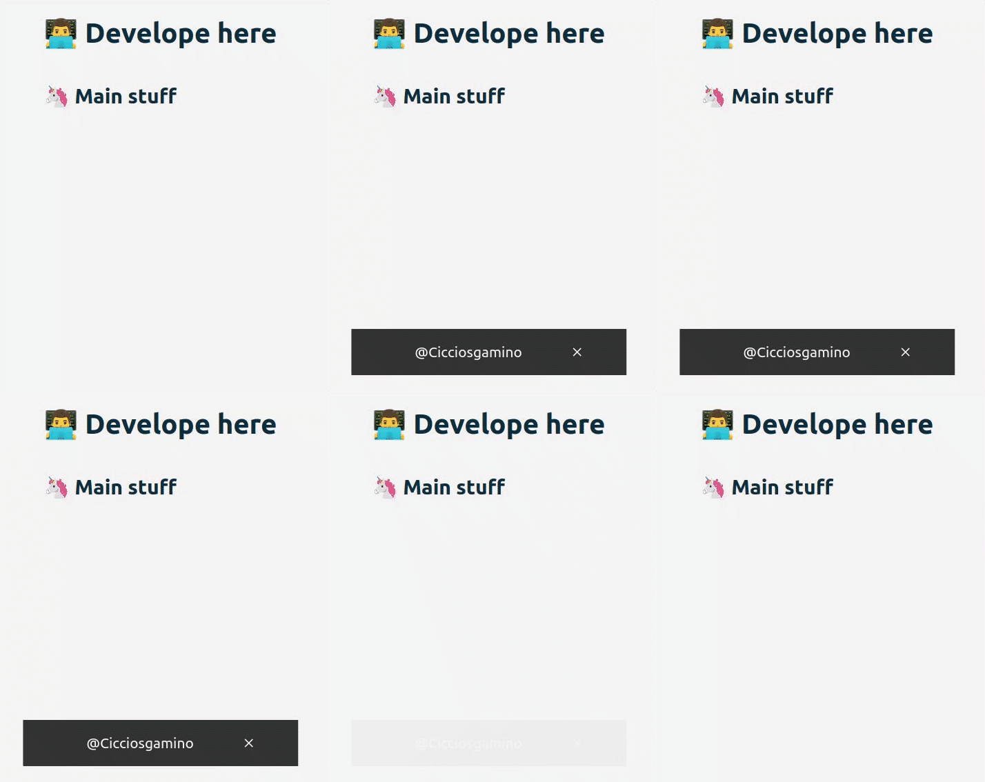
🌰 <snack-bar>
Simple Snackbar CustomElement
examples • usage • api • accessibility • TODO •
Examples
<snack-bar timing="5000" title="Offline"></snack-bar>🚀 Usage
- Install package
npm install --save @cicciosgamino/snack-bar- Import
<!-- Import Js Module -->
<script type="module">
  // Importing this module registers <progress-ring> as an element that you
  // can use in this page.
  //
  // Note this import is a bare module specifier, so it must be converted
  // to a path using a server such as @web/dev-server.
  import '@cicciosgamino/snack-bar'
</script>- Place in your HTML
<snack-bar timing="5000" title="Offline"></snack-bar>🐝 API
📒 Properties/Attributes
| Name | Type | Default | Description |
|---|---|---|---|
| timing | Number | 3000 |
Snackbar active timing |
| title | String | 🌰 ... SnackBar Title |
Snackbar title |
| active | Boolean | `` | Snackbar active attribute (present/NOT) |
| closebtn | Boolean | `` | Show the close button when attribute is present |
Methods
| Name | Description |
|---|---|
closeSnackbar() => void |
Close the snackbar |
Events
None
🧁 CSS Custom Properties
| Name | Default | Description |
|---|---|---|
--snak-bk-color |
#333 |
Snackbar background-color |
--snack-txt-color |
#f5f5f5 |
Snackbar text color |
--snack-font-size |
2.1rem |
Snackbar text / space / proportion |
--snack-bottom |
0 |
Snackbar bottom |
--snack-radius |
1px |
Snackbar border-radius |
🤖 Write HTML and JavaScript
Import the component's JavaScript module, use the component in your HTML, and control it with JavaScript, just like you would with a built-in element such as <button>:
<!doctype html>
<html>
  <head>
    <meta charset="utf-8">
    <title>My Example App</title>

    <!-- Add support for Web Components to older browsers. -->
    <script src="./node_modules/@webcomponents/webcomponentsjs/webcomponents-loader.js"></script>

  </head>
  <body>
    <!-- Use Web Components in your HTML like regular built-in elements. -->
    <snack-bar url=""></snack-bar>

    <!-- The Material Web Components use standard JavaScript modules. -->
    <script type="module">

      // Importing this module registers <progress-ring> as an element that you
      // can use in this page.
      //
      // Note this import is a bare module specifier, so it must be converted
      // to a path using a server such as @web/dev-server or @vitejs.
      import '@cicciosgamino/snack-bar'

      // Standard DOM APIs work with Web Components just like they do for
      // built-in elements.
      window.addEventListener('DOMContentLoaded', () => {
        const snack = document.querySelector('snack-bar')
        setTimeout(() => {
          // active the snack
          snack.setAttribute('active', '')
        }, 4000)
        setTimeout(() => {
          // close the snack (before timing ended)
          snack.closeSnackbar()
        }, 6000)
      })
    </script>
  </body>
</html>
🚀 Serve
Serve your HTML with any server or build process that supports bare module specifier resolution (see next section) in this project i'll use vite. So check the vite.config.js and the package.json for the scripts.
vite.config.js
import { defineConfig } from 'vite'
import { resolve } from 'path'

// https://vitejs.dev/config/
export default defineConfig({
  build: {
    lib: {
      entry: 'snack-bar.js',
      formats: ['es']
    },
    rollupOptions: {
      input: {
        main: resolve(__dirname, 'index.html')
      }
    }
  }
})
package.json
"scripts": {
  "dev": "vite --host",
  "build": "vite build",
  "preview": "vite preview --port 3000 --host"
},
Contributing
Got something interesting you'd like to share? Learn about contributing.
Accessibility
TODO
🔧 TODO
- [ ] Basic Unit testing
CSS encapsulation
The elements HTML structure is initialized in a Shadow DOM, so it is impossible to apply CSS to it. If you need to change the element's default style for any reason, you should open up a new issue (or a pull request!), describing your use case, and we'll work with you on solving the problem.
Browser support
Browsers without native custom element support require a polyfill. Legacy browsers require various other polyfills. See [examples/index.html][example] for details.
- Chrome
- Firefox
- Safari
- Microsoft Edge
Author
 |
|---|
| @cicciosgamino |
Support
Reach out to me at one of the following places:
Donate
Donate help and contibutions!
License
GNU General Public License v3.0
Made


