A slightly modified version for cxms needs
Features
-
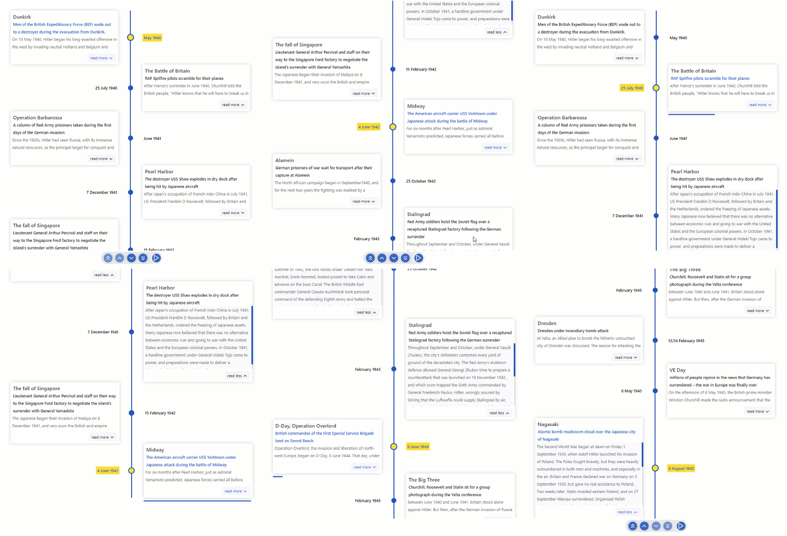
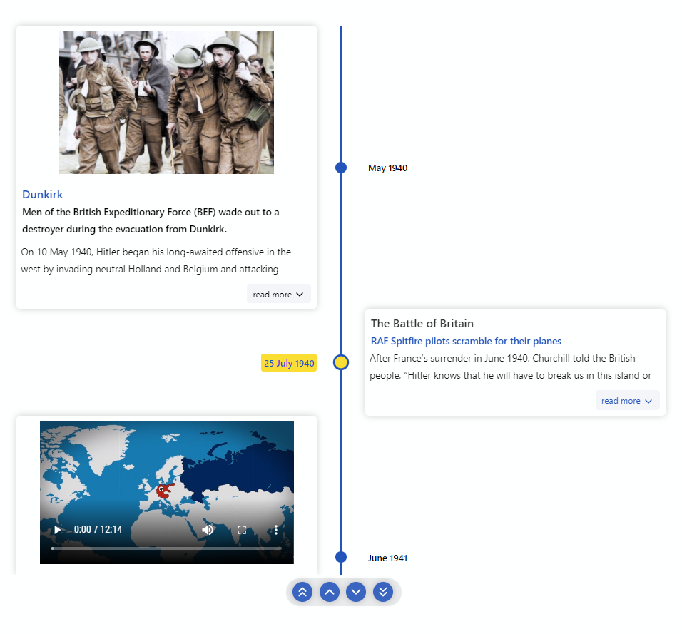
🚥 Render timelines in three different modes (Horizontal, Vertical, Vertical-Alternating). -
📺 Auto play the timeline with the slideshow mode. -
🖼️ Display Images & Videos in the timeline with ease. -
⌨ Keyboard accessible. -
🔧 Render custom content easily. -
⚡ Data driven API. -
🎨 Customize colors with ease. -
🎭 Use custom icons in the timeline. -
💪 Built with Typescript. -
🎨 Styled with emotion.
Table of Contents
⚡ Installation- Getting Started
- Props
📦 CodeSandbox Examples📚 Storybook🔨 Build Setup🧪 Tests🤝 Contributing🧱 Built with- Meta
- Contributors
✨
⚡ Installation
yarn add react-chronoGetting Started
Please make sure you wrap the component in a container that has a width and height.
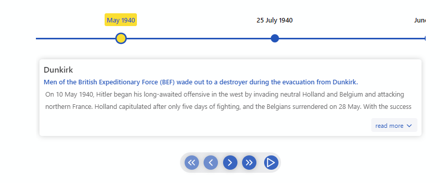
When no mode is specified, the component defaults to HORIZONTAL mode. Please check props for all the available options.
  import React from "react"
  import { Chrono } from "react-chrono";

  const Home = () => {
    const items = [{
      title: "May 1940",
      cardTitle: "Dunkirk",
      cardSubtitle:"Men of the British Expeditionary Force (BEF) wade out to..",
      cardDetailedText: "Men of the British Expeditionary Force (BEF) wade out to..",
      media: {
        type: "IMAGE",
        source: {
          url: "http://someurl/image.jpg"
        }
      }
    }, ...];

    return (
      <div style={{ width: "500px", height: "400px" }}>
        <Chrono items={items} />
      </div>
    )
  }
🚥 Vertical Mode
To render the timeline vertically use the VERTICAL mode
  <div style={{ width: "500px", height: "950px" }}>
    <Chrono
      items={items}
      mode="VERTICAL"
    />
  </div>
🚥 Vertical Alternating
In VERTICAL_ALTERNATING mode the timeline is rendered vertically with cards alternating between left and right side.
  <div style={{ width: "500px", height: "950px" }}>
    <Chrono
      items={items}
      mode="VERTICAL_ALTERNATING"
    />
  </div>
📺 Slideshow
Play the timeline automatically with the slideShow mode. This prop enables the play button on the ui controls.
  <div style={{ width: "500px", height: "950px" }}>
    <Chrono
      items={items}
      slideShow
      mode="VERTICAL_ALTERNATING"
    />
  </div>
Props
| name | description | default |
|---|---|---|
| mode | sets the mode of the component. can be HORIZONTAL, VERTICAL or VERTICAL_ALTERNATING
|
HORIZONTAL |
| items | collection of Timeline Item Model. | [] |
| disableNavOnKey | disables the keyboard navigation. | false |
| slideShow | enables the slideshow control. | false |
| slideItemDuration | duration (in ms), the timeline card is active during a slideshow. |
5000 |
| itemWidth | width of the timeline section in HORIZONTAL mode. |
300 |
| hideControls | hides the navigation controls. | 300 |
| allowDynamicUpdate | allows timeline items to be updated dynamically. | false |
| cardHeight | sets the minimum height of the timeline card. | 200 |
| cardWidth | sets the maximum width of the timeline card. | |
| scrollable | makes the timeline scrollable (applicable for VERTICAL & VERTICAL_ALTERNATING). |
true |
| flipLayout | flips the layout (RTL). applicable only to VERTICAL and VERTICAL_ALTERNATING
|
false |
| cardPositionHorizontal | positions the card in HORIZONTAL mode. can be either TOP or BOTTOM
|
|
| theme | prop to customize the colors. | |
| onScrollEnd | use the onScrollEnd to detect the end of the timeline. |
|
| useReadMore | enables or disables the read more button. when disabled the card will auto expand to fit the content | true |
Mode
react-chrono supports three modes HORIZONTAL, VERTICAL and VERTICAL_ALTERNATING. No additional setting is required.
<Chrono items={items} mode="HORIZONTAL" /> <Chrono items={items} mode="VERTICAL" /> <Chrono items={items} mode="VERTICAL_ALTERNATING" />Timeline item Model
| name | description | type |
|---|---|---|
| title | title of the timeline item | String |
| cardTitle | title that is displayed on the timeline card | String |
| cardSubtitle | text displayed in the timeline card | String |
| cardDetailedText | detailed text displayed in the timeline card | String or String[] |
| media | media object to set image or video. | Object |
{
  title: "May 1940",
  cardTitle: "Dunkirk",
  cardSubtitle:
    "Men of the British Expeditionary Force (BEF) wade out to a destroyer during the evacuation from Dunkirk.",
  cardDetailedText: ["paragraph1", "paragraph2"],
}
if you have a large text to display(via cardDetailedText) and want to split the text into paragraphs, you can pass an array of strings.
each array entry will be created as a paragraph inside the timeline card.
⌨ Keyboard Navigation
The timeline can be navigated via keyboard.
- For
HORIZONTALmode use your LEFT RIGHT arrow keys for navigation. - For
VERTICALorVERTICAL_ALTERNATINGmode, the timeline can be navigated via the UP DOWN arrow keys. - To easily jump to the first item or the last item in the timeline, use HOME or END keys.
To disable keyboard navigation set disableNavOnKey to true.
<Chrono items={items} disableNavOnKey />Scrollable
With the scrollable prop, you can enable scrolling on both VERTICAL and VERTICAL_ALTERNATING modes.
<Chrono items={items} scrollable />The scrollbar is not shown by default. To enable the scrollbar, pass an object with prop scrollbar to scrollable prop.
<Chrono items={items} scrollable={{scrollbar: true}} />
📺 Media
Both images and videos can be embedded in the timeline.
Just add the media attribute to the Timeline Item model and the component will take care of the rest.
To embed a image
{
  title: "May 1940",
  cardTitle: "Dunkirk",
  media: {
    name: "dunkirk beach",
    source: {
      url: "http://someurl/image.jpg"
    },
    type: "IMAGE"
  }
}
To embed a video
Videos start playing automatically when active and will be automatically paused when not active.
Like images, videos are also automatically hidden when not in the visible viewport of the container.
{
  title: "7 December 1941",
  cardTitle: "Pearl Harbor",
  media: {
    source: {
      url: "/pearl-harbor.mp4",
      type: "mp4"
    },
    type: "VIDEO",
    name: "Pearl Harbor"
  }
}
To embed YouTube videos, use the right embed url.
{
  title: "7 December 1941",
  cardTitle: "Pearl Harbor",
  media: {
    source: {
      url: "https://www.youtube.com/embed/f6cz9gtMTeI",
      type: "mp4"
    },
    type: "VIDEO",
    name: "Pearl Harbor"
  }
}
🛠 Rendering custom content
The component also supports embedding custom content in the Timeline cards.
To insert custom content, just pass the blocked elements between the Chrono tags.
For e.g the below snippet will create 2 timeline items. Each div element is automatically converted into a timeline item and inserted into the timeline card.
The items collection is completely optional and custom rendering is supported on all 3 modes.
  <Chrono mode="VERTICAL">
    <div>
      <p>Lorem Ipsum. Lorem Ipsum. Lorem Ipsum</p>
    </div>
    <div>
      <img src="<url to  a nice image" />
    </div>
  </Chrono>
The items collection will also work nicely with any custom content that is passed.
The following snippet sets the the title and cardTitle for the custom contents.
  const items = [
    {title: "Timeline title 1", cardTitle:  "Card Title 1"},
    {title: "Timeline title 2", cardTitle:  "Card Title 2"}
  ];

  <Chrono mode="VERTICAL" items={items}>
    <div>
      <p>Lorem Ipsum. Lorem Ipsum. Lorem Ipsum</p>
    </div>
    <div>
      <img src="<url to  a nice image" />
    </div>
  </Chrono>
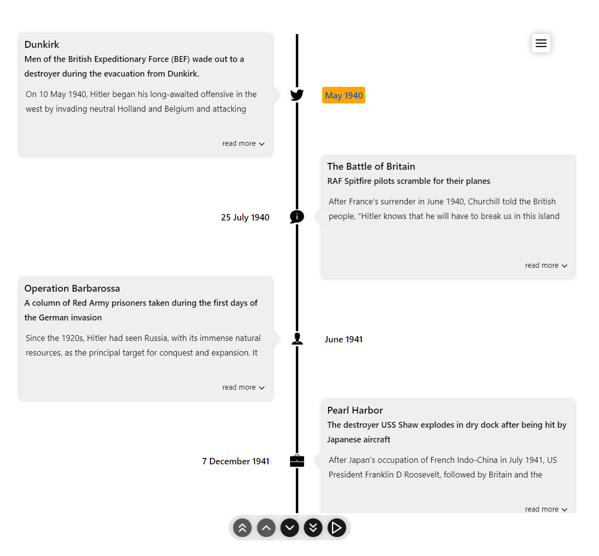
🎭 Custom icons for the Timeline
To use custom icons in the timeline, pass in the collection of images between the chrono tags wrapped in a container.
The icons are sequentially set (i.e) the first image you pass will be used as the icon for the first timeline item and so on.
Please make sure to pass in the image collection inside a container with a special className chrono-icons. This convention is mandatory as the component uses this class name to pick the images.
 <Chrono items={items} mode="VERTICAL_ALTERNATING">
   <div className="chrono-icons">
     <img src="image1.svg" alt="image1" />
     <img src="image2.svg" alt="image2" />
   </div>
 </Chrono>
custom icons also works if you are rendering custom content inside the cards.
  <Chrono mode="VERTICAL" items={items}>
    <div>
      <p>Lorem Ipsum. Lorem Ipsum. Lorem Ipsum</p>
    </div>
    <div>
      <img src="<url to  a nice image" />
    </div>
    <div className="chrono-icons">
      <img src="image1.svg" alt="image1" />
      <img src="image2.svg" alt="image2" />
    </div>
  </Chrono>
Slideshow mode
Slideshow can be enabled by setting the slideShow prop to true. You can also set an optional slideItemDuration that sets the time delay between cards.
setting this prop enables the play button in the timeline control panel.
<Chrono items={items} slideShow slideItemDuration={4500} />Item Width
The itemWidth prop can be used to set the width of each individual timeline sections. This setting is applicable only for the HORIZONTAL mode.
🎨 Theme
Customize colors with the theme prop.
<Chrono items={items} theme={{primary: "red", secondary: "blue", cardBgColor: "yellow", cardForeColor: "violet" }} />
📦 CodeSandbox Examples
- Horizontal Basic
- Vertical basic
- Vertical Alternating
- Vertical All Images
- Vertical Custom content
- Vertical Custom content with items collections
- Custom Icons
📚 Storybook
Deep dive into wide variety of examples hosted as a Storybook.
🔨 Build Setup
# install dependencies
yarn install

# start dev setup
yarn run start

# run css linting
yarn run lint:css

# eslint
yarn run eslint

# prettier
yarn run lint

# package lib
yarn run rollup
🧪 Tests
  # run unit tests
  yarn run test

  # run cypress tests
  yarn run cypress:test
🤝 Contributing
- Fork it
- Create your feature branch (
git checkout -b new-feature) - Commit your changes (
git commit -am 'Add feature') - Push to the branch (
git push origin new-feature) - Create a new Pull Request
🧱 Built with
- Typescript.
- Styled with emotion.
- Powered by snowpack
Meta
Huge thanks to BrowserStack for the Open Source License!
Distributed under the MIT license. See LICENSE for more information.
Prabhu Murthy – @prabhumurthy2 – prabhu.m.murthy@gmail.com https://github.com/prabhuignoto
Contributors ✨
Thanks goes to these wonderful people (emoji key):
|
Alois |
Koji |
Alexandre Girard |
Ryuya |
This project follows the all-contributors specification. Contributions of any kind welcome!

