<mwc-formfield> 
IMPORTANT: The Material Web Components are a work in progress and subject to major changes until 1.0 release.
A form field is a text caption for MWC input elements including
<mwc-checkbox>,
<mwc-radio>,
and
<mwc-switch>.
It is equivalent to the native
<label>
element in that it forwards user interaction events to the input element. For example, tapping on the label causes the associated input element to toggle and focus.
Material Design Guidelines: Selection controls
Installation
npm install @dev.mohe/mwc-formfieldNOTE: The Material Web Components are distributed as ES2017 JavaScript Modules, and use the Custom Elements API. They are compatible with all modern browsers including Chrome, Firefox, Safari, Edge, and IE11, but an additional tooling step is required to resolve bare module specifiers, as well as transpilation and polyfills for IE11. See here for detailed instructions.
Example usage
With checkbox
<mwc-formfield label="Tomato">
  <mwc-checkbox checked></mwc-checkbox>
</mwc-formfield>

<script type="module">
  import '@dev.mohe/mwc-checkbox';
  import '@dev.mohe/mwc-formfield';
</script>
nowrap label with checkbox
<style>
  mwc-formfield[nowrap] {
    width: 150px;
  }
</style>
<mwc-formfield label="really really long label" nowrap>
  <mwc-checkbox></mwc-checkbox>
</mwc-formfield>

<script type="module">
  import '@dev.mohe/mwc-checkbox';
  import '@dev.mohe/mwc-formfield';
</script>
With Radio
<style>
  mwc-formfield {
    display: block;
  }
</style>

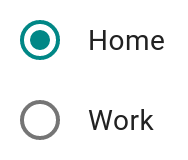
<mwc-formfield label="Home">
  <mwc-radio name="location" checked></mwc-radio>
</mwc-formfield>

<mwc-formfield label="Work">
  <mwc-radio name="location"></mwc-radio>
</mwc-formfield>

<script type="module">
  import '@dev.mohe/mwc-radio';
  import '@dev.mohe/mwc-formfield';
</script>
With Switch
<mwc-formfield label="Airplane mode">
  <mwc-switch checked></mwc-switch>
</mwc-formfield>

<script type="module">
  import '@dev.mohe/mwc-switch';
  import '@dev.mohe/mwc-formfield';
</script>
API
Slots
| Name | Description |
|---|---|
| default | The input element that this form field provides a label for. |
Properties/Attributes
| Name | Type | Description |
|---|---|---|
label |
string |
The text to display for the label and sets a11y label on input. (visually overriden by slotted label) |
alignEnd |
boolean |
Align the component at the end of the label. |
spaceBetween |
boolean |
Add space between the component and the label as the formfield grows. |
nowrap |
boolean |
Prevents the label from wrapping and overflow text is ellipsed. |
Methods
None
Events
None
CSS Custom Properties
Global CSS Custom Properties
This component exposes the following global theming custom properties.
| Name | Description |
|---|---|
--mdc-typography-body2-<PROPERTY> |
Styles the typography of the formfield. |


