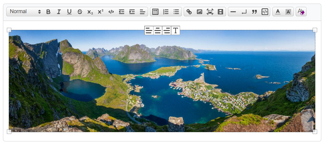
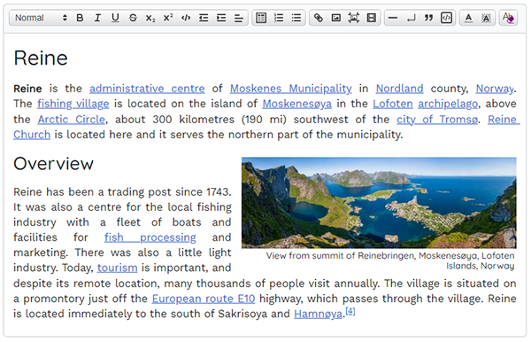
An update of quill module quill-blot-formatter to make alignments compatible with Quill V2. Out of the box supports resizing and realigning images and iframe videos. Supports editing alt & title values for images. It can be easily extended using BlotSpec and Action.
[!IMPORTANT] Before using this package, it's recommended to at least be familiar with the information covered in Actions, CSS and Options. If your Quill editor is scrollable, be sure to also read the notes in Scrollable Editors.
- What's New
- Installation
- Usage
- Actions
- Included Custom Blots
- Formatting Images
- Formatting Videos
- CSS
- Scrollable Editors
- Toolbar
- Configuring Options
- Further Customisations
This release is a major rewrite, including:
- support for mobile/touch screens (including resize by pinch gesture)
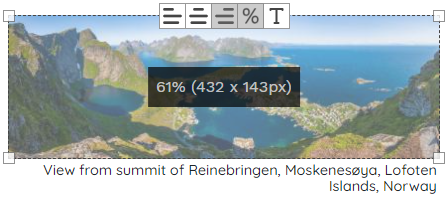
- relative sizing vs absolute (% vs px), option to use on all resize actions or change on a per blot basis via toolbar button
- size information inlay for accurate sizing and interactive feedback during resize
- support for scrollable editors
- many fixes for bugs carried over from original
blot-formatterpackage
- compress action was added to reduce the size of embedded images if applicable
- an optional
imageOversizeProtectionsetting for the Resize Action prevents images from being sized larger than their natural size when using absolute sizes
See change log for full details.
This release adds alt and title editing support for images. Look for the T button next to the alignment buttons on the overlay toolbar.
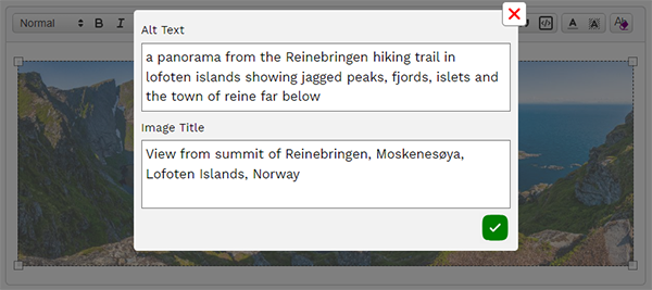
Clicking the T button will open a modal form to add your values.
Using the suggested css, the title can also be used as a caption on your images.
See notes below on usage, css and importantly, supporting image titles in Quill.
npm install --save @enzedonline/quill-blot-formatter2
Download both from the dist folder in this repository, or use jsdelivr CDN's:
<script
  src="https://cdn.jsdelivr.net/npm/@enzedonline/quill-blot-formatter2@2.2/dist/js/quill-blot-formatter2.min.js">
</script>
<link
  rel="stylesheet"
  href="https://cdn.jsdelivr.net/npm/@enzedonline/quill-blot-formatter2@2.2/dist/css/quill-blot-formatter2.css"
>import Quill from 'quill';
Quill.register('modules/blotFormatter2', BlotFormatter2);
const quill = new Quill(..., {
modules: {
...
blotFormatter2: {
// see config options below
}
}
});quill-blot-formatter2.min.js is provided which exports the same modules as index.js under the global QuillBlotFormatter2.
<script src="<quill>"></script>
<script src="https://cdn.jsdelivr.net/npm/@enzedonline/quill-blot-formatter2@2.2/dist/js/quill-blot-formatter2.min.js"></script>
<link rel="stylesheet" href="https://cdn.jsdelivr.net/npm/@enzedonline/quill-blot-formatter2@2.2/dist/css/quill-blot-formatter2.css">
<script>
  Quill.register('modules/blotFormatter2', QuillBlotFormatter2.default);
  const quill = new Quill(..., {
      modules: {
          ...
          blotFormatter2: {
            // see config options below
          }
      }
    }
  );
</script>There are three common actions plus an additional two for image blots. These are enabled with the following options:
blotFormatter2: {
  align: {
    allowAligning: true,
  },
  resize: {
    allowResizing: true,
  },
  delete: {
    allowKeyboardDelete: true,
  },
  image: {
    allowAltTitleEdit: true,
    allowCompressor: true
  }
}
Set the value to false to disable the action.
All of these are set to true by default except allowCompressor.
This action handles aligning the blot.
Two Quill formats for aligning blots are registered with this package: IframeAlign and ImageAlign
Alignment and placing is handled by css classes, one set each for image and iframe:
.ql-image-align-left, .ql-image-align-center, .ql-image-align-right,
.ql-iframe-align-left, .ql-iframe-align-center, .ql-iframe-align-right
For images, these classes are applied to the Quill <span> wrapper, not to the image itself.
For both images and iframes, a helper attribute data-blot-align is added with the value of the alignment (i.e 'left', 'center' or 'right').
The width of an aligned blot is required for the styling helpers (data-relative-size and --resize-width) - see the Resize section below for more information on these. In the case the blot has no width attribute, the following will be used:
- for images, the natural width of the image (in px) will be used
- for iframes, the current displayed width (in px) will be used
Which format is applied is actually decided on by scope - inline for image and block for iframe. If, for some reason, you use a custom image blot with block scope, it will be formatted with .ql-iframe-align-xx.
[!TIP] Quill docs incorrectly extend
BlockEmbedto create theImageBlot. If you use a customImageblot, the correct class to extend isblots/Embed.
Two options exist for Align:
  align: {
    allowAligning: true,
    alignments: ['left', 'center', 'right']
},-
allowAligning: boolean- turn aligning on or off. Iffalse, no alignment buttons will be added to the toolbar. Defaulttrue. -
alignments: string[]- alignments to use - must match toolbar icon name & be a member of align format whitelist. Default['left', 'center', 'right'].
⚠️ Updated in 2.2The toolbar and icons options were moved from the
alignbranch of options to their owntoolbaroption category (see below).If upgrading from 2.0/2.1 and using the new CSS, it may be necessary to reapply alignment formats in some cases. See the CSS section for details on using both previous and new CSS during transition.
Handles resizing the blot and displaying size information. Note that a blot cannot be resized to a width greater than the available displayed width in the Quill editor.
Resizing a blot will add the following attributes:
-
width: blot size in pixels or % as per options -
height: blot height -autoin all cases except when an iframe is resized using absolute dimensions and noaspect-ratiois available.
The following are applied to aligned image span wrappers and directly to iframes. They exist purely to build CSS selectors & rules to assist with styling.
-
data-relative-sizeboolean, reflects if blot has been sized with px or %. -
style: --resize-widthstring, a copy of the blot width attribute. Can be used to set width on image align span wrapper, and also conditionally resize elements on responsive sites. For images, this will only be added if it has an alignment set.
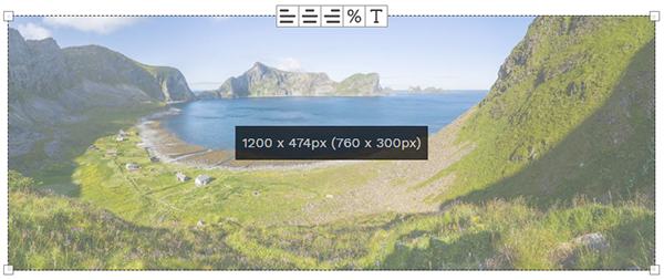
With the overlay active, hold the mouse down, or touch, on the overlay to display size. Release to dismiss the display.
If using relative sizing, the relative size will be shown with current absolute display size in brackets.
If using absolute sizing and the current display size differs from the width attribute value (for example, the width value is wider than the editor width), the dimensions based on the width attribute will be shown first with current display size in brackets.
If no width has been set on the blot, and the blot is an image, the image size will be shown (along with current display size if different).
The size information box will be active during resizing for interactive feedback.
Styling of the size information box is possible via options.overlay.sizeInfoStyle.
There are five settings most likely of interest:
  resize: {
    allowResizing: true,
    allowResizeModeChange: false,
    useRelativeSize: false,
    imageOversizeProtection: false,
    minimumWidthPx: 25,
},-
allowResizing: boolean: allow blots to be resized. Setting this to false stops theResizeaction loading when the formatter overlay is activated. This will disable the drag handles in the overlay corners and not load the event listeners that handle resizing. -
allowResizeModeChange: boolean: shows the%button on the toolbar. Clicking this toggles the size mode between absolute and relative. See Using Relative Sizes for more details. IfallowResizingisfalse, theResizeaction will not be loaded and the%button will not be available. -
useRelativeSize: boolean: iftruethen use relative sizes by default or use relative sizes for all resize operations depending on value set forallowResizeModeChange. See Using Relative Sizes for more details. -
imageOversizeProtection: boolean⚠️ New in 2.2.2: when set to true, prevents an image being resized larger than its natural width to prevent degradation of image quality. This is only applicable when the resize mode is absolute (px) and not relative (%). If the imagesrcis ansvg(either embedded ot linked), the image is exempt from this limit. -
minimumWidthPx: number: the minimum width (px) a blot can be shrunk to during a resize operation.
Additionally, handleClassName and handleStyle are availble to control the drag handle styling (see Options)
Version 2.2 introduces relative sizing as an option. If used, the size will be set as a proportion of the Quill editor useable width (quill.root width minus horizontal padding).
A blot must be resized (i.e. have a width attribute) to use relative sizing.
Relative sizing is not enabled by default.
⚠️ Regardless of settings, blots will retain their original/current width attribute units until resized. A blot sizing will not change from absolute to relative (or vice versa) without first being resized or actively using the mode change%button. The only exception is an unsized image being aligned withallowResizeModeChange = falseanduseRelativeSize = true- in this case, the image will have a relative size set based on its natural width as a proportion of the editor width (up to 100%).
There are two ways to apply the rule to use relative (or absolute) sizing.
No toolbar % button is present to change size mode (the default setting).
useRelativeSize = false - any resize action will set the width attribute in pixels. This is the default setting.
useRelativeSize = true - any resize action will set the width attribute in % as a proportion of the editor width (minus padding). Aligning an unsized image with this setting will set the image width to relative.
A toolbar % button is present to toggle size mode from absolute to relative.
With allowResizeModeChange = true, the useRelativeSize setting is only applied to blots that do not already have a width attribute. The size mode for existing width attributes is maintained. For example, resizing a blot with a width attribute in px with useRelativeSize = true will not change the size mode. You can then change the sizing mode with the % button.
When changing from absolute to relative size, you may notice a small change in display size on the blot. Relative sizes are rounded to the nearest whole number % which may result in the displayed width adjusting slighlty up or down.
Resize blots on a touch screen via the pinch gesture: with the formatter overlay active, touch the overlay with two fingers, control the size by spreading/contracting the fingers
The drag handles do not respond well on a touch screen, it is recommended to use the pinch gesture.
When the overlay is active, this action will delete the underlying blot on pressing either delete or backspace.
To disable the Delete action, use the following setting:
  delete: {
    allowKeyboardDelete: false,
},From version 2.1, alt and title image attributes can be edited from the T button on the overlay toolbar.
[!CAUTION]
At the time of writing, the current version of Quill (v2.0.2) does not natively support storing the title attribute in the image delta. As such, when you reload the editor, the title attribute will be lost. There is a Quill pull request to address this.
This package includes an updated Image blot that addresses this issue.
To use that updated blot, simply include the following in your
blotFormatter2options:image: { registerImageTitleBlot: true }This is not enabled by default as this can potentially overwrite any custom Image blot you might have in use.
If you use a custom image blot, leave
registerImageTitleBlotout of your options and be sure to addtitleto supported attributes.
To disable alt/title editing use the following option (default true):
image: {
allowAltTitleEdit: false,
},The alt/title modal is customisable in terms of style, icons and label text (:warning:New in 2.2.1):
image: {
altTitleModalOptions: {
styles: {
modalBackground: { [key: string]: any } | null | undefined; // screen background mask
modalContainer: { [key: string]: any } | null | undefined;; // modal dialog
label: { [key: string]: any } | null | undefined; // form labels
textarea: { [key: string]: any } | null | undefined; // textareas
submitButton: { [key: string]: any } | null | undefined; // submit button
cancelButton: { [key: string]: any } | null | undefined; // cancel button
};
icons: {
// inner html for buttons (svg recommended)
submitButton: string;
cancelButton: string;
};
labels: {
// text for labels (for multi-lang support)
alt: string;
title: string;
};
}
}Any of the styles specified above will be merged with the default styles unless null is specified, in which case the style attribute will be absent from the rendered modal. You can also specify styles: null to remove all inline styles from the modal. If you prefer to use CSS to style the modal, you can use div[data-blot-formatter-modal] in your selector to target the rendered modal elements.
Specify a string representation of an svg (without width/height attributes) or other suitable inner HTML for the buttons.
For multi-lingual sites, you can change the modal form labels in the options. For example:
image: {
altTitleModalOptions: {
labels: {
alt: "Alt tekst",
title: "Bildetittel",
};
}
}For aligned images (assuming your image blot is inline), the image title is copied into the data-title attribute of the wrapping <span> tag.
<span class="ql-image-align-center"
data-title="some image title"
data-relative-size="true"
style="--resize-width: 50%;">
<img src="https://example.com/media/images/some-image.png"
alt="some alt text"
data-blot-align="center"
title="some image title"
width="25%" height="auto">
</span>You can make use of the data-title attribute to display a caption using the suggested css below.
The Compress Action will reduce the size of embedded images that meet the criteria for reduction.
[!IMPORTANT] The Compressor Action is not available for linked (external) images, or embedded SVG's & GIF's.
This action is not enabled by default.
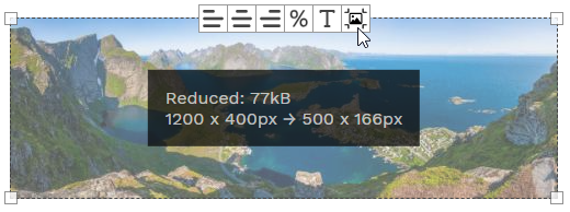
To compress an image, activate the formatter for that image and click the 'compress image' button:

The button is only visible for eligible image types.
All compressed images are jpeg format.
Images are considered 'compressible' if
- They are larger than the
maxWidthvalue in options (if any - see Options below). - The image has been resized and its
widthattribute is smaller than its natural width. This condition will only be met if it has been resized with absolute units (px, rem or em).
Images resized with relative (%) unit will only be reduced if they are larger than the maxWidth value.
A modal is used to confirm the action before compressing. The styles and text content of the modal are fully cusomtisable in the options. The modal has a default prompt and a 'more info' button to expand a more detailed explantaion. These can be configured in options. Set the 'more info' text to null to hide the button.
When completed, a feedback box is displayed in the formatter overlay to show the reduced amount in kB, as well as the initial and final dimensions for the image. If the image is not compressible (already optimum size), this is displayed instead of the modal.
image: {
allowCompressor: Boolean;
compressorOptions: {
jpegQuality: number;
maxWidth?: number | null;
styles? : {
modalBackground?: { [key: string]: any } | null | undefined;
modalContainer?: { [key: string]: any } | null | undefined;
buttonContainer?: { [key: string]: any } | null | undefined;
buttons?: { [key: string]: any } | null | undefined;
} | null | undefined;
text: {
prompt: string;
moreInfo: string | null;
reducedLabel: string;
nothingToDo: string;
};
icons: {
continue: string;
moreInfo: string;
cancel: string;
};
}
}-
allowCompressor: enable the Compressor Action (falseby default). -
jpegQuality: jpeg quality (compression factor) to apply when reducing the image. Must be 0 - 1 where 0 is absolute compression (lowest quality) and 1 is no compression (highest quality).0.8by default. This value will typically reduce the file size to 30% of the original without any noticeable degradation of image quality. -
maxWidth: if set, will reduce images to this size if the image has no width attribute, or is resized with relative (%) units, and is larger than themaxWidthvalue.nullby default. -
styles: Any of the styles specified above will be merged with the default styles unless null is specified, in which case the style attribute will be absent from the rendered modal. You can also specifystyles: nullto remove all inline styles from the modal. If you prefer to use CSS to style the modal, you can usediv[data-blot-formatter-compress-modal]in your selector to target the rendered modal elements. -
text: text or rich text HTML for the modal and feedback box-
prompt- text for the modal when opened -
moreInfo- extra detail for the user when clicking the?button. Setting this tonullhides the?button. -
reducedLabel- label for the file size reduction feedback ("Reduced" in the screenshot above). -
nothingToDo- text shown in the feedback box when there is no compression to do.
-
-
icons- Specify a string representation of an svg (without width/height attributes) or other suitable inner HTML for the buttons.
This package includes two custom blots, one each for Image and Video that override the Quill blot types of the same name.
⚠️ Neither blot is registered by default. To register these blots with Quill, use the following options:
blotFormatter2: {
image: {
registerImageTitleBlot: true,
},
video: {
registerCustomVideoBlot: true,
}
}This is a modified Image blot (source) that adds title attribute support to the default Quill Image blot. If you use the Attribute action for alt/title editing, you must either use this blot or register your own with title support.
This is a modified Video blot (source) that will add the video with aspect ratio of 16:9 (the default for YouTube) and an initial width of 100% instead of the default 350x150px.
If you'd like to use the custom blot with a different aspect ratio, you can set this via the defaultAspectRatio setting. For example, to set 2:1:
video: {
registerCustomVideoBlot: true,
defaultAspectRatio: '2/1 auto'
}This blot also fixes a Quill bug where the video embed is outputted as a hyperlink when using quill.getSemanticHTML(). Using this custom blot, the iframe will be replicated exactly as it is in the editor.
⚠️ New in 2.2Resized images will always have their
heightattribute set toauto. The originalblot-formatterpackage set a fixed pixel height which caused distortion if thewidthexceeded themax-widthstyling for that image. If upgrading to 2.2 from previous versions, you will need to resize images to get this fix.
image: {
allowAltTitleEdit: true,
registerImageTitleBlot: false,
registerArrowRightFix: true
},-
allowAltTitleEdit: boolean: show the alt/titleTbutton on the overlay (see previous section) -
registerImageTitleBlot: boolean: registers the custom Image blot that supports the delta for the title attribute (see previous section) -
registerArrowRightFix: boolean: registers a keyboard binding that fixes a Quill bug where the cursor disappears when moved by right arrow into thespantag for the image.
⚠️ New in 2.2Custom aspect ratios are now supported for iframes.
Each iframe now gets a unique proxy image for touch screen compatibility. Proxy images now exist in the Quill container rather than the end of the document body for compatibility with scrollable editors. If you use a scrollable editor, make sure to set the container overflow to
hidden. See Scrollable Editors below for mre information.
When adding a video to the editor content, blot-formatter-2 will assign it a transparent 'proxy-image' mask to prevent interaction with the iframe content. Clicking this proxy image will activate the formatter overlay for that video.
Proxy image positions are maintained whenever one of the following occurs: Quill's text-change event fires, either the window or editor is scrolled, the editor is resized (included mobile screen orientation change).
[!IMPORTANT] It is recommended that you set an
aspect-ratiostyle on your iframes, either via inline style or css. This is imperative for relative sizing of iframes.
video: {
selector: 'iframe.ql-video',
registerCustomVideoBlot: false,
registerBackspaceFix: true,
defaultAspectRatio: '16/9 auto',
proxyStyle: {}
}-
selector: string: this is used to determine which elements are iframes to assign proxy images to. If you use a custom video blot without the Quill defaultql-videoclass, amend this to suit your needs. -
defaultAspectRatio: string: Sets the aspect ratio used by the custom video blot if registered. If no aspect ratio has been defined either via inline style or CSS, and the size mode is relative, this value will be used during resizing. Note, in this case, this is not sticky and will not be saved into the Quill delta. -
registerCustomVideoBlot: boolean: Registers a custom video blot with aspect-ratio specified bydefaultAspectRatiowhich isaspect-ratio: 16 / 9 auto;by default (the Youtube default) and initial width 100% (see below). -
registerBackspaceFix: boolean: Registers a backspace keyboard binding that fixes the following Quill bug: If there are two adjacent video blots and the first is deleted with backspace, the size attributes of deleted blot are passed into the remaining blot. -
proxyStyle: { [key: string]: any } | null | undefined: an optional mapped type of style settings to add to the proxy image. For troubleshooting any issues to do with proxy positioning, it can be useful to use{'border': '5px red solid'}to help visualise the proxy placement.
Suggested css can be found in src/css/quill-blot-formatter2.css (shown below). This is also exported to the dist folder and published via npm:
<link rel="stylesheet" href="https://cdn.jsdelivr.net/npm/@enzedonline/quill-blot-formatter2@2.2/dist/css/quill-blot-formatter2.css">These styles are not loaded automatically, it is up to you to load the styles relevant to your site.
div.ql-editor {
--blot-align-left-margin: 0.5rem 1rem 0.5rem 0;
--blot-align-center-margin: 1rem auto;
--blot-align-right-margin: 0.5rem 0 0.5rem 1rem;
}
/* image wrapper common */
div.ql-editor [class^="ql-image-align-"] {
display: flex;
flex-wrap: wrap;
width: var(--resize-width);
max-width: 100%;
}
div.ql-editor [class^="ql-image-align-"]>img {
flex: 1;
}
/* left */
div.ql-editor .ql-image-align-left,
div.ql-editor .ql-iframe-align-left {
margin: var(--blot-align-left-margin);
float: left;
}
/* centre */
div.ql-editor .ql-image-align-center,
div.ql-editor .ql-iframe-align-center {
margin: var(--blot-align-center-margin);
}
/* right */
div.ql-editor .ql-image-align-right,
div.ql-editor .ql-iframe-align-right {
margin: var(--blot-align-right-margin);
float: right;
}
/* image caption */
/* common */
div.ql-editor [class^="ql-image-align-"][data-title] {
margin-bottom: 0;
}
div.ql-editor [class^="ql-image-align-"][data-title]::after {
content: attr(data-title);
padding: 0.25rem 0.2rem;
font-size: 0.9rem;
line-height: 1.1;
background-color: white;
width: 100%;
}
/* remove text decoration on caption when image linked */
a:has([class^="ql-image-align-"]>img) {
text-decoration: none !important;
}
/* left */
div.ql-editor .ql-image-align-left[data-title]::after {
text-align: left;
}
/* center */
div.ql-editor .ql-image-align-center[data-title]::after {
text-align: center;
}
/* right */
div.ql-editor .ql-image-align-right[data-title]::after {
text-align: right;
}
⚠️ New in 2.2The
--resize-widthstyle property was introduced in version 2.2 and is a copy of the target elementwidthattribute. Setting thewidthon thespanwrapper with this value allows the use offlexdisplay and a cleaner style including no longer clipping the image with wrapped image captions. If you're upgrading this package from previous versions, this attribute will not be present until you load the blot in an editor.If you have content from previous versions and want to take advantage of this styling without needing to update every aligned image in your content, you can use the following to allow the two formats to coexist:
Version 2.2 also introduced the
data-relativeattribute as a css helper for sites using mixed absolute and relative sizes. It is added to every formatted image but not present on blots aligned in previous versions. To apply the previous styling to pre-2.2 content, add:not[data-relative]to each of your align selectors on your previous css definitions and add[data-relative]to each of the align selectors above.For example:
/* pre-2.2 styling */ div.ql-editor .ql-image-align-center:not[data-relative], div.ql-editor .ql-iframe-align-center:not[data-relative] { margin: 0.5rem auto; display: block; } /* post 2.2 styling */ div.ql-editor .ql-image-align-center[data-relative], div.ql-editor .ql-iframe-align-center[data-relative] { margin: var(--blot-align-center-margin); }
If you use Quill in a modal form with elevated z-index, you may need to increase the z-index for the proxies to correctly cover the iframes. This can be done using the video.proxyStyle setting in Options. For example:
video: {
proxyStyle: {
zIndex: 10
}
}Alternatively, use css to amend the style for img.blot-formatter__proxy-image.
img.blot-formatter__proxy-image {
z-index: 10; /* use an appropriate value here */
}Take care that the proxy image doesn't have a higher z-index than the Quill toolbar as this could result in the proxy covering toolbar buttons.
[!IMPORTANT] See also the note below regarding scrollable Quill editors if your editor is scrollable or has a
max-heightattribute.
One conundrum facing responsive designers faced with an element that could be any width is how to deal with this in a sensible manner when considering smaller screen sizes. You can set all images to 100% at screens below 600px for example, but this is treating all images as equal whether they be 20px or 2000px (or 10% or 75%) for example. In this case, if you had an image with width 20% and breakpoint at 600px, your image will abruptly jump from 120px to 600px as the screen resizes below that threshold.
It is possible to use the --resize-width style property to incrementally increase the width of aligned images to a maximum of 100%.
Example css below progressively expands relative-sized images by 20% up to a maximum of 100% for each 100px reduction in screen size from 900 to 500px.
div.ql-editor [class^="ql-image-align-"] {
width: var(--resize-width);
max-width: 100%;
}
@media (max-width: 900px) {
div.ql-editor [class^="ql-image-align-"][data-relative="true"] {
width: calc(var(--resize-width) + 20%);
}
}
@media (max-width: 800px) {
div.ql-editor [class^="ql-image-align-"][data-relative="true"] {
width: calc(var(--resize-width) + 40%);
}
}
@media (max-width: 700px) {
div.ql-editor [class^="ql-image-align-"][data-relative="true"] {
width: calc(var(--resize-width) + 60%);
}
}
@media (max-width: 600px) {
div.ql-editor [class^="ql-image-align-"][data-relative="true"] {
width: calc(var(--resize-width) + 80%);
}
}
@media (max-width: 500px) {
div.ql-editor [class^="ql-image-align-"][data-relative="true"] {
width: 100%;
}
}[!Note] This is a bit simplistic and can result in adjacent content being 'pinched out' if this was used on a float image or a table for instance and the
calcstatement resulted in a value of (say) between 80% & 100%. A more robust (but complicated) method uses min/max calculations to mimic a logic gate (i.e mimicking an if/else clause) and set the width steps to a fixed width depending on the range that--resize-widthfalls into. A description of that method can be found in this article.
[!IMPORTANT] It's recommended to only apply these responsive styles outside of the editor (or when the editor is set to read-only) as otherwise this would interfere with the ability to resize blots at those screen sizes.
[!IMPORTANT] A lot of pre-existing bugs to do with scrollable editors were adressed in version 2.2. If you have a previous version and use a scrollable Quill editor, it's recommended to upgrade to this version. See the Change Log for more details.
Quill Blot Formatter 2 has been tested with scrollable editor elements (
quill.root). It is not recommended with scrollable containers (quill.container).
If your Quill root element is scrollable, any active overlay will scroll with the target element. The overlay element and proxy images sit in the Quill container element however and will be visible outside of the bounds of your editor. The proxy image can scroll off the available window and cause that to overflow while potentially masking elements outside of the editor.
For these reasons, you must set the overflow on your Quill container to hidden.
For example:
.ql-editor {
max-height: 25rem;
overflow-y: auto;
}
.ql-container {
overflow: hidden;
}
⚠️ New in version 2.2.In previous versions, the toolbar settings were a sub-property of the
alignsetting.
The formatter loads enabled (and relevant) actions for the target blot when the overlay activates. Each action has an optional array of ToolbarButtons that are loaded into the overlay toolbar. These are created and destroyed each time the overlay is shown and hidden. When actions are enabled or disabled, their relevant toolbar buttons are shown/hidden on the toolbar.
The toolbar options are concerned with styling and icon definition and shouldn't need amending in most cases:
toolbar: {
// toolbar icons - key name must match toolbar name & alignment name if relevant
icons: Record<string, string>,
// class name applied to the root toolbar element
mainClassName: string,
// style applied to root toolbar element, or null to prevent styles
mainStyle?: { [key: string]: any } | null | undefined,
// style applied to buttons, or null to prevent styles
buttonStyle?: { [key: string]: any } | null | undefined,
// class name applied to each button in the toolbar
buttonClassName: string,
// style applied to the svgs in the buttons
svgStyle?: { [key: string]: any } | null | undefined,
}For more information on configuring and extending the toolbar and buttons, see the developer notes below.
See relavent sections above for a more detailed description of available options. Additionally, the Options module has inline descriptions in each type definition.
For a setup using blot-formatter-2's custom Image and Video blots, with alt/title editing and optional relative sizing enabled (with relative size the default):
blotFormatter2: {
  image: {
      registerImageTitleBlot: true
},
video: {
registerCustomVideoBlot: true,
},
resize: {
useRelativeSize: true,
allowResizeModeChange: true,
},
image: {
allowAltTitleEdit: true
}
},Using quill module options it's easy to disable existing specs, actions, or to override any of the styles provided by this module.
For example: if you wanted to disable resizing, support only images, disable alt/title editing, and change the overlay border, the following config would work:
import Quill from 'quill';

// from main module
import BlotFormatter2, { ImageSpec } from 'quill-blot-formatter2'

Quill.register('modules/blotFormatter2', BlotFormatter2);

const quill = new Quill(..., {
  modules: {
    ...
    blotFormatter2: {
      image: {
        allowAltTitleEdit: false
      }
      specs: [
        ImageSpec,
      ],
      overlay: {
        style: {
          border: '2px solid red',
        }
      },
      resize: {
        allowResizing: false
      }
    }
  }
});
[!TIP] For all supported options as well as the default see (
Options).
Object properties are merged, but array properties override the defaults.
To completely disable styles (overlay.style,resize.handleStyle, etc) set those tonull
[!NOTE] The notes from here on are here only for those who wish to customise the default behaviour and/or work with custom blots.
blotFormatter2is already compatible with QuillImageandVideoblots, no custom blots or actions need be registered to work with this package, though you will need to use the included customImageblot (or create your own withtitlesupport) to use the alt/title editing feature.
[!IMPORTANT] If you create any custom actions that may move or change the content in any way, it is recommended to call
formatter.update()whereformatteris the current instance ofBlotFormatter. This ensures the overlay and proxy positions & sizes are maintained.Proxy positions will update on Quill's
text_changeevent in any case. For other Quill extensions, they should be raising thetext_changeevent when inserting/changing content.
The BlotSpec (/src/specs/BlotSpec.ts) classes define how BlotFormatter interacts with blots. They take the BlotFormatter as a constructor arg and have the following attributes and functions:
Set to true if this blot type will have a proxy image mask. false by default.
Called after all specs have been constructed. Use this to bind to quill events to determine when to activate a specific spec.
The actions that are allowed on this blot. The default is [AlignAction, ResizeAction, DeleteAction] with the addition of AttributeAction for image blots.
When the spec is active this should return the element that is to be formatted
When the spec is active this should return the element to display the formatting overlay. This defaults to return getTargetElement() since they will typically be the same element.
After the spec is activated this should set the quill selection using setSelection. Defaults to quill.setSelection(null).
Called when the spec is deactivated by the user clicking away from the blot. Use this to clean up any state in the spec during activation.
Each spec should call this.formatter.show(this); to request activation. See specs/ (/src/specs) for the built-in specs.
The Action (/src/actions/Action.ts) classes define the actions available to a blot once its spec is activated. They take the BlotFormatter as a constructor arg and have the following attributes and functions:
Option array of ToolbarButtons that are added to the overlay toolbar whenever the formatter is shown and this action is active.
Called immediately after the action is created. Use this to bind quill events and create any needed elements to attach to the overlay.
Called when the formatter has changed something on the blot. Use this to update any internal state.
Called when the formatter is hidden by the user.
See actions (/src/actions) for the existing actions.
⚠️ New in version 2.2
Handles creating the formatter overlay toolbar and adding buttons according to loaded actions.
The toolbar takes the current formatter instance as parameter: formatter: BlotFormatter
The toolbar has two methods:
Called by formatter.show. Creates the toolbar buttons to be used with the selected blot.
Cycles through all the actions loaded in formatter.createActions(spec) and creates a ToolbarButton for each button defined in action.ToolbarButtons.
Tidies content and resources for the Toolbar instance when formatter.hide() is called. ToolbarButton.destroy() is called for each loaded ToolbarButton.
⚠️ New in version 2.2
Whenever the formatter is shown, after the actions have been created, the toolbar buttons defined for each created action are loaded into the overlay toolbar.
Each ToolbarButton takes the following as arguments:
  action: string,
  onClickHandler: EventListener,
  options: ToolbarOptions
The action should match the icon name and is also added to the button as data attribute data-action="name". This attribute can be used to determine which button has been clicked in the case of multiple buttons per action (see AlignAction for an example).
onClickHandler should be an arrow function which will be added as the onClick event listener when the button is created. Use an arrow function here to ensure the handler is bound to the correct class instance.
options is the formatter.options.toolbar instance.
A basic example is the AttributeAction button:
export default class AttributeAction extends Action {

    constructor(formatter: BlotFormatter) {
        super(formatter);
        if (formatter.options.image.allowAltTitleEdit) {
            this.toolbarButtons = [
                new ToolbarButton(
                    'attribute',
                    this.onClickHandler,
                    this.formatter.options.toolbar,
                )
            ]
        }
    }

    onClickHandler: EventListener = () => {
        this.showAltTitleModal();
    }
    ....
The ToolbarButton has the following methods:
Creates an instance of the toolbar button including the HTML element, adding the onClick event listener and determining if the button should be selected or not on load.
formatter.show() will call this via Toolbar.create() for each button listed in the toolbarButtons attribute of each loaded action.
Clean up all attributes of the toolbar button. Called by formatter.hide() via Toolbar.destroy().
Return true/false based on criteria to determine if button should be selected on load. Called by create(). A basic example is the resize mode button in the ResizeAction which preselects the button if the target blot is sized with a relative unit (%).
preselect = () => {
  return this.isRelative;
}Gets the currently selected status for the button.
Setter that sets the currently selected status for the button, e.g. button.selected = true.
Gets the visible status of the button (true if style.display !== 'none')
Setter that sets the visible status of the button (display = 'inline-block' if true else display = 'none'), e.g. button.visible = false

