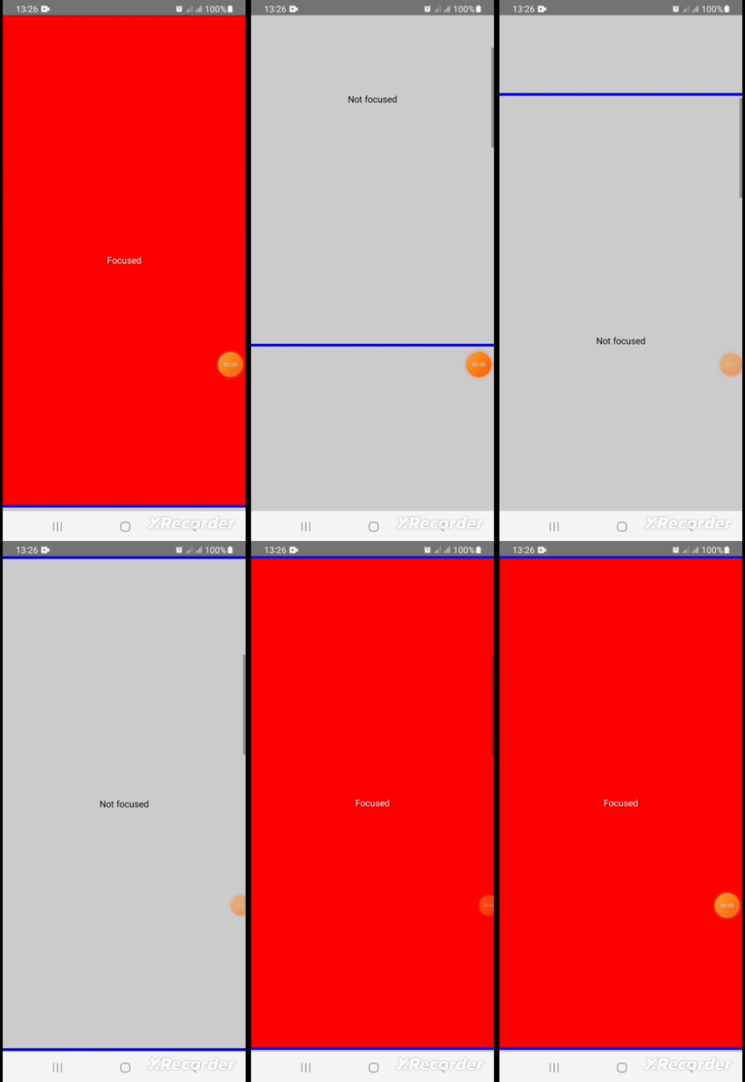
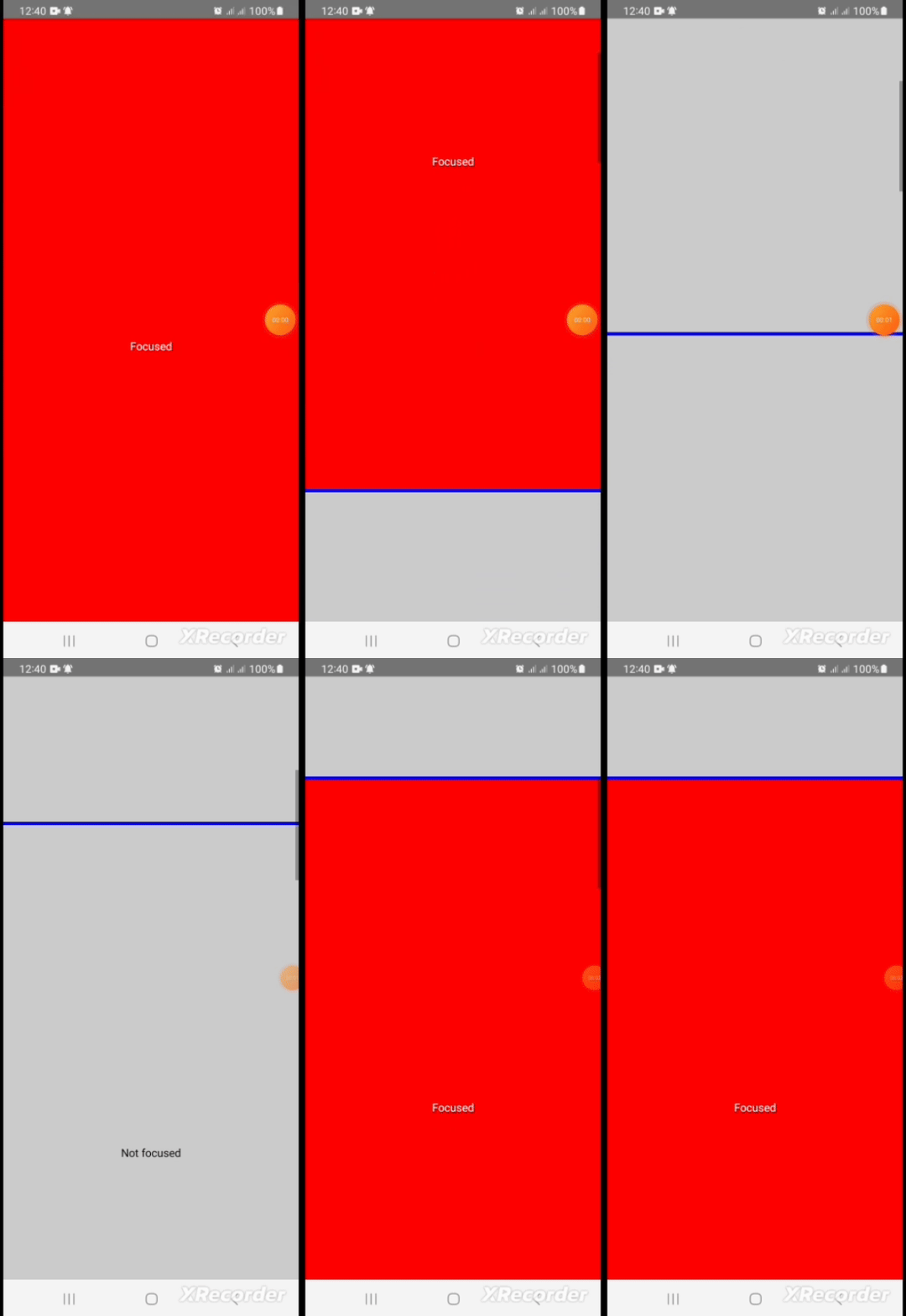
This is a fully customizable, TypeScript-based React Native component that lets you effortlessly monitor when any component enters or exits the viewport. Perfect for tracking impressions and creating engaging, data-driven experiences, this tool triggers a callback whenever visibility changes, enabling precise in-view tracking. Whether you’re building analytics features, enhancing user experience, or managing dynamic content, this package offers a streamlined, reliable way to detect visibility in scrollable views.
2. Set a custom minimum value to Track and trigger visible if the view container is visible on the screen (For this case, the minimum value 70% to trigger isVisibility)
There many react-native viewport packages on npm but some of them are no longer actively maintained by their authors, doesn't support Typescript, and most importantly none of them support custom threshold for minimum percentage of the view to be considered visible.
Since I failed to get a package that fulfils the video requirements of my client's application, I decided to write it myself and we are happy with the results
npm i @herberthtk/react-native-viewportOr
yarn add @herberthtk/react-native-viewport
import InViewport from '@herberthtk/react-native-viewport';

 const Section = () => {
  const [focused, setFocused] = useState(false);

  const handleChange = useCallback((isVisible: boolean) => {
    setFocused(isVisible);
  }, []);

  const backgroundColor = focused ? 'red' : '#ccc';

  return (
    <InViewport
      threshold={0.7} // This component will be considered visible if it is 70% visible (Default is 1 that means 100%)
      delay={100} // This component will check if it is visible every 200ms (default is 1000ms or 1 second) )
      onChange={handleChange}
      style={[styles.section, { backgroundColor }]}
    >
      <Text style={focused ? { color: '#fff' } : { color: '#000' }}>
        {focused ? 'Focused' : 'Not focused'}
      </Text>
    </InViewport>
  );
};

const App = (): React.JSX.Element => {
  return (
    <SafeAreaView style={styles.container}>
      <ScrollView>
        {[...new Array(5)].map((_, k) => (
          <Section key={k} />
        ))}
      </ScrollView>
    </SafeAreaView>
  );
};

const styles = StyleSheet.create({
  container: {
    flex: 1,
  },
  section: {
    width: Dimensions.get('screen').width,
    height: Dimensions.get('screen').height,
    justifyContent: 'center',
    alignItems: 'center',
    borderBottomColor: 'blue',
    borderBottomWidth: 4,
  },
});

export default App;| Property | type | Required | Description | Default value |
|---|---|---|---|---|
| disabled | boolean | false | If enabled the component will not track visibility status | false |
| delay | number | false | How frequent to check visibility status. Not setting lower less than a second will increase frequency of updates leading performance issues especially in old architecture bridge mode | 1000ms |
| threshold | number | false | A fraction (0 to 1) that is greater than 0 but less or equal to 1, 1 means 100% 0.7 means 70% and so on, The value indicate the minimum percentage of the container to be considered visible | 1 |
| onChange | Function | true | This is the core and exposed method that listens and updates visibility status | undefined |
This component also accepts all properties of the View component like style Check full list of properties here
See the contributing guide to learn how to contribute to the repository and the development workflow.
MIT
Made with Herbert kavuma


