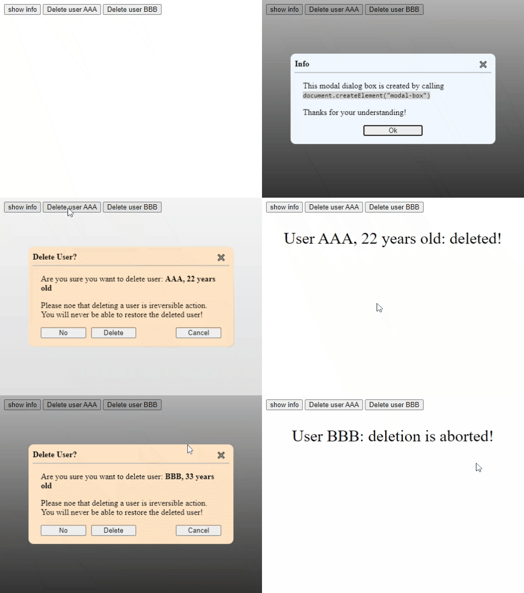
This is a modal dialog box component. It is customizable and could serve multiple purposes. It is a standard custom web component written in pure vanilla JS, so it could be used in any framework.
With the package you will find a complete functional example (example.html, example.css, example.js)
Use it like any standard tag:
- In html:
<modal-box></modal-box> - In JS:
document.createElement("modal-box")
The following code is extracted from the example accompanying the component.
<modal-box class="confirm">
   <!-- this will go into the header slot -->
   <span slot="header">Delete User?</span>

   <!-- these will go into the default slot: the content -->
   <p>Are you sure you want to delete user: <span id="user-info"></span></p>
   <p>Please noe that deleting a user is ireversible action. You will never be able to restore the deleted user!</p>

   <!-- this will go into the footer slot -->
   <div slot="footer">
      <button data-action="no">No</button>
      <button data-action="delete">Delete</button>
      <button data-action="cancel">Cancel</button>
   </div>
</modal-box>
Notice how you could customize the content of the modal box by adding child html tags inside the component. Also notice how each child tag is assigned to one of the 3 different slots that are making up the component.
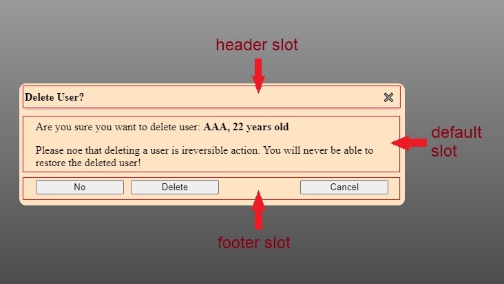
The following figure shows the result of the previous code. It also demonstrates the slots that make up the component: header slot, article content (default slot), and footer slot.
-
showModal(openingData): call this method to showmodal-box(usually in response to a user action or a system event).openingDatais optional and could be of any type (simple or object), it could be retrieved when themodal-boxis closed (inmodal-box-closedevent).openingDataenables attaching dynamic data to the samemodal-boxso that versatile functionality could be achieved (see the accompanying example). -
close(closingData): call this method to hide the modal-box (usually in response to a user action).closingDatais optional and could be of any type (simple or object), it could be retrieved inmodal-box-closedevent.closingDatacould be used to make code general and compact (see the accompanying example).
Please note that
Esckey and✖️close button (in the upper right corner) both close themodal-boxwithout any intervention from the developer.
-
modal-box-opened: this event enables developers to take actions when the component is opened.event.detailwill have the propertyopeningData, which is the same passed parameter whenshowModal(openingData)is called. -
modal-box-closed: this event enables developers to take actions when the component is closed.event.detailwill have the following properties:-
openingData: the same passed parameter whenshowModal(openingData)is called. -
closingData: the same passed parameter whenclose(closingData)is called. -
closingSource: of typeDialogClosingSourcesEnum(which is defined and exported inside the component's module). It indicates how the modal box was closed.
-
See the accompanying example for possible usage of these events.
-
Define in an element's selector block one or more of the following custom properties:
-
--bg-color: the modal box's background-color. Default isaliceblue. -
--inline-size: the inline-size of the component when it is shown. Default is 75%. -
--max-inline-size: since the default inline-size is a percentage, this custom property is used to prevent having too wide modal box when the screen is too wide. Default is 40rem.
-
-
Or you can reach the 3 constituent parts of the component (which correspond the 3 slots shown in the previous figure):
-
::part(header): it is actually aheadertag. Corresponds the header slot. -
::part(article): it is actually aarticletag. Corresponds the default slot. -
::part(footer): it is actually afootertag. Corresponds the footer slot.
-
block-sizeis determined by the content of the component, but it has a maximum of 85vh.

