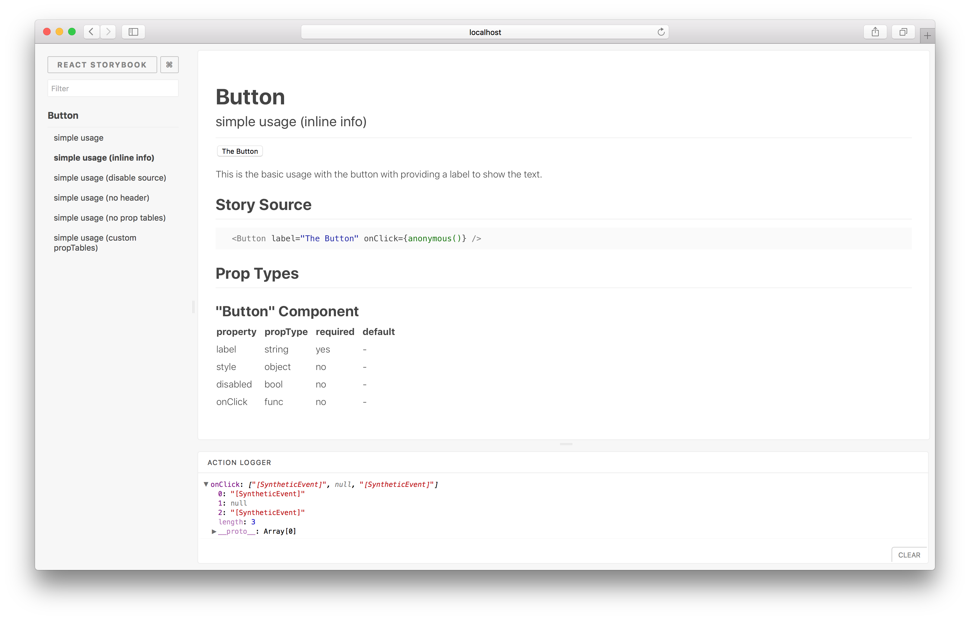
React Storybook Info Addon
A React Storybook addon to show additional information for your stories.
Usage
Install the following npm module:
npm i -D @kadira/react-storybook-addon-infoThen set the addon in the place you configure storybook like this:
import { configure, setAddon } from '@kadira/storybook';
import infoAddon from '@kadira/react-storybook-addon-info';

setAddon(infoAddon);

configure(function () {
  ...
}, module);
Then create your stories with the .addWithInfo API.
import React from 'react';
import Button from './Button';
import { storiesOf, action } from '@kadira/storybook';

storiesOf('Button')
  .addWithInfo(
    'simple usage',
    `
      This is the basic usage with the button with providing a label to show the text.
    `,
    () => (
      <div>
        <Button label="The Button" onClick={action('onClick')}/>
        <br />
        <p>
          Click the "?" mark at top-right to view the info.
        </p>
      </div>
    ),
  );
Have a look at this example stories to learn more about the
addWithInfoAPI.
The FAQ
Components lose their names on static build
Component names also get minified with other javascript code when building for production. When creating components, set the displayName static property to show the correct component name on static builds.
