react-native-picker-select
A Picker component for React Native which emulates the native <select> interfaces for iOS and Android
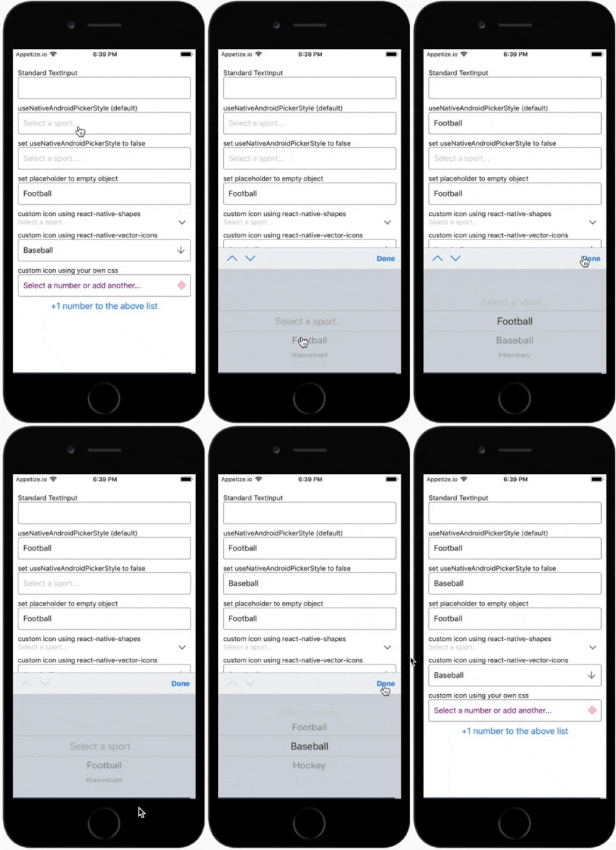
For iOS, by default we are wrapping an unstyled TextInput component. You can then pass down styles to customize it to your needs.
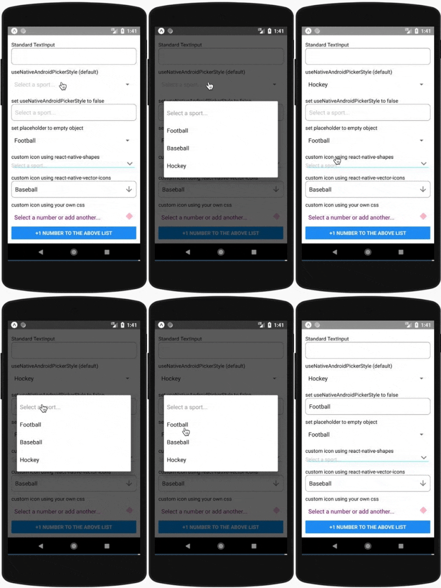
For Android, by default we are using the native Picker component. If you prefer, you can set useNativeAndroidPickerStyle to false, which will also render an unstyled TextInput component. You can then pass down styles to customize it to your needs.
For either platform, you can alternatively pass down a child element of your choice that will be wrapped in a touchable area.
View examples on snack.expo.io
Getting Started
Installing
npm install react-native-picker-select

# React Native users
npm install @react-native-picker/picker
npx pod-install

# Expo
expo install @react-native-picker/picker
Basic Usage
import RNPickerSelect from 'react-native-picker-select';

export const Dropdown = () => {
    return (
        <RNPickerSelect
            onValueChange={(value) => console.log(value)}
            items={[
                { label: 'Football', value: 'football' },
                { label: 'Baseball', value: 'baseball' },
                { label: 'Hockey', value: 'hockey' },
            ]}
        />
    );
};
Versioning
| Version | Notes |
|---|---|
| >= 8.0.0 | Uses @react-native-picker/picker. React Native 0.60 or above. If using Expo, SDK38 or above. |
| >= 3.0.0 | React v16.3 or above. |
| < 3.0.0 | React v16.2 or below. |
Props
| Name | Description | Details |
|---|---|---|
onValueChange |
Callback which returns value, index
|
required function |
items |
The items for the component to render - Each item should be in the following format: {label: 'Orange', value: 'orange', key: 'orange', color: 'orange', inputLabel: 'Orange!'}- label and value are required- key, color, and inputLabel are optional- key will be set to equal label if not included- value can be any data type- If inputLabel exists, the TextInput will display that value instead of the label
|
required array |
placeholder |
- An override for the default placeholder object with a label of Select an item... and a value of null- An empty object can be used if you'd like to disable the placeholder entirely |
object |
disabled |
Disables interaction with the component | boolean |
value |
Will attempt to locate a matching item from the items array by checking each item's value property. If found, it will update the component to show that item as selected. If the value is not found, it will default to the first item. |
any |
itemKey |
Will attempt to locate a matching item from the items array by checking each item's key property. If found, it will update the component to show that item as selected. If the key is not found, it will attempt to find a matching item by value as above. |
string, number |
style |
Style overrides for most parts of the component. More details in styling |
object |
pickerProps |
Additional props to pass to the Picker (some props are used in core functionality so use this carefully) | object |
Icon |
Custom icon component to be rendered. More details in styling |
Component |
textInputProps |
Additional props to pass to the TextInput (some props are used in core functionality so use this carefully). This is iOS only unless useNativeAndroidPickerStyle={false}. |
object |
touchableWrapperProps |
Additional props to pass to the touchable wrapping the TextInput (some props are used in core functionality so use this carefully) | object |
onOpen |
Callback triggered right before the opening of the picker Not supported when useNativeAndroidPickerStyle={true}
|
function |
useNativeAndroidPickerStyleAndroid only |
The component defaults to using the native Android Picker in its un-selected state. Setting this flag to false will mimic the default iOS presentation where a tappable TextInput is displayed.More details in styling |
boolean |
fixAndroidTouchableBugAndroid only |
Experimental flag to fix issue #354 | boolean |
InputAccessoryViewiOS only |
Replace the InputAcessoryView section (bar with tabbing arrown and Done button) of the opened picker with your own custom component. Can also return null here to hide completely. While this bar is typical on select elements on the web, the interface guidelines does not include it. View the snack to see examples on how this can be customized. |
Component |
doneTextiOS only |
"Done" default text on the modal. Can be overwritten here | string |
onUpArrow / onDownArrowiOS only |
Presence enables the corresponding arrow - Closes the picker - Calls the callback provided |
function |
onDonePressiOS only |
Callback when the 'Done' button is pressed | function |
onCloseiOS only |
Callback triggered right before the closing of the picker | function |
modalPropsiOS only |
Additional props to pass to the Modal (some props are used in core functionality so use this carefully) | object |
touchableDonePropsiOS only |
Additional props to pass to the Done touchable (some props are used in core functionality so use this carefully) | object |
Styling
All properties mentioned below must be nested under the style prop. Examples of different styling options can be found on the example snack.
iOS-specific
- The component wraps a TextInput without styling. You can target the TextInput styling with
inputIOS. - Other styles that can be modified for iOS are named
inputIOSContainer,placeholder,viewContainer,chevronContainer,chevron,chevronUp,chevronDown,chevronActive,done,modalViewTop,modalViewMiddle, andmodalViewBottom
Android-specific
- The native Picker in its inactive state acts looks similar to a TextInput, but it has limitations on custom styling. Any styling that is possible can be applied via
inputAndroid. - You can add some styling customization to the active-state native Picker, but that requires modifying some xml files
- If you set the prop
useNativeAndroidPickerStyleto false, the component will allow a few other style objects:inputAndroidContainer,placeholder, andinputAndroid - Other styles that can be modified for Android are named
headlessAndroidContainerandviewContainer
Web-specific
- The component creates a select tag
- The styling of this select tag can be modified using a nested object with the key
inputWeb
Icon
- If a component is passed in via the
Iconprop - it will be rendered with{ position: 'absolute', right: 0 }applied to its wrapping container. You can modify these values and add additional spacing to position the icon as needed by modifyingiconContainer. You'll probably also want to add somepaddingRightto your input styling to avoid any longer text appearing behind the icon. - You can pass a component of your choosing (css, image, svg, etc..) for use as the icon. For ease of use, consider a library such as react-native-shapes or react-native-vector-icons.
- Examples of different icons and their usage can be found on the example snack.
Accessibility
If you need to add accessibility props to the rendered component, you may use pickerProps and touchableWrapperProps to pass these through.
pickerProps accepts an object of props that get passed directly to the native <Picker /> component.
touchableWrapperProps also accepts an object of props, but this gets passed to a <TouchableOpacity /> that toggles the visibility of the picker.*note: touchableWrapperProps is not supported on web or when useNativeAndroidPickerStyle={true}
Accessibility Example
In the example below, we render the picker with supplementary description text, but for screen readers, we omit this by passing just the title to the accessibilityLabel prop.
const selectedItem = {
    title: 'Selected item title',
    description: 'Secondary long descriptive text ...',
};

export const Dropdown = () => {
    return (
        <RNPickerSelect
            pickerProps={{
                accessibilityLabel: selectedItem.title,
            }}
        >
            <Text>{selectedItem.title}</Text>
            <Text>{selectedItem.description}</Text>
        </RNPickerSelect>
    );
};
Testing
Test suite included. This component has been used and tested since React Native v0.51.
License
react-native-picker-select is MIT licensed and built with


