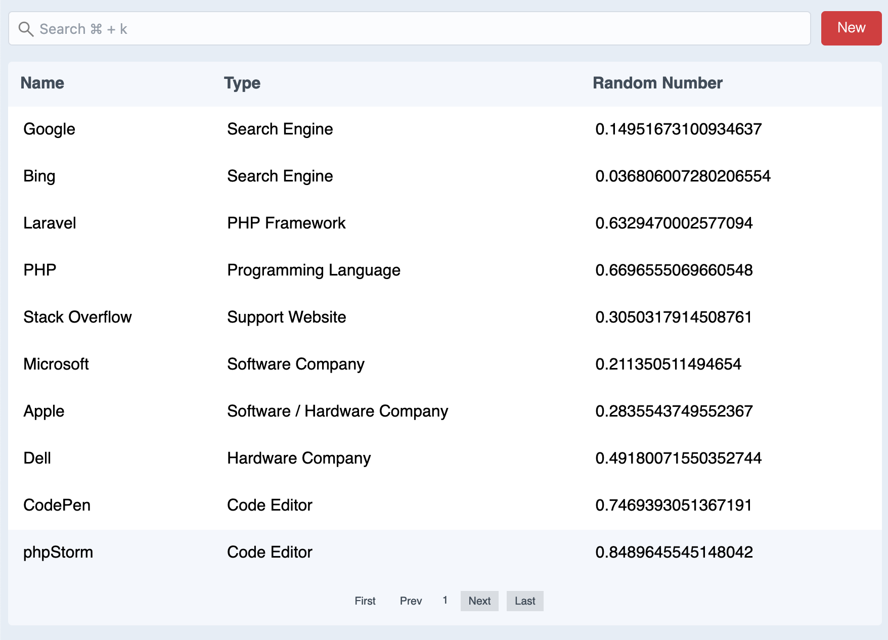
@nathanbate/vue-list
When I write custom web apps, I need to use lists all the time. So, I decided to write a reusable vue component.
Installation
npm i @nathanbate/vue-listConfig Options
See the demo config and the demo data
showList
true: the table of results with always show
false: the table of results will only show once 4 characters have been typed
into the search field.
showHeading
true: shows the table column headings
itemsPerPage
How many items are on each page of the results
rowLinkable
Does the row link to something? If so, it will look for the link property on the row object.
searchBar
false: hides the search bar
inertiaLinks
true: uses IntertiaJS links in Inertia Apps so the page doesn't
reload. Non-Inertia apps will not want to use this.
rowLinkTarget
Any valid anchor tag targets can be used here. If you don't want to use a target, just remove the key from the config.
actionButton
If you don't want an action button, just omit this from the config.
actionButton: {
        label: 'New User',
        link: 'https://example.com/user/add'
    }
columns
Array of objects specifying columns. The label property specifies
what the column label will be. The key property specifies what
the key name is in the row data. And, the search property
specifies if this column should be included in the search criteria.
Cell without Action Button
{
    label: "Name",
    key: "name",
    search: true,
},
Cell with action button
{
    label: "Action Button Example",
    button: true,
    key: "buttonExample",
    search: false,
},
Array of Objects with Column Config
    columns: [
        {
            label: "Name",
            key: "name",
            search: true,
        },
        {
            label: "Action Button Example",
            button: true,
            key: "buttonExample",
            search: false,
        },
        {
            label: "Type",
            key: "type",
            search: true,
        },
        {
            label: "Random Number",
            key: "randomNumber",
            search: true,
        },

    ]
Implementation
If you want to see it work in demo mode, just omit the list-config and/or the list-data props.
<template>
    <List :list-config="vueListConfig" :list-data="listData"/>
</template>

<script>
import List from '@nathanbate/vue-list';

export default {
    components: {
        List
    },
    data() {
        return {
            vueListConfig: {
                showList: true,
                showList: true,
                showHeading: true,
                itemsPerPage: 10,
                rowLinkable: true,
                searchBar: true,
                inertiaLinks: false,
                rowLinkTarget: "_blank",
                actionButton: {
                    label: 'New',
                    link: 'https://inertiajs.com'
                },
                columns: [
                    {
                        label: "Name",
                        key: "name",
                        search: true,
                    },
                    {
                        label: "Type",
                        key: "type",
                        search: true,
                    },
                    {
                        label: "Random Number",
                        key: "randomNumber",
                        search: true,
                    }
                ]
            },
            listData: [
                {
                    name: "Google",
                    link: "https://google.com",
                    type: "Search Engine",
                    randomNumber: Math.random(),
                },
                {
                    name: "Bing",
                    link: "https://bing.com",
                    type: "Search Engine",
                    randomNumber: Math.random(),
                },
                {
                    name: "Laravel",
                    link: "https://laravel.com",
                    type: "PHP Framework",
                    randomNumber: Math.random(),
                },
                // etc
            ]


        }
    }
}
</script>
Styling Themes
Right now I only offer one styling theme, and that is a theme that looks like a CraftCMS list. However, I do have a conditional in place where when I have other themes, you can select them in the config options.
Roadmap
- Add a config feature that allows you to make a column sortable
- Allow icon actions at the beginning or end of a row.
