This package contains the APIs for adding server-sider User Interfaces (UI) for players to view or interact with. Such elements include FormUI and Bossbar.
There are 3 different types of Server Forms that the vanilla Minecraft Client supports: ActionForm, ModalForm, and MessageForm. Forms are a popup prompt that appears on the client side, and these different types of forms allows developers to present different types of data in unique ways. Custom Server Forms can also be created by making a Resource Pack that modifies the vanilla modal-form properties.
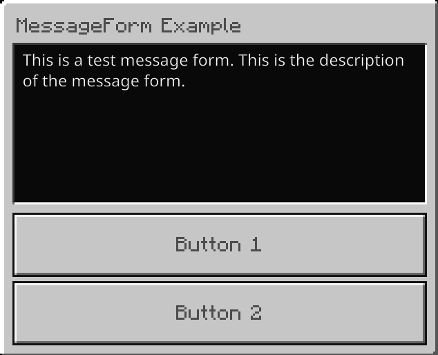
These forms add a simple popup with a brief context with only 2 selection button, these are usally used for a Yes or No question.
import { MessageForm } from "@serenityjs/server-ui"

// Create a new MessageForm instance and set the title, content, and button text
const form = new MessageForm()
form.title = "MessageForm Example"
form.content = "This is a test message form. This is the description of the message form."
form.button1 = "Button 1"
form.button2 = "Button 2"

// Show the form to the player
form.show(player)
  .then((response) => {})
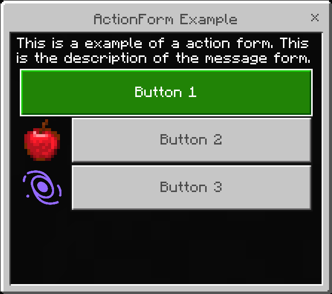
.catch((rejected) => {})These forms also contain a title and a context area, but developers can add as many buttons as they so desire. These buttons can also have textures that include either a resource path, or a url path.
import { ActionForm } from "@serenityjs/server-ui"

// Create a new ActionForm instance and set the title, content, and add buttons
const form = new ActionForm()
form.title = "ActionForm Example"
form.content = "This is a example of a action form. This is the description of the message form."

// Button with no additional data
form.button("Button 1")

// Button with a texture path
form.button("Button 2", {
  type: "path",
  data: "textures/items/apple"
})

// Buttom with a url path
form.button("Button 3", {
  type: "url",
  data: "https://raw.githubusercontent.com/SerenityJS/serenity/develop/public/serenityjs-logo.png"
})

// Show the form to the player
form.show(player)
  .then((response) => {})
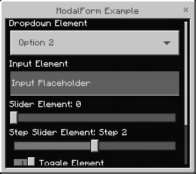
.catch((rejected) => {})These forms are the must advanced type of form. These allow developers to add elements to request input from the player, rather than using buttons. The elements used in ModalForms are: dropdown, input, label, slider, stepSlider, and toggle.
import { ModalForm } from "@serenityjs/server-ui"

// Create a new ModalForm instance and set the title and add elements
const form = new ModalForm()
form.title = "ModalForm Example"

// A dropdown allows the player to select from a list of options
form.dropdown("Dropdown Element", ["Option 1", "Option 2", "Option 3"], 1)

// An input allows the player to enter text
form.input("Input Element", "Input Placeholder", "Input Text")

// A slider allows the player to select a value within a range
form.slider("Slider Element", 0, 100, 10)

// A step slider allows the player to select a value from a list of options
form.stepSlider("Step Slider Element", ["Step 1", "Step 2", "Step 3"], 1)

// A toggle allows the player to enable or disable an option
form.toggle("Toggle Element", true)

// A label displays text to the player
form.label("Label Element", "Label Text")

// Show the form to the player
form.show(player)
  .then((response) => {})
  .catch((rejected) => {})


