Storyless
For when design system powerhouses like Storybook is just too much.
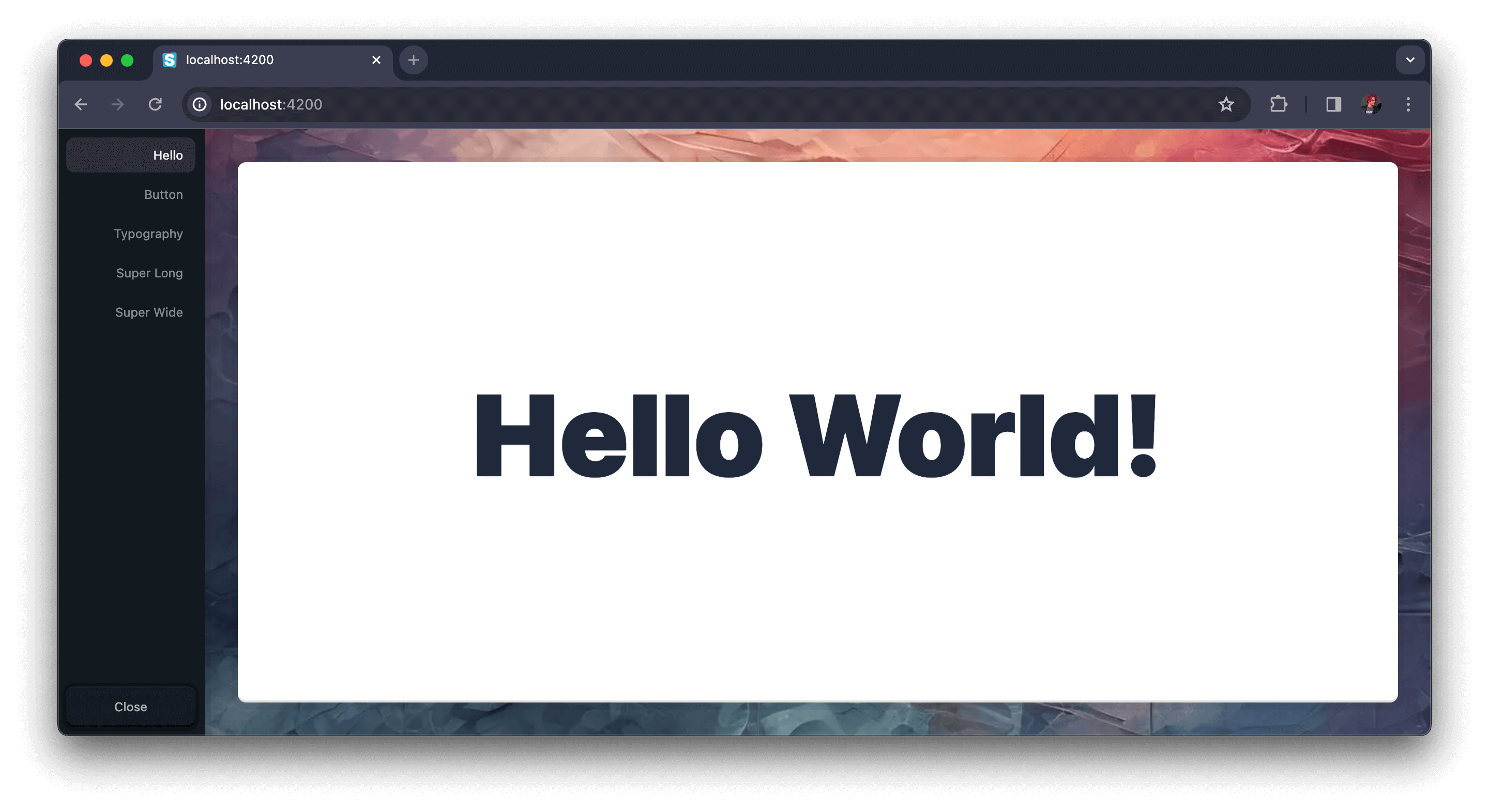
Storyless is a UI DevTool that lets you build and test components in isolation inside of your app.
Direct interoperability with your app and main build tools means hard-to-integrate features like authentication, fetching, state management, themes, etc. will just work when you need them.
[!CAUTION]
Storyless is currently in alpha and is not recommended for production use.
🚀 Getting Started
Install using your project's package manager:
npm i @storyless/react
yarn add @storyless/react
pnpm i @storyless/react
bun i @storyless/react
{the-new-thing} {add-package-command} @storyless/react
Then drop it in your app (we're using Next.js as an example here):
import { Storyless } from "@storyless/react";

function App({ Component, pageProps }: AppProps) {
  return (
    <>
      <Component {...pageProps} />
      <Storyless
        components={{
          Hello: <h1>Hello World!</h1>,
        }}
      />
    </>
  );
}
🎭 Combinations
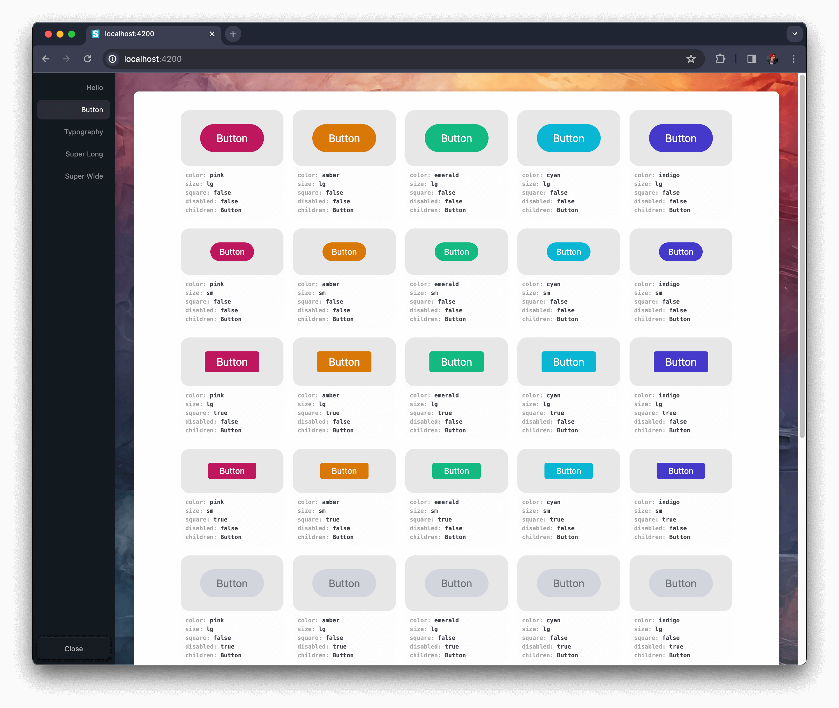
We've added a nifty <Combinations /> component to help you test your components with different props:
import { Storyless, Combinations } from "@storyless/react";
import { Button } from "./ButtonExample";

function App({ Component, pageProps }: AppProps) {
  return (
    <>
      <Component {...pageProps} />
      <Storyless
        components={{
          Hello: <h1>Hello World!</h1>,
          // 🗑️ Delete this Button component if copy-pasting
          Button: (
            <Combinations
              component={Button}
              propsToCombine={{
                color: ["#57799F", "#43577E", "#313851", "#D4D195", "#A7C2D1"],
                size: ["lg", "sm"],
                square: [false, true],
                disabled: [false, true],
                children: ["Button"],
              }}
            />
        }}
      />
    </>
  );
}
[!TIP]
Here's the<Combinations />documentation:
Display all combinations of props for a component.
Main props:
component- The component to display.propsToCombine- The props to display all combinations for.componentProps- Props to pass to all instances of the component.columns- Override the number of columns to display the combinations in.componentBackgroundColor- Override the background color of the combinations.@example
<AllCombinations
  component={Button} // props => <Button {...props} />
  propsToCombine={{
    color: ["slate", "emerald", "sky", "rose"],
    size: ["lg", "sm"],
    square: [false, true],
    disabled: [false, true],
    children: ["Button"],
  }}
  backgroundColor="#13191f"
  columns={2} // Auto-calculated by default
/>
If you want to customize the preview window, you can replace the original Wrapper by passing a wrapper prop to your <Storyless /> component. Here's a style agnostic starter wrapper you can use:
import { Storyless, Combinations } from "@storyless/react";
import { Button } from "./ButtonExample";

function Wrapper({
  children,
}: {
  children: React.ReactNode;
}) {
  return (
    <div
      style={{
        borderRadius: "0.5rem",
        width: "100%",
        height: "100%",
        maxWidth: "100%",
        display: "grid",
        placeItems: "center",
        backgroundColor: "rgba(239, 239, 239, 0.1)",
        boxShadow: `
          inset 0 1px 0px 0px rgba(255, 255, 255, 0.1),
          inset 0 -2px 0px 0px rgba(0, 0, 0, 0.125),
          0 1px 0 7px rgba(0, 0, 0, 0.1)
        `,
        backdropFilter: "blur(30px)",
        padding: "1rem 2rem",
        margin: 0,
      }}
    >
      {children}
    </div>
  );
}

function App({ Component, pageProps }: AppProps) {
  return (
    <>
      <Component {...pageProps} />
      <Storyless
        wrapper={Wrapper}
        components={{
          Hello: <h1>Hello World!</h1>,
          // 🗑️ Delete this Button component if copy-pasting
          Button: (
            <Combinations
              component={Button}
              propsToCombine={{
                color: ["#57799F", "#43577E", "#313851", "#D4D195", "#A7C2D1"],
                size: ["lg", "sm"],
                square: [false, true],
                disabled: [false, true],
                children: ["Button"],
              }}
            />
        }}
      />
    </>
  );
}
That's it – now go nuts 🥜🐿️
And don't worry, Storyless is automatically removed from your production bundle.


