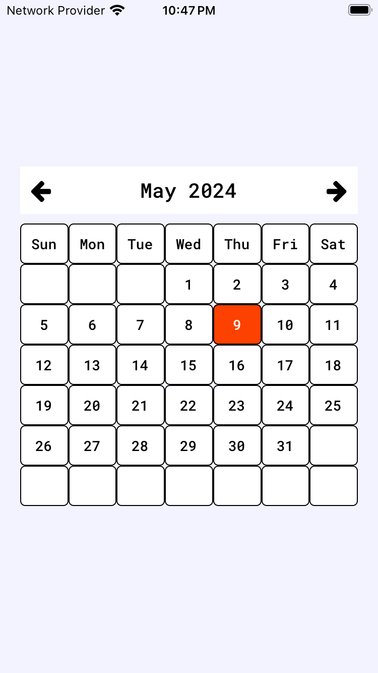
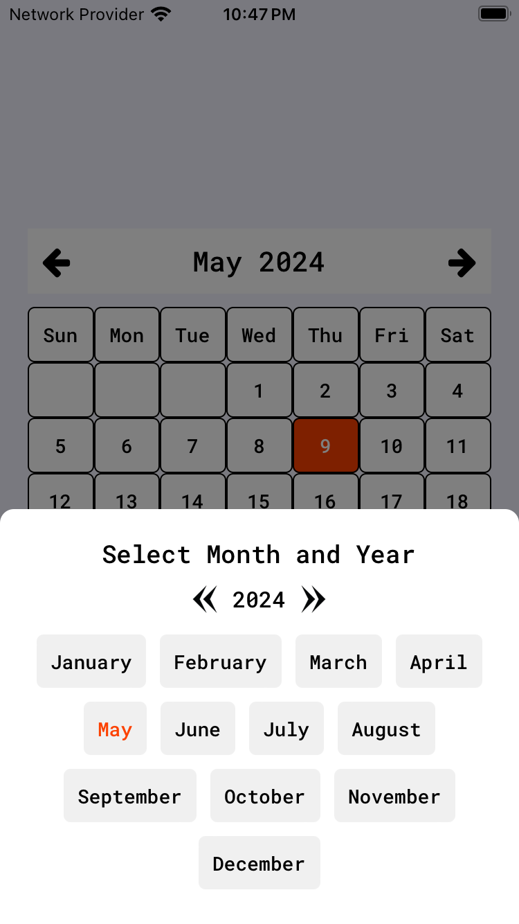
A custom calendar component for React Native.
@visionlyft/custom-calendar is a versatile and customizable calendar component designed specifically for React Native applications. It provides developers with an easy-to-use interface and a variety of customization options to integrate a functional and visually appealing calendar into their mobile apps.
- Customizable UI: Easily modify the look and feel to match your app's design.
- Event Handling: Add, remove, and manage events efficiently.
- Localization Support: Adapt the calendar for different languages and regions.
- Performance Optimized: Built to handle large datasets without compromising on performance.
- Cross-Platform Compatibility: Works seamlessly on both iOS and Android devices.
To install the @visionlyft/custom-calendar package, use npm:
npm install @visionlyft/custom-calendarHere's how to use the calendar with default settings in your React Native application:
import React from "react";
import { View } from "react-native";
import { CustomCalendar } from "@visionlyft/custom-calendar";

const App = () => {
  return (
    <View style={{ flex: 1 }}>
      <CustomCalendar />
    </View>
  );
};

export default App;For more advanced use, you can customize the calendar's appearance and behavior:
import React from "react";
import { View } from "react-native";
import FontAwesome from "react-native-vector-icons/FontAwesome";
import { CustomCalendar } from "@visionlyft/custom-calendar";

const App = () => {
  return (
    <View
      style={{ flex: 1, backgroundColor: "#f3f3ff", justifyContent: "center" }}
    >
      <CustomCalendar
        fontFamily="RobotoMono-Medium"
        onSubmit={(date) => console.log(date)}
        selectedMonthTextStyle={{ color: "#FC4100" }}
        selectedDateCellTextStyle={{ color: "white" }}
        cellTextStyle={{ color: "black", fontSize: 14 }}
        navButtonStyle={{ color: "black", fontSize: 16 }}
        headerTextStyle={{ color: "black", fontSize: 20 }}
        headerStyle={{ backgroundColor: "#fff", padding: 10 }}
        selectedDateCellStyle={{ backgroundColor: "#FC4100" }}
        cellStyle={{ backgroundColor: "#fff", borderRadius: 5 }}
        containerStyle={{ backgroundColor: "#f3f3ff", borderRadius: 10 }}
        prevIcon={<FontAwesome name="arrow-left" size={24} color="black" />}
        nextIcon={<FontAwesome name="arrow-right" size={24} color="black" />}
      />
    </View>
  );
};

export default App;This package is developed and maintained by Javed Khan. You can find more of his work and contributions on his GitHub profile.
For more information, updates, and support, visit the VisionLyft website.


