react-native-gif-search
An easy-to-use, highly customizable react-native package for searching and selecting from a list of gifs and/or stickers using the Tenor V2 and/or the Giphy API
See more previews here.
This package allows you to present a searchable list of gifs to the user, from which the user can select the desired gif. In the beginning and when the search term is empty, a list of trending gifs is shown. You can use this component inside a chat screen, for posts, comments or wherever else you need. The gifs that are displayed in the gifs list are low quality previews, in order to load faster and minimize mobile data usage. The gif that the user selects is given in a higher quality, so that it can be used and displayed properly in the app. These are the default settings, but can be changed (see Data Usage section below).
This package uses the Giphy API so you need to create an account and obtain an API key which is free and easy. This article was helpful for creating this package and has instructions on how to get a Giphy API key. The Tenor API has also been added, for which an API key can be obtained here. This means that you can present gifs using the Giphy API, the Tenor API or both.
Installation
npm install react-native-gif-search --save
Android
In your project's folder go to file android/app/build.gradle and inside dependencies block add these lines:
implementation 'com.facebook.fresco:fresco:2.0.0'
implementation 'com.facebook.fresco:animated-gif:2.0.0'
Note: The fresco version depends on the React Native version. The above fresco version (2.0.0) is used for RN >= 0.60. For RN >= 0.65 use fresco version 2.5.0. For RN < 0.60 use 1.x fresco versions (eg. 1.10.0 for RN 0.59 etc.). For more information or questions or for providing additional information about this, check the issue #13. Credits to dreamerchandra for pointing this out.
Usage
Example Projects
For a plain Javascript example project go to Examples/js-example
If you use TypeScript for your project go to Examples/ts-example
Import
import {
  GifSearch,
  poweredByTenorLogoWhite,
  poweredByTenorLogoGrey,
  poweredByTenorLogoBlue,
  viaTenorLogoWhite,
  viaTenorLogoGrey,
  viaTenorLogoBlue,
  poweredByGiphyLogoGrey,
  poweredByGiphyLogoWhite
} from 'react-native-gif-search'
- GifSearch: The gif searching component
- poweredByTenorLogoWhite: The white powered by Tenor logo for use in an Image
- poweredByTenorLogoGrey: The grey powered by Tenor logo for use in an Image
- poweredByTenorLogoBlue: The blue powered by Tenor logo for use in an Image
- viaTenorLogoWhite: The white via Tenor logo for use in an Image
- viaTenorLogoGrey: The grey via Tenor logo for use in an Image
- viaTenorLogoBlue: The blue via Tenor logo for use in an Image
- poweredByGiphyLogoWhite: The white powered by Giphy logo for use in an Image
- poweredByGiphyLogoGrey: The grey powered by Giphy logo for use in an Image
You can import only the logos that you need and use them like this: <Image source={poweredByTenorLogoGrey} />
Minimal example
<GifSearch
  tenorApiKey={YOUR_TENOR_API_KEY}
  giphyApiKey={YOUR_GIPHY_API_KEY}
  onGifSelected={(gif_url)=>{alert(gif_url)}}
/>
Bigger example
<GifSearch
  tenorApiKey={YOUR_TENOR_API_KEY}
  gifsToLoad={10}
  maxGifsToLoad={25}
  style={{backgroundColor: 'white', borderWidth: 3, borderRadius: 10}}
  textInputStyle={{fontWeight: 'bold', color: 'black'}}
  gifListStyle={{height:320}}
  gifStyle={{height:160}}
  loadingSpinnerColor={'black'}
  placeholderTextColor={'grey'}
  placeholderText={'Search'}
  onGifSelected={(gif_url, gif_object) => {console.log(gif_url); console.log(gif_object)}}
  onGifLongPress={(gif_url, gif_object) => {console.log(gif_url); console.log(gif_object)}}
  visible={this.state.visible}
  onBackPressed={() => {this.setState({visible: false})}}
  horizontal={false}
  showScrollBar={false}
  noGifsFoundText={"No Gifs found :("}
  noGifsFoundTextStyle={{fontWeight: 'bold'}}
  provider={"tenor"}
  providerLogo={poweredByTenorLogoGrey}
  textInputProps={{autoFocus: true}}
  onError={(error) => {console.log(error)}}
/>
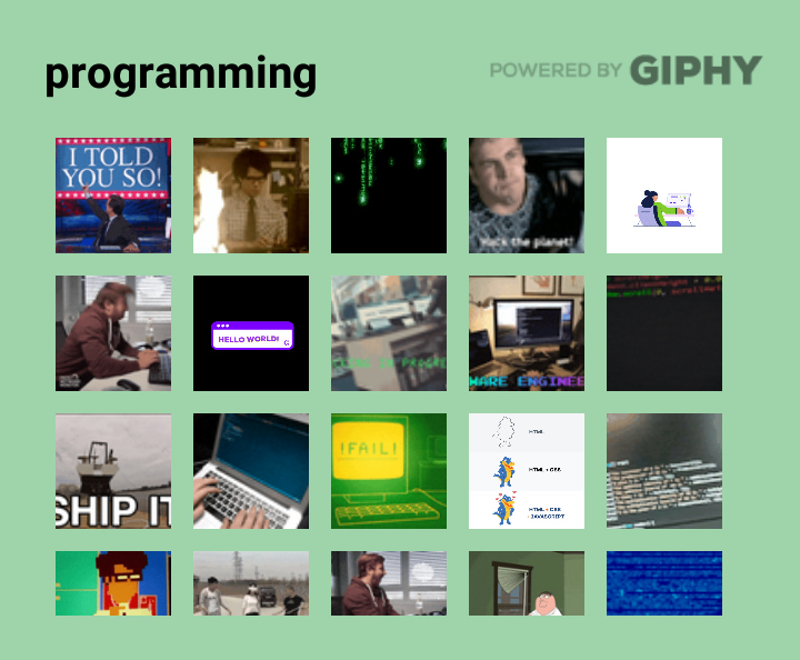
Multiple columns example
<GifSearch
  giphyApiKey={YOUR_GIPHY_API_KEY}
  onGifSelected={(gif_url)=>{alert(gif_url)}}
  style={{backgroundColor: '#9fd4ab', height:300}}
  textInputStyle={{fontWeight: 'bold', color: 'black'}}
  loadingSpinnerColor={'black'}
  placeholderTextColor={'grey'}
  numColumns={5}
  provider={"giphy"}
  providerLogo={poweredByGiphyLogoGrey}
  showScrollBar={false}
  noGifsFoundText={"No Gifs found :("}
/>
Stickers example
<GifSearch
  giphyApiKey={YOUR_GIPHY_API_KEY}
  onGifSelected={(gif_url)=>{alert(gif_url)}}
  textInputStyle={{fontWeight: 'bold', color: 'white'}}
  loadingSpinnerColor={'white'}
  placeholderTextColor={'grey'}
  providerLogo={poweredByGiphyLogoWhite}
  providerLogoStyle={{width:'40%'}}
  showScrollBar={false}
  noGifsFoundText={"No stickers found :("}
  stickersPlaceholderText={"Search for stickers"}
  gifType={"sticker"}
/>
Usage examples: JS code, TS code.
Properties
| Property name | Required | Explanation | Default |
|---|---|---|---|
onGifSelected |
Yes | Function to be called when user clicks on a gif. The parameters of this function is a string with the url of the selected gif in better quality and the whole Giphy/Tenor object in case the developer wants to use a different url or more info about the selected gif. See the properties of a Giphy object here and the properties of a Tenor object here. The gif object (second parameter) also contains the provider ("giphy", "tenor") and the type ("gif", "sticker"). See a usage example of this in onGifSelected function of App.js. |
|
onGifLongPress |
No | Function to be called when the user long presses on a gif. The parameters of this function is a string with the url of the gif in better quality and the whole Giphy/Tenor object in case the developer wants to use a different url or more info about the selected gif. See the properties of a Giphy object here and the properties of a Tenor object here. The gif object (second parameter) also contains the provider ("giphy", "tenor") and the type ("gif", "sticker"). See a usage example of this in onGifLongPress function of App.js. |
|
giphyApiKey |
Yes, except if provider={"tenor"}
|
The Giphy API key you obtained (see step 1 here) | |
tenorApiKey |
No | The Tenor API key you obtained from here | |
provider |
No | From which provider to load gifs. Can be "tenor", "giphy" or "all". |
"all" |
gifType |
No | What type of gifs to show. Can be "gif", "sticker" or "all". In case of "sticker" only tha GIPHY provider is used regardless the provider property, because only GIPHY supports stickers. In case of "all" there are two buttons to switch between gifs and stickers. |
"gif" |
gifsToLoad |
No | How many gifs to load in the beginning and every time the user reaches the scroll end | 15 |
maxGifsToLoad |
No | On how many gifs to stop loading more gifs | 60 |
providerLogo |
No | The logo to appear on top right corner (e.g.providerLogo={poweredByTenorLogoGrey}) |
|
providerLogoStyle |
No | The style of the provider's logo (e.g.providerLogoStyle={{width:'40%'}}) |
|
placeholderText |
No | The text for when there is no search term and gifType is set to "gif". If gifType is set to "all" then this is the placeholder while gifs button is selected. |
'Search GIF' |
stickersPlaceholderText |
No | The text for when there is no search term and gifType is set to "sticker". If gifType is set to "all" then this is the placeholder while stickers button is selected. |
'Search Stickers' |
visible |
No | Can be used for toggling the view for the gif selection (e.g. open on button press) | true |
previewGifQuality |
No | Set the quality of the GIFs that appear inside the GifSearch component. Can be "low", "medium" or "high". See also Data Usage section below. |
"low" |
selectedGifQuality |
No | Set the quality of the GIF that is the first parameter of the onGifSelected and onGifLongPress. Can be "low", "medium" or "high". See also Data Usage section below. |
"medium" |
onBackPressed |
No | Function for when the device's back button is pressed. Used with visible={this.state.visible} for closing the gif selection when back button is pressed. If not set then default action is taken. If set then default action is ignored while gif selection is visible. Recommended usage: onBackPressed={() => {this.setState({visible: false})}}
|
|
onError |
No | Function to be called when an error occures, e.g. no internet connection | |
horizontal |
No | Set the orientation of the list with the gifs. Horizontal if true, vertical if false | true |
style |
No | The component's style property (e.g. style={{backgroundColor: 'yellow', borderRadius: 5}}) |
|
textInputStyle |
No | Additional style of the search text input | |
gifStyle |
No | The style of the gif inside the list | |
gifListStyle |
No | Additional style for the FlatList used for displaying the gifs | |
loadingSpinnerColor |
No | The color of the loading spinner | 'white' |
placeholderTextColor |
No | The color of the placeholder for the search text input | 'grey' |
showScrollBar |
No | Whether to show or not the scroll bar / scroll indicator | true |
numColumns |
No | How many columns of gifs to show. When this is used, horizontal is automatically set to false |
|
gifListProps |
No | Additional properties for the FlatList with the gifs | |
textInputProps |
No | Additional properties for the TextInput with the search term (e.g. textInputProps={{autoFocus: true}}) |
|
noGifsFoundText |
No | Text to display when no gifs are found | 'No GIFS found' |
noGifsFoundTextStyle |
No | Additional style of the text that is displayed when no gifs are found | |
tenorApiProps |
No | For adding and/or overwriting the default properties of the tenor API request (e.g. tenorApiProps={{"locale":"en_US"}}). See all possible properties here. |
|
giphyApiProps |
No | For adding and/or overwriting the default properties of the giphy API request (e.g. giphyApiProps={{"lang":"en"}}). See all possible properties here. |
|
showGifsButtonText |
No | The text for the button that shows gifs when gifType is "all". |
"Gifs" |
showGifsButtonTextStyle |
No | Additional style for the text of the button that shows gifs when gifType is "all". |
|
showGifsButtonSelectedTextStyle |
No | Additional style for the text of the button that shows gifs when the button is selected and gifType is "all". |
|
showGifsButtonStyle |
No | Additional style for the button that shows gifs when gifType is "all". |
|
showGifsButtonSelectedStyle |
Additional style for the button that shows gifs when it is selected and gifType is "all". |
aaa | |
showStickersButtonText |
No | The text for the button that shows stickers when gifType is "all". |
"Stickers" |
showStickersButtonTextStyle |
No | Additional style for the text of the button that shows stickers when gifType is "all". |
|
showStickersButtonSelectedTextStyle |
No | Additional style for the text of the button that shows stickers when the button is selected and gifType is "all". |
|
showStickersButtonStyle |
No | Additional style for the button that shows stickers when gifType is "all". |
|
showStickersButtonSelectedStyle |
No | Additional style for the button that shows stickers when it is selected and gifType is "all". |
Attribution
If you wish to publish your app and go from development to production you need to follow some steps for every API that you use.
Tenor
All content retrieved from Tenor must be properly attributed by including one of the three following options:
- Powered By Tenor - to be used in the GIF browsing experience
- Search Tenor - to be used as the placeholder text in the search bar
- Via Tenor - to be used in the footer of a shared GIF
Source: https://tenor.com/gifapi/documentation#attribution
Giphy
For the Giphy API you need to upgrade the Giphy API key. To do so, you must verify that you have used the Giphy attribution marks (Giphy logos) in your app, by providing screenshots and videos from your app. The verification process can take up to 3 days. The react-native-gif-search package can help you with this too, because it has a property for adding a logo on top right corner (see providerLogo in Properties section) or you can include a Giphy logo near your shared GIF using the logos you can import from this package (see Import section).
Data usage
The quality of the GIFs is an important factor when it comes to how much mobile data the component uses. When the user is connected through cellular data and not wifi, then it is easy to consume a lot of data while loading GIFs. That's why react-native-gif-search uses by default a low quality for the preview of the GIFs and a better (medium) quality for the selected GIF. Of course the developer can change this according to the specifications of the app that uses this package. If you are concerned about data usage, you can also have a look at this article for Giphy API. Also click here to see available format types for Giphy, and here for Tenor.
The values of the previewGifQuality and selectedGifQuality properties correspond to these (Giphy/Tenor) API values:
| Property value | Giphy API value | Tenor API value |
|---|---|---|
"low" |
preview_gif |
nanogif |
"medium" |
fixed_width |
tinygif |
"high" |
downsized_large |
mediumgif |
If you wish to use other quality values or in general have more control over API request values, you can use tenorApiProps and giphyApiProps properties (see Properties section above).
Warnings ⚠️
- If your GifSearch component is nested in a
ScrollViewyou should addkeyboardShouldPersistTaps={"handled"}property in the ScrollView (like in example code), otherwise the scrolling will probably be luggy. - If you want to have
borderRadiusfor a GIF, you should also useoverlayColor, otherwise there will probably be no border radius when you test it. SeegifComponentstyle in GifPicker example code). To find out more about this issue check this StackOverflow answer.
Version History
-
v1.3.2
- Fixed the #11 bug.
-
v1.3.1
-
Added previewGifQuality and selectedGifQuality
- Credits to anthlasserre for adding properties that handle the quality of the gifs (see pull request #10).
-
Added previewGifQuality and selectedGifQuality
-
v1.3.0
-
Added support for TypeScript
- Credits to anthlasserre for adding TS support and an example project (see pull request #9).
-
Added support for TypeScript
-
v1.2.1
-
v1.2.0
- Added support for Stickers from GIPHY API
- onGifLongPress: Now you can provide a function used when the user long presses a gif (e.g. for showing a preview before selecting)
-
New properties:
gifType,stickersPlaceholderText,onGifLongPress,showGifsButtonText,showGifsButtonTextStyle,showGifsButtonSelectedTextStyle,showGifsButtonStyle,showGifsButtonSelectedStyle,showStickersButtonText,showStickersButtonTextStyle,showStickersButtonSelectedTextStyle,showStickersButtonStyle,showStickersButtonSelectedStyle(see Properties section for explanation).
-
v1.1.0
- Added support for Tenor API
-
New properties:
tenorApiKey,provider,providerLogo,tenorApiProps,giphyApiProps(see Properties section for explanation). -
Removed properties:
developmentMode,darkGiphyLogo. Anyone who useddevelopmentMode={false}withdarkGiphyLogo={true}should replace these withproviderLogo={poweredByGiphyLogoGrey}and importpoweredByGiphyLogoGrey(see Import section) in order to have the same results (useproviderLogo={poweredByGiphyLogoWhite}in case you haddarkGiphyLogo={false}). Notice that if you intend to use only Giphy API you must add the propertyprovider={"giphy"}. -
Fixes:
- After typing the search term, the gifs of the final search term will be displayed. Previously there were cases where the user would type "test" and the gifs for "tes" would appear.
-
v1.0.10
-
giphyLogo, giphyLogoDark: Now you can also import the giphyLogo and the giphyLogoDark from the module and use it as a
sourceof anImagecomponent (like in example code). -
Fixes:
- Bigger width for "no gifs found" text.
-
giphyLogo, giphyLogoDark: Now you can also import the giphyLogo and the giphyLogoDark from the module and use it as a
-
v1.0.8
- No GIFS found: Displaying a text when there are no gifs matching the search term. See Properties section.
-
Autofocus on open: Now you can autofocus on the search input when the GifSearch component is displayed. Just use
textInputProps={{autoFocus: true}}. -
Fixes:
- The selected gif is now better quality with no lag (credits to anthlasserre for noticing).
- When keyboard is open and the user selects a gif, the keyboard now closes and the gif is selected. Previously it did not select the gif on first tap.
-
v1.0.7
- numColumns: Displaying gifs in grid view with specific number of columns. See Properties section. Credits to anthlasserre for suggesting and helping add this feature.
- gifListProps: See Properties section. Credits to anthlasserre for suggesting and helping add this feature.
- onGifLongPress: Function for when the user long presses on a link. This can be used to show a bigger preview. See Properties section.


