first-born
Getting Started
These instructions will get you a copy of the project up and running on your local machine for development and testing purposes
Prerequisites
This module can only be used in a React Native app. To use it, you will need a React Native app with it's dependencies installed. The following modules need to be added as a dev dependency as well.
create-react-classreact-native-vector-icons
Installing
To install first-born run the following command in the terminal;
npm install --save @99xt/first-born
You will additionally require to install the following modules as well.
npm install --save create-react-class react-native-vector-icons
Follow this guide to configure react-native-vector-icons for your project.
No other steps are required to configure first-born separately for each platform (Android/iOS).
Development Testing
To test the repo, first clone it;
git clone https://github.com/99xt/first-born.git
Move into the folder;
cd first-born
Install dependencies;
npm install
And run the test script;
npm run test
Usage
Import components like this;
import { Button } from "@99xt/first-born";Utils
Colors
| Color | Android | iOS |
|---|---|---|
| white | #FFF | #FFF |
| black | #000 | #000 |
| primary | #486c86 | #486c86 |
| secondary | #8dd9d5 | #8dd9d5 |
| error | #e74c3c | #e74c3c |
| inputGrey | rgba(33, 33, 33, 0.5) | rgba(33, 33, 33, 0.5) |
| darkGrey | rgba(33, 33, 33, 0.87) | rgba(33, 33, 33, 0.87) |
| lightGrey | rgba(33, 33, 33, 0.4) | rgba(33, 33, 33, 0.4) |
| overlay | rgba(68, 68, 68, 0.6) | rgba(68, 68, 68, 0.6) |
| secondaryBackground | rgba(125, 167, 217, 0.2) | #ecf8fa |
Atoms
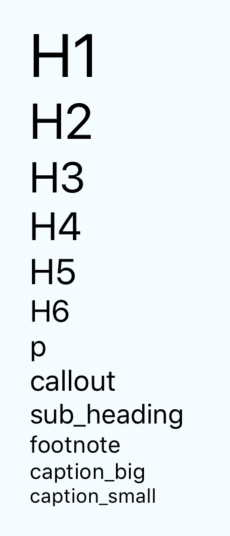
Text
<Text>Hello</Text>Android
iOS
You can use any Text property and the following:
| Prop | Description | Default |
|---|---|---|
size |
Size of the text, picked from predefined sizes, according to underlying platform. | 'p' |
bold |
If text is bold or not. | false |
color |
Color of the text. | black |
margin |
If the text requires a margin or not. | false |
align |
Alignment of text ('left', 'right', 'center') | 'left' |
| Size | Android | iOS |
|---|---|---|
| h1 | 96 | 34 |
| h2 | 60 | 28 |
| h3 | 48 | 24 |
| h4 | 34 | 22 |
| h5 | 24 | 20 |
| h6 | 20 | 17 |
| p | 16 | 16 |
| callout | 15 | 16 |
| sub_heading | 14 | 15 |
| footnote | 13 | 13 |
| caption_big | 12 | 12 |
| caption_small | 11 | 11 |
Icon
The All Icon components (all font styles) from react-native-vector-icons is used.
<Icon name='heart'/>Android
iOS
You can use any TouchableOpacity property and the following:
| Prop | Description | Default |
|---|---|---|
size |
Size of the icon. | 18 |
name |
Similar to the name attribute in react-native-vector-icons. Does not require the prefix md or ios for Ionicons. |
None |
color |
Color of the icon. | white |
type |
Type of the icon font style. ('zocial', 'octicon', 'material', 'material-community', 'ionicon', 'foundation', 'evilicon', 'entypo', 'font-awesome', 'simple-line-icon', 'feather', 'antdesign') | white |
Badge
Only accepts Text and Icon atoms and react-native Image .
<Badge>
    <Text>+1</Text>
</Badge>
<Badge color="red">
    <Icon name="heart" />
</Badge>
Android
iOS
You can use any View property and the following:
| Prop | Description | Default |
|---|---|---|
color |
Color of the badge. | primary |
outline |
If the badge has the outline style. | false |
Thumbnail
An Image component that displays either a square or circular image.
<Thumbnail source={require("path/to/image.png")}/>You can use any Image property and the following:
| Prop | Description | Default |
|---|---|---|
size |
Size of the image. ('small', 'medium', 'large', 'exlarge') | 'medium' |
customSize |
Size of the image, if it does not fit the above defined sizes. | None |
rounded |
If the image is to be a circle. | false |
onEdit |
Props to handle an image change of the thumbnail. You can use all Button atom properties. |
None |
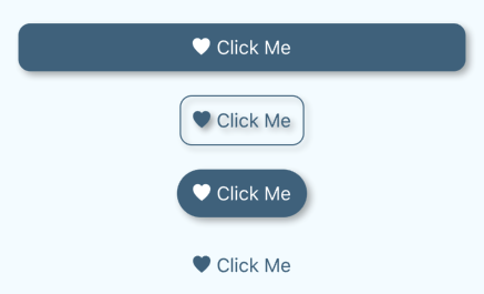
Button
Only accepts Text and Icon atoms and react-native Image .
<Button onPress={this.handleButtonClick} block >
    <Text>Click Me</Text>
</Button>
Android
iOS
You can use any TouchableOpacity property and the following:
| Prop | Description | Default |
|---|---|---|
size |
Size of the button, picked from predefined sizes small, default and large. | 'default' |
color |
Color of the button. | primary |
rounded |
If the button has rounded corners. | false |
block |
If the button has full width. | false |
ouline |
If the button is transparent, but with a colored border and children. | false |
rounded |
If the button is transparent, but with colored children. | false |
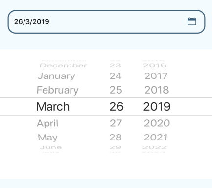
DatePicker
Renders a Text, that displays a date picker modal when the onPress method is triggered.
<DatePicker onDateChange={this.handleDateChange} />Android
iOS
You can use any TextInput property and the following:
| Prop | Description | Default |
|---|---|---|
placeholder |
Display this string if value not selected yet. iOS only. | 'Select Date' |
formatChosenDate |
User defined function that returns a formatted date. | None |
onDateChange |
User defined function to run when selected date changes. | None |
defaultDate |
Initially picked date. | None |
minimumDate |
Minimum in date range. | None |
maximumDate |
Maximum in date range. | None |
modalTransparent |
If DatePicker modal is transparent. iOS only. | true |
animationType |
Type of entry/exit animation for DatePicker modal. iOS only. | 'fade' |
locale |
Locale of DatePicker. iOS only. | None |
mode |
Type of picker ('date', 'time'). | 'date' |
color |
Color of the TextInput when in focus. |
primary |
isValid |
User defined validation function, that returns true for valid input | None |
errorMessage |
Error message to display below input, if validation fails | None |
rounded |
If DatePicker style is rounded edges. | false |
underline |
If DatePicker style is an underline. | false |
defaultStyle |
If DatePicker style is default as seen above. | true |
noStyle |
If DatePicker has no framework defined style. | false |
style |
Custom DatePicker inactive style. (Style object) | None |
activeStyle |
Custom DatePicker active style. (Style object) | None |
errorStyle |
Custom DatePicker error style. (Style object) | None |
errorColor |
Color of DatePicker when validation fails | error |
Input
<Input onChangeText={this.handleTextChange} placeholder="Name" />Android
iOS
You can use any TextInput property and the following:
| Prop | Description | Default |
|---|---|---|
color |
Color of the TextInput when in focus. |
primary |
isValid |
User defined validation function, that returns true for valid text | None |
errorMessage |
Error message to display below input, if validation fails | None |
rounded |
If Input style is rounded edges. | false |
underline |
If Input style is an underline. | false |
defaultStyle |
If Input style is default as seen above. | true |
noStyle |
If Input has no framework defined style. | false |
style |
Custom Input inactive style. (Style object) | None |
activeStyle |
Custom Input active style. (Style object) | None |
errorStyle |
Custom Input error style. (Style object) | None |
errorColor |
Color of Input when validation fails | error |
iconLeft |
Icon Atom to render on the left of the Input | None |
iconRight |
Icon Atom to render on the right of the Input | None |
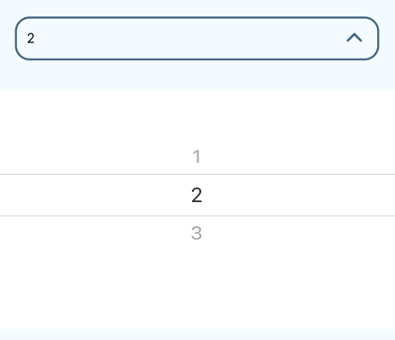
Picker
In Android, display a dropdown picker.
In iOS, renders a Text, that displays a picker modal when the onPress method is triggered.
<Picker onValueChange={this.handleValueChange} selectedValue={this.state.pickerValue}>
    <Picker.Item value="1" label="1" />
    <Picker.Item value="2" label="2" />
    <Picker.Item value="3" label="3" />
</Picker>
Android
iOS
You can use any Picker property and the following:
| Prop | Description | Default |
|---|---|---|
placeholder |
Display this string if value not selected yet. iOS only. | 'Select Option' |
modalTransparent |
If Picker modal is transparent. iOS only. | true |
animationType |
Type of entry/exit animation for Picker modal. iOS only. | 'fade' |
mode |
Type of picker mode ('dialog', 'dropdown'). Android only. | 'dropdown' |
color |
Color of the TextInput when in focus. |
primary |
isValid |
User defined validation function, that returns true for valid input | None |
errorMessage |
Error message to display below input, if validation fails | None |
rounded |
If Picker style is rounded edges. | false |
underline |
If Picker style is an underline. | false |
defaultStyle |
If Picker style is default as seen above. | true |
noStyle |
If Picker has no framework defined style. | false |
style |
Custom Picker inactive style. (Style object) | None |
activeStyle |
Custom Picker active style. (Style object) | None |
errorStyle |
Custom Picker error style. (Style object) | None |
errorColor |
Color of Picker when validation fails | error |
TextArea
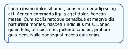
Renders a TextInput, that increases in height with the height of the text entered.
<TextArea onChangeText={this.handleTextChange} placeholder="Description" />Android
iOS
You can use any TextInput property and the following:
| Prop | Description | Default |
|---|---|---|
color |
Color of the TextInput when in focus. |
primary |
isValid |
User defined validation function, that returns true for valid text | None |
errorMessage |
Error message to display below input, if validation fails | None |
underline |
If TextArea style is an underline. | false |
defaultStyle |
If TextArea style is default as seen above. | true |
noStyle |
If TextArea has no framework defined style. | false |
style |
Custom TextArea inactive style. (Style object) | None |
activeStyle |
Custom TextArea active style. (Style object) | None |
errorStyle |
Custom TextArea error style. (Style object) | None |
errorColor |
Color of TextArea when validation fails | error |
Molecules
Form Elements
FormDatePicker
Uses the Atom DatePicker.
<FormDatePicker onDateChange={this.handleDateChange} label="Date" />Android
iOS
Additional Props;
| Prop | Description | Default |
|---|---|---|
label |
Label to display name of input. (Required) | None |
FormInput
Uses the Atom Input.
<FormInput onChangeText={this.handleTextChange} label="Name" />Android
iOS
Additional Props;
| Prop | Description | Default |
|---|---|---|
label |
Label to display name of input. (Required) | None |
FormPicker
Uses the Atom Picker.
<FormPicker onValueChange={this.handleValueChange} selectedValue={pickerValue} label="Number" data={pickerData} />Android
iOS
Additional Props;
| Prop | Description | Default |
|---|---|---|
label |
Label to display name of input. (Required) | None |
data |
An array containing objects with values and labels for each Picker.Item. |
None |
FormTextArea
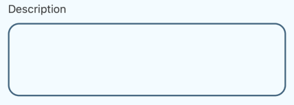
Uses the Atom TextArea.
<FormTextArea onChangeText={this.handleTextChange} label="Description" />Android
iOS
Additional Props;
| Prop | Description | Default |
|---|---|---|
label |
Label to display name of input. (Required) | None |
Simple Notifications
<Notification ref={"alert"} />To use the Notification Component and pass data to it, you will need to register a Notification manager in componentDidMount and unregister it in componentWillUnmount.
componentDidMount() {
    NotificationBarManager.registerMessageBar(this.refs.alert);
}

componentWillUnmount() {
    NotificationBarManager.unregisterMessageBar();
}
To trigger the Notification display, you will need to run the Notification manager method showAlert.
handleShowNotification = () => {
    NotificationBarManager.showAlert({
        message: 'Your alert message goes here', // required
        icon: { name: "alert" },
        // image: { source: require("./assets/images/accessibility.png") }, // image prop
    });
}
Android
iOS
The data that can be passed to the notification are;
| Prop | Description | Default |
|---|---|---|
message |
Message to display. (Required) | None |
shouldHideAfterDelay |
If notification should hide after display or keep being shown. | true |
durationToHide |
Animation duration for the notification to completely hide. | 350 |
durationToShow |
Animation duration for the notification to completely show. | 350 |
duration |
Duration of time to display the alert | 3000 |
image |
Image to be displayed next to notification message | None |
icon |
Icon to be displayed next to notification message | 'alert' |
color |
Background color of the Notification body. | '#007bff' |
textColor |
Color of the Notification text. | white |
fontSize |
Font size of Notification text. Accepts text identifier of above Text atom, or specific number. | 'sub_heading' |
fontWeight |
Font weight of the Notification text. | 'bold' |
SnackBars
<SnackBar ref={"alert"} />To use the SnackBar Component and pass data to it, you will need to register a SnackBar manager in componentDidMount and unregister it in componentWillUnmount.
componentDidMount() {
    SnackManager.registerMessageBar(this.refs.alert);
}

componentWillUnmount() {
    SnackManager.unregisterMessageBar();
}
To trigger the SnackBar display, you will need to run the SnackBar manager method showAlert.
handleShowSnackBar = () => {
    SnackManager.showAlert({
        message: 'Your alert message goes here' // required
    });
}
Android
iOS
The data that can be passed to the SnackBar are;
| Prop | Description | Default |
|---|---|---|
message |
Message to display. (Required) | None |
shouldHideAfterDelay |
If SnackBar should hide after display or keep being shown. | true |
durationToHide |
Animation duration for the SnackBar to completely hide. | 350 |
durationToShow |
Animation duration for the SnackBar to completely show. | 350 |
duration |
Duration of time to display the alert | 3000 |
backgroundColor |
Background color of the SnackBar body. | '#333333' |
onClickDismiss |
If SnackBar should hide after clicking the action button. | true |
position |
Position of SnackBar notification ('bottom', 'top'). | 'bottom' |
action |
An object denoting the method to run when the snack alerts button is clicked . | see below |
The data to be passed to the action prop of a SnackBar;
| Prop | Description | Default |
|---|---|---|
title |
Title of the button | 'Close' |
onPress |
Method to run when the button is clicked. | internal method to hide alert |
color |
Button's text color | error |
ListItem
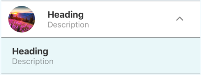
A List Item that displays a title (required), description and image. This molecule makes use of the Text Atom.
<ListItem title="Heading" description="Description" image={{ source: require("path/to/image.png")}} >
    <ListItem title="Heading" onPress={this.handleButtonClick} description="Description" /> //Nested List Item
</ListItem>
Android
iOS
You can use any TouchableOpacity property and the following:
| Prop | Description | Default |
|---|---|---|
title |
Description of List Item. (Required) | None |
description |
Description of List Item. | None |
image |
Image to display in List Item. You can use all react-native Image properties. |
None |
block |
If the List Item has full width of the device. | false |
backgroundColor |
Background color of List Item. | white |
secondary |
If the List Item is nested inside another. | false |
rounded |
If the image displayed on the ListItem is rouned or not. | false |
ThinListItem
A List Item that displays a title (required), description and image. This molecule makes use of the Text Atom. Similar to the above molecule but smaller with a few added features
<ThinListItem title="Heading" description="Description" image={{ source: require("path/to/image.png") }} />You can use any TouchableOpacity property and the following:
| Prop | Description | Default |
|---|---|---|
title |
Description of List Item. (Required) | None |
description |
Description of List Item. | None |
image |
Image to display in List Item. You can use all react-native Image properties. |
None |
icon |
Icon to display in List Item. You can use all Icon properties. |
None |
arrow |
If the List Item has an arrow at the right of the item. | false |
backgroundColor |
Background color of List Item. | white |
rounded |
If the image displayed on the ListItem is rouned or not. | false |
Floating Action Button
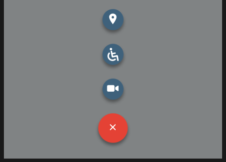
This molecule makes use of the Text and Icon Atoms.
One action
<FloatingButton onPress={this.handleAction} image={require("path/to/image.png")} />Multiple actions
actions = [
    { text: 'Accessibility', image: require("path/to/image.png"), name: 'bt_accessibility', position: 2, onPress: () => this.handleAccessibility() },
    { text: 'Location', icon: "pin", name: 'bt_room', position: 1, onPress: () => this.handleLocation() },
    { text: 'Video', icon: "videocam", name: 'bt_videocam', position: 3, onPress: () => this.handleVideo() }
];

<FloatingButton actions={actions} />
Android
iOS
The props for the main FloatingButton are;
| Prop | Description | Default |
|---|---|---|
| color | Background color of main button. | primary |
| distanceToEdge | Distance from edge of device for FAB positioning. | 30 |
| mainVerticalDistance | Distance of FAB from the bottom of the screen | 0 |
| visible | If the FAB and its children are visible. | true |
| overlayColor | The overlay color of the background. | overlay |
| position | The position of the FAB (center, right). | 'right' |
| showBackground | Show background behind the FAB. | true |
| openOnMount | If FAB should be expanded when page mounts. | false |
| actionsPaddingTopBottom | Spacing between child action items. | 8 |
| iconHeight | Height of button icon. | 15 |
| iconWidth | Width of button icon. | 15 |
| listenKeyboard | If listeners are to be added for the Keyboard component. | false |
| dismissKeyboardOnPress | If keyboard should be dismissed on button click. | false |
| onPress | User defined action to run when FAB main button is clicked. | None |
| onClose | User defined action to run when FAB is closed. | None |
| onOpen | User defined action to run when FAB is expanded. | None |
| onPressBackdrop | User defined action to run when the background of the expanded FAB is clicked. | None |
| onStateChange | User defined action to run when the component state changes | None |
| image | Image to display on FAB main button. | None |
| iconName | Icon to display on FAB main button. | None |
| tabs | If the page also includes a footer navigation | false |
| action | Array of objects which correlate to a FloatingButtonItem | false |
The props for the nested FloatingButtonItems, which is being sent through the actions prop are;
| Prop | Description | Default |
|---|---|---|
| color | Background color of main button. | primary |
| image | Image to display on FAB main button. | None |
| icon | Icon to display on FAB main button. | None |
| name | Unique name for each button. (Required) | None |
| textContainerStyle | Style of text container | None |
| text | Text to be displayed next to button. | None |
| textStyle | Style of text. | None |
| textProps | Other text props. | 'right' |
| textBackground | Background color of text. | white |
| textColor | Font color of text. | darkGrey |
| textElevation | Shadow of text element. | 5 |
| position | The position of the FAB (center, right). | None |
| active | If FAB is expanded or not. | None |
| distanceToEdge | Distance from edge of device for FAB positioning. | 30 |
| paddingTopBottom | Vertical padding of each action item. | None |
| onPress | User defined action to run when FAB child action button is clicked. | None |
| margin | Padding right of each action item, if the position of FAB is 'right'
|
8 |
Card
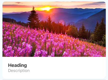
A Card that displays a title (required), description and image.
<Card title="Heading" description="Description" image={{ source: require("path/to/image.png")}} />Android
iOS
You can use any TouchableOpacity property and the following:
| Prop | Description | Default |
|---|---|---|
title |
Description of Card. (Required) | None |
description |
Description of Card. | None |
image |
Image to display in Card. You can use all react-native Image properties. |
None |
block |
If the Card has full width of the device. | false |
backgroundColor |
Background color of Card. | white |
Organisms
Form
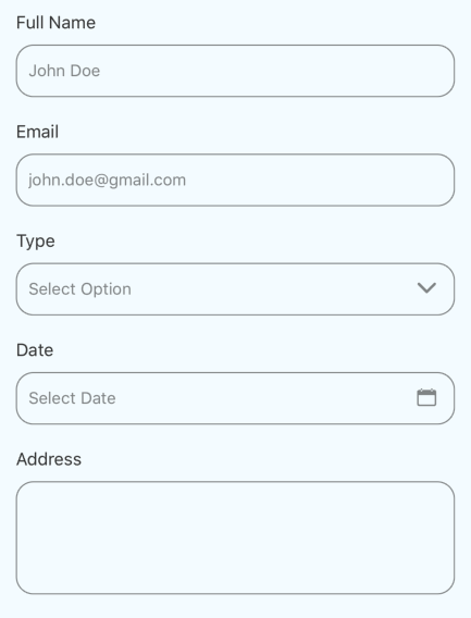
formElements = [
    { label: "Full Name", type: "text", onChangeText: (value) => this.handleTextChange(value), placeholder: "John Doe" },
    { label: "Email", type: "text", onChangeText: (value) => this.handleTextChange(value), placeholder: "john.doe@gmail.com", isValid: (value) => this.checkInputValidity(value) },
    { label: "Type", type: "picker", onValueChange: (value) => this.handleValueChange(value), pickerData: this.pickerData },
    { label: "Date", type: "date", onDateChange: (value) => this.handleDateChange(value) },
    { label: "Address", type: "textarea", onChangeText: (value) => this.handleTextChange(value) },
];

<Form formElements={formElements} />
Android
iOS
The Form Component iterates through the formElements array, to render the fields according to the type of input specified in each object.
The form object only has one extra prop;
| Prop | Description | Default |
|---|---|---|
color |
Color of all form elements when in focus. | primary |
rounded |
If form element style is rounded edges. | false |
underline |
If form element style is an underline. | false |
defaultStyle |
If form element style is default as seen above. | true |
noStyle |
If form element has no framework defined style. | false |
style |
Custom form element inactive style. (Style object) | None |
activeStyle |
Custom form element active style. (Style object) | None |
errorStyle |
Custom form element error style. (Style object) | None |
But each type of input has corresponding proptypes to the molecules named below;
| Type | Molecule Component |
|---|---|
'text' |
FormInput |
'textarea' |
FormTextArea |
'date' |
FormDatePicker |
'picker' |
FormPicker |
ListView
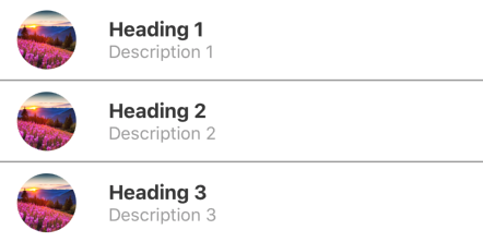
A vertical list of ListItem molecules
listData = [
    { title: "Heading 1", description: "Description 1", image: { source: require("path/to/image.png")} },
    { title: "Heading 2", description: "Description 2", image: { source: require("path/to/image.png")} },
    { title: "Heading 3", description: "Description 3", image: { source: require("path/to/image.png")} }
];

<ListView data={listData} />
You can also pass a custom renderItem method to the ListView, to render ListItems with other TouchableOpacity props, like onPress;
handleListItemClick = (title, description) => {
    Alert.alert(title, description);
}

<ListView data={listData} renderItem={({item}) => <ListItem {...item} onPress={() => handleListItemClick(item.title, item.description)} />} />
Android
iOS
You can use any FlatList property and the following:
| Prop | Description | Default |
|---|---|---|
backgroundColor |
Background color of all cards. | white |
thin |
If the 'ThinListItem' is the component to be rendered. |
false |
rounded |
If the image displayed on the ListItem is rouned or not. | false |
The data to be sent to the ListView needs to contain the same fields as the props of ListItem component.
CardList
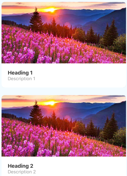
A vertical/horizontal List of Card molecules.
listData = [
    { title: "Heading 1", description: "Description 1", image: { source: require("path/to/image.png")} },
    { title: "Heading 2", description: "Description 2", image: { source: require("path/to/image.png")} },
    { title: "Heading 3", description: "Description 3", image: { source: require("path/to/image.png")} }
];

<CardList data={listData} />
You can also pass a custom renderItem method to the CardList, to render Cards with other TouchableOpacity props, like onPress;
handleListItemClick = (title, description) => {
    Alert.alert(title, description);
}

<CardList data={listData} renderItem={({item}) => <Card {...item} onPress={() => handleListItemClick(item.title, item.description)} />} />
Android
iOS
You can use any FlatList property and the following:
| Prop | Description | Default |
|---|---|---|
backgroundColor |
Background color of all cards. | white |
The data to be sent to the CardList needs to contain the same fields as the props of Card component.
NavBar
The Navigation Header makes use of the Text and Icon atom.
<NavBar>
    <NavBarLeft>
        <NavBarButton type="drawer" />
    </NavBarLeft>
    <NavBarBody>
        <Text>Title</Text>
    </NavBarBody>
    <NavBarRight>
        <NavBarButton onPress={this.handleFavourites} >
            <Icon name="heart" />
        </NavBarButton>
    </NavBarRight>
</NavBar>
Android
iOS
NavBar is the main container for the header. It makes use of the View property and the following:
| Prop | Description | Default |
|---|---|---|
transparent |
If status bar above header is transparent | None |
statusBarColor |
Background color of the NavBar. |
primary for Android, '#F8F8F8' for iOS |
statusBarColor |
Content type of the StatusBar.('light-content', 'dark-content') |
'light-content' for Android, 'dark-content' for iOS |
NavBarBody is a container that displays its children in the center of the header. It only accepts the title of the page within a Text tag. It makes use of the View property and the following:
| Prop | Description | Default |
|---|---|---|
color |
Color of the titleText. |
white for Android, black for iOS |
NavBarLeft displays its children on the left while, NavBarRight is displays its children on the right side of the header.
All headers must contain these three tags, to render uniformly.
NavBarButton is the button element to be used within the NavBar. It will only accept the atoms Text, Icon and a react-native Image. It contains the same property as a TouchableOpacity. It also comes with an inbuilt type for common features, which are 'drawer', 'back' and 'search'.
| Prop | Description | Default |
|---|---|---|
type |
Built in UI implementation of common NavBar button (drawer, back, search) |
None |
color |
Text and Icon color of button. |
white for Android, '#0a60ff' for iOS |
TabBar
The Navigation Footer makes use of the Text and Icon atom.
<TabBar>
    <TabItem active>
        <Icon name="heart" />
        <Text>Favorites</Text>
    </TabItem>
    <TabItem>
        <Icon name="add" />
        <Text>Add New</Text>
    </TabItem>
    <TabItem>
        <Icon name="camera" />
        <Text>Camera</Text>
    </TabItem>
    <TabItem>
        <Icon name="settings" />
        <Text>Settings</Text>
    </TabItem>
</TabBar>
Android
iOS
TabBar is the main container for the footer navigation. It makes use of the View property and the following:
| Prop | Description | Default |
|---|---|---|
color |
Background color of the TabBar. |
primary for Android, '#F8F8F8' for iOS |
activeColor |
Text and Icon color of active tab. |
white for Android, '#0a60ff' for iOS |
inactiveColor |
Text and Icon color of inactive tab. |
'rgba(209, 216, 224, 0.8)' for Android, '#8e8e93' for iOS |
top |
If the TabBar is on top of the page. Android only. | false |
TabItem is the button element to be used within the TabBar. It will only accept the atoms Text, Icon and a react-native Image. It contains the same property as a TouchableOpacity. In addition, it contains the following properties as well;
| Prop | Description | Default |
|---|---|---|
activeColor |
Text and Icon color of active tab. |
white for Android, '#0a60ff' for iOS |
inactiveColor |
Text and Icon color of inactive tab. |
'rgba(209, 216, 224, 0.8)' for Android, '#8e8e93' for iOS |
active |
If current TabItem is active. |
false |
PillBar
The Pill Navigation Bar.
pillScenes = [
    { scene: <Home /> },
    { scene: <CardList data={listData} /> },
    { scene: <ListView data={listData} /> },
    { scene: <View style={styles.innerContainer}><Form formElements={formElements} /></View> },
];

pillHeaders = [
    { title: 'Home', icon: "home" },
    { title: 'Card List', icon: "card" },
    { title: 'List View', icon: "list" },
    { title: 'Form', icon: "help" }
];

<PillView pillHeaders={pillHeaders} pillScenes={pillScenes} />
Android
iOS
The index of the pillHeader object, will be used to query the corresponding pillScene, during transition.
PillBar is the main container for the pill navigation. It makes use of the View property and the following:
| Prop | Description | Default |
|---|---|---|
color |
Active color of the PillBar. Android only. |
primary for Android, '#0a60ff' for iOS |
This property color, will be passed down to child element PillItem as the activeColor prop mentioned below
PillItem is the button element to be used within the PillBar. It will only accept the atoms Text, Icon and a react-native Image. It contains the same property as a TouchableOpacity. In addition, it contains the following properties as well;
| Prop | Description | Default |
|---|---|---|
activeColor |
Text and Icon color of active tab. |
white for Android, '#0a60ff' for iOS |
inactiveColor |
Text and Icon color of inactive tab. Android only. | '#adadad' |
active |
If current PillItem is active. |
false |
Contributing
Please read CONTRIBUTING.md for details on our code of conduct, and the process for submitting pull requests to us.
Versioning
We use SemVer for versioning.
Authors
- Sameeha Rahman - Initial work - samsam-026
- Muditha Batagoda - Initial Design - mudithabatagoda
See also the list of contributors who participated in this project.
License
This project is licensed under the MIT License - see the LICENSE.md file for details

