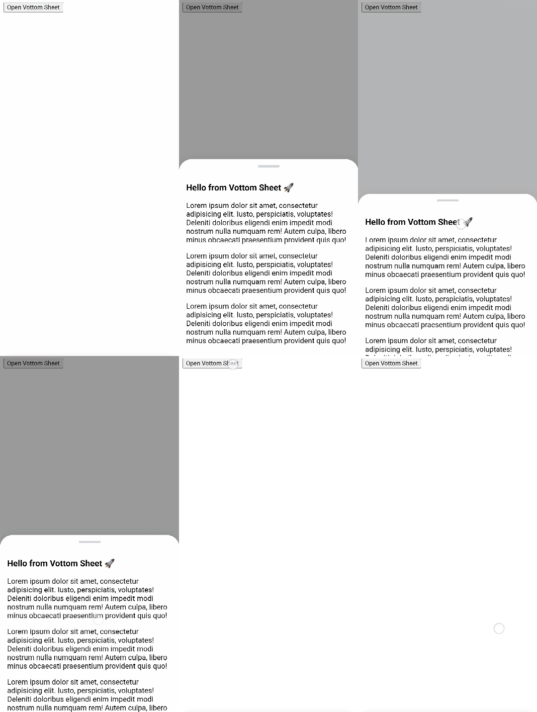
Vottom Sheet
Vottom Sheet is a touch-friendly, lightweight and easy-to-use Vue.js component that allows you to create smooth bottom sheets or modal dialogs in your web application.
Features
- Simple integration: Easily integrate the Vottom Sheet component into your Vue.js project with just a few lines of code.
- Smooth animations: Enjoy smooth and elegant animations as the bottom sheet slides into view and hides.
- Flexible: Use Vottom Sheet however you want.
- More to come...
Installation
# npm:
npm install @amho/vottom-sheet
# or yarn:
yarn add @amho/vottom-sheet# or pnpm:
pnpm add @amho/vottom-sheetHow to use
<script lang="ts" setup>
import { ref } from 'vue';
import { VottomSheet } from '@amho/vottom-sheet';

const model = ref(false);
</script>

<template>
  <button type="button" @click="model = true">Open Vottom Sheet</button>

  <VottomSheet v-model="model" closeOnOverlayClick>
    <div>Hello from Vottom Sheet!</div>
  </VottomSheet>
</template>

<style src="@amho/vottom-sheet/style.css" />
How to use in Nuxt.js
Just wrap the component inside <ClientOnly> provided by Nuxt.js. This is because vottom-sheet uses browser APIs that are not available on the server.
<template>
  <ClientOnly>
    <VottomSheet v-model="model" closeOnOverlayClick>
      <div>Hello from Vottom Sheet!</div>
    </VottomSheet>
  </ClientOnly>
</template>
Props
Vottom Sheet supports the following props (More props are going to be added):
| Prop | Type | Required | Default Value | Description |
|---|---|---|---|---|
modelValue |
Boolean |
✅ | - | Control the visibility of the bottom sheet. Works in pair with @update:modelValue to enable 2-way data binding (v-model). |
fullscreen |
Boolean |
❌ | false |
Make the component fullscreen. |
zIndex |
String or Number
|
❌ | 0 |
Specify the z-index of the bottom sheet. |
closeOnEscape |
Boolean |
❌ | false |
Whether to close the bottom sheet on Esc key press. |
eager |
Boolean |
❌ | false |
Force the component's content to render when it mounts. This is useful if you have content that will not be rendered in the DOM that you want crawled for SEO. |
closeOnOverlayClick |
Boolean |
❌ | false |
Whether to close the bottom sheet if the overlay is clicked. |
disableSwipe |
Boolean |
❌ | false |
Disable the swipe-to-close functionality. |
transitionDuration |
Boolean |
❌ | 300 |
Specify the transition duration of toggling the bottom sheet. |
Events
| Event | Payload Type | Description |
|---|---|---|
update:modelValue |
Boolean |
Works in pair with modelValue prop to enable 2-way data binding (v-model). Can be used to listen on state changes and trigger custom code. |
Slots
| Slot | Description |
|---|---|
default |
Insert the content that is going to be displayed inside the bottom sheet. |
handle |
Insert a custom handle for the bottom sheet which is displayed above the content slot and can be used to drag the component. |

