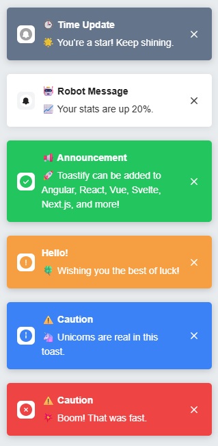
DEMO: https://stackblitz.com/edit/vitejs-vite-md4bg7fw
Toastify is a super simple, fast, and easy-to-use toast notification library designed to display clean, customizable notifications in your web applications without any unnecessary bloat.
- No Dependencies: No external libraries.
- Fully Customizable: You can adjust things like position, duration, icons, and more to fit your app's style.
- Flexible API: Easily show different types of toasts (success, error, info, warning).
- Customizable Styles: Add your own classes to tweak the look of the toasts however you want.
npm install @andreasnicolaou/toastifyimport { ToastifyManager } from '@andreasnicolaou/toastify';
const toastifyManager = new ToastifyManager('top-right', { closeButton: true, withProgressBar: true });
toastifyManager.default('Default', 'Default message from toastify');
toastifyManager.error('Error!', 'Something went wrong, please try again.');
toastifyManager.success('Success!', 'Your operation was completed successfully.');
toastifyManager.warning('Warning!', 'This action might have unintended consequences.');
toastifyManager.info('Heads Up!', 'You have new updates available.', { closeButton: false });You have two options for applying styles.
- Include the default styles.css file from the dist folder in your project.
- Pass a custom class to the ToastifyManager when creating it. Then, based on the class provided customize the toast as per your needs.
| Function | Description | Options |
|---|---|---|
default(title, message, options?) |
Displays a default toast. |
duration, isHtml, withProgressBar, progressBarDuration, closeButton, direction, showIcons
|
error(title, message, options?) |
Displays an error toast. |
duration, isHtml, withProgressBar, progressBarDuration, closeButton, direction, showIcons
|
success(title, message, options?) |
Displays a success toast. |
duration, isHtml, withProgressBar, progressBarDuration, closeButton, direction, showIcons
|
warning(title, message, options?) |
Displays a warning toast. |
duration, isHtml, withProgressBar, progressBarDuration, closeButton, direction, showIcons
|
info(title, message, options?) |
Displays an info toast. |
duration, isHtml, withProgressBar, progressBarDuration, closeButton, direction, showIcons
|
Each toast can be customized, which overrides the default options per toast.
| Option | Description | Default Value |
|---|---|---|
duration |
Time in milliseconds for the toast to remain visible. Setting this to 0 will stick the toast forever. | 3000 |
isHtml |
Whether the message should support HTML. | false |
withProgressBar |
Show a progress bar for the toast. | false |
progressBarDuration |
Duration of the progress bar (milliseconds). | 100 |
closeButton |
Show a close button on the toast. | false |
showIcons |
Show icons for each toast type (error, success, etc.). | true |
direction |
Direction of the text (supports ltr or rtl). |
ltr |
customClasses |
Custom CSS classes to add to the toast container. | "" |
maxToasts |
The maximum number of toasts that can be displayed at once. | 5 |
Contributions are welcome! If you encounter issues or have ideas to enhance the library, feel free to submit an issue or pull request.


