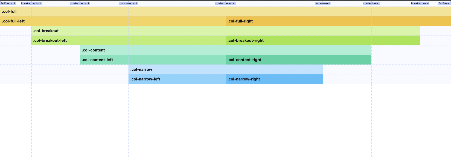
A Tailwind CSS plugin that adds an extraordinary grid-x-perience by adding easy-to-use full/breakout/content/narrow grid column template areas.
Requires tailwindcss v1.0 or higher.
Install the plugin via npm:
npm install @barbieswimcrew/tailwindcss-grid-xThen add the plugin to your tailwind.config.js file:
/** @type {import('tailwindcss').Config} */
module.exports = {
  theme: {
    // ...
  },
  plugins: [
    require('@barbieswimcrew/tailwindcss-grid-x'),
    // ...
  ],
}Now you can use the .grid-x component class and the provided .col- grid column utilitiy classes to rock your HTML.
<div class="grid-x *:font-bold *:p-2">
    <div class="col-full bg-amber-200">.col-full</div>
    <div class="col-full-left bg-amber-300">.col-full-left</div>
    <div class="col-full-right bg-amber-400">.col-full-right</div>
    <div class="col-breakout bg-lime-200">.col-breakout</div>
    <div class="col-breakout-left bg-lime-300">.col-breakout-left</div>
    <div class="col-breakout-right bg-lime-400">.col-breakout-right</div>
    <div class="col-content bg-emerald-200">.col-content</div>
    <div class="col-content-left bg-emerald-300">.col-content-left</div>
    <div class="col-content-right bg-emerald-400">.col-content-right</div>
    <div class="col-narrow bg-sky-200">.col-narrow</div>
    <div class="col-narrow-left bg-sky-300">.col-narrow-left</div>
    <div class="col-narrow-right bg-sky-400">.col-narrow-right</div>
    <!-- ... -->
</div>This plugin provides several utility classes for grid template columns.
Here are the regular classes that are being generated:
| Class | Grid template area |
|---|---|
col-content (default)
|
Content area |
col-full |
Full-width area |
col-breakout |
Breakout from content area |
col-narrow |
Narrow area |
[!NOTE] If not explicitly set, direct child elements of
.grid-xare automatically treated like.col-content.
In addition there are classes for specific use cases:
| Class | Grid template area |
|---|---|
col-content-left |
The left side of the content area |
col-content-right |
The right side of the content area |
col-breakout-left |
The left side of the breakout area |
col-breakout-right |
The right side of the breakout area |
col-full-left |
The left side of the full area |
col-full-right |
The right side of the full area |
col-narrow-left |
The left side of the narrow area |
col-narrow-right |
The right side of the narrow area |
Of course, it can also be fancy! Just play around a bit yourself and try things like... col-[narrow-start_/_content-end] ;-)
It is of course possible to adjust the maximum width of the grid column template areas as well as the paddings towards the side of the browser. Simply override the corresponding css vars in the styles/app.css of your project:
@tailwind base;
@tailwind components;
@tailwind utilities;

@layer base {
  :root{
      --narrow-max-w: 1200px;
      --content-max-w: 1500px;
      --breakout-max-w: 1700px;
      --narrow-px: 1rem;
      --content-px: 1rem;
      --breakout-px: 0rem;
    /* ... */
  }
}If you need to use a class name other than grid-x for any reason, you can do so using the className option when registering the plugin:
/** @type {import('tailwindcss').Config} */
module.exports = {
  theme: {
    // ...
  },
  plugins: [
    require('@barbieswimcrew/tailwindcss-grid-x')({
      className: 'foo',
    }),
  ]
  ...
}This repository is distributed under the MIT License (MIT). You can find the whole license text in the LICENSE file.
