aurelia-loaders
This is an aurelia compatible plugin for loading indicators.
How to use aurelia-loaders
install @bmaxtech/aurelia-loaders via npm or yarn
npm i @bmaxtech/aurelia-loaders --saveor
yarn add @bmaxtech/aurelia-loadersthen register plugin with your application
aurelia.use.plugin(PLATFORM.moduleName('@bmaxtech/aurelia-loaders'))use progress-bar or spinner element within your application
color schemes available for progress-bar and spinner elements
-
#B0BEC5-default -
#2196F3-primary -
#323a45-secondary -
#64DD17-success -
#FFD600-warning -
#29B6F6-info -
#ef1c1c-danger
Usage of progress-bar element
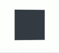
preview

basic usage
<progress-bar progress="50"></progress-bar>
advance usage
- style-class : string = used for external style configurations | default = ''
- height : integer = adjust progress bar height | default = 20px
- progress : integer = current progress | default = 0
- step : integer = progress bar incrementing step value | default = 10
- timer : boolean = auto-incrementer, if this is
true, the progress bar will be automatically incremented | default = false - timer-interval : integer = auto-incrementer interval time in seconds | default = 2500 (2.5s)
- theme : string = color scheme of the progress bar, value can be
primary,secondary,success,info,warningordanger| default =primary - on-complete : function = callback function, when auto-incrementer is used, this function will be called when progress gets completed | default =
undefined - show-value : boolean = show current progress percentage value in progress bar | default =
true
<progress-bar style-class="" height="" progress="" step="" timer="" timer-interval="" theme="" on-complete.call="" show-value=""></progress-bar>
Usage of spinner element
common options :
- type : string = the spinner type, value can be
S1 to S14| default =S1 - style-class : string = used for external style configurations | default = ''
- size : integer = the width and height | default :
40 - color : string = spinner color | default :
black
<spinner type="" style-class="" size="" color=""></spinner>
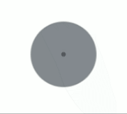
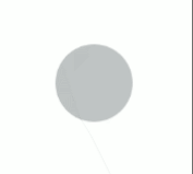
More about Spinners
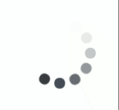
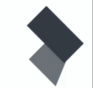
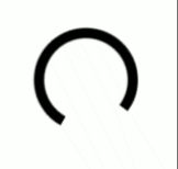
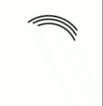
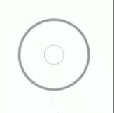
| Spinner | Preview | Options |
|---|---|---|
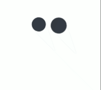
S1 |
 |
type: S1, size: 100, color: HEX or RGB value
|
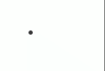
S2 |
 |
type: S2, size: 100, color: HEX or RGB value
|
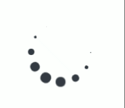
S3 |
 |
type: S3, size: 100, color: HEX or RGB value
|
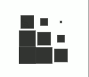
S4 |
 |
type: S4, size: 100, color: HEX or RGB value
|
S5 |
 |
type: S5, size: 100, color: HEX or RGB value
|
S6 |
 |
type: S6, size: 100, color: HEX or RGB value
|
S7 |
 |
type: S7, size: 100, color: HEX or RGB value
|
S8 |
 |
type: S8, size: 100, color: [default, primary, secondary, success, warning, info, danger] |
S9 |
 |
type: S9, size: 100, color: HEX or RGB value
|
S10 |
 |
type: S10, size: 100, color: [default, primary, secondary, success, warning, info, danger] |
S11 |
 |
type: S11, size: 100, color: [default, primary, secondary, success, warning, info, danger] |
S12 |
 |
type: S12, size: 100, color: HEX or RGB value
|
S13 |
 |
type: S13, size: 100, color: HEX or RGB value
|
S14 |
 |
type: S14, size: 100, color: [default, primary, secondary, success, warning, info, danger] |