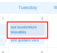
I created this calendar as a part of another project under a private org repository. After the project was finished, I was allowed to make this calendar public, so if anyone needs a simple, responsive vue calendar, this could be a good option.
The calendar itself is fully typed, and pretty simple to use, with custom slots for event cards that allow you to implement custom functionality. All actions in the calendar emit an event that can be listened for if necessary.
yarn

yarn dev [--port <port>] # default port is 5173

yarn build # runs typecheck and then builds the project

yarn preview # lauches a server to preview the built projectTo use the pacakage in a project, you need to add a .npmrc file to the projects root directory
//npm.pkg.github.com/:_authToken=<token>
@borderss:registry=https://npm.pkg.github.com
Go to https://github.com/settings/tokens and generate a new personal access token with the read:packages permission. Then replace <token> with the generated token.
After this, you can add the package to the app with
yarn add @borderss/vue-calendarIn the project, find your main.ts or main.js file and add the following lines
import calendar from "@borderss/vue-calendar"
import "@borderss/vue-calendar/dist/style.css"
In the same file, find a chain of .use() calls on a createApp() object and add the following line
createApp(App)
  .use(store)
  ...
  .use(router)
  .use(calendar) // add this line
  .mount("#app")
Now you can use the calendar component globally across the project without importing it
<template>
  <VueCalendar :options="calendarOptions"/>
</template>The options parameter is of type CalendarOptions and can be used to customize the calendar component visually and functionally.
The comment next to each key is its default value
interface CalendarOptions {
  events?: Event[]                            // []
  defaultView?: ViewType                      // 'month'
  showViewSelector?: boolean                  // true
  showNavigation?: boolean                    // true
  mobileBreakpointPx?: number                 // 768
  forceMobile?: boolean                       // false
  forceDesktop?: boolean                      // false
  locale?: string                             // 'en'

  // Custom color overrides
  colors?: {
    containerBg?: string                      // #ffffff
    primaryBg?: string                        // #2f92df
    primaryBgText?: string                    // #ffffff
    secondaryBg?: string                      // #e9f5ff
    textPrimary?: string                      // #000000
    textSecondary?: string                    // #768B95
    dateSelectedColor?: string                // #69b8ff
    dateBackground?: string                   // #ffffff
    dateBackgroundNotThisWeek?: string        // #f9f9f9
    scrollbarColor?: string                   // #efefef
  }

  onEventClick?: (event: Event) => void       // Fired when an event card is clicked
  onViewChange?: (view: ViewType) => void     // Fired when view changes
  onNavigationChange?: (date: Date) => void   // Fired wehn user navigates in the calendar
}

interface Event {
  title: string         // REQUIRED // title of the event
  date: Date | string   // REQUIRED // date of the event
  startTime?: string    // Start time of the event, eg. "12:30"
  endTime?: string      // End time of the event, eg. "14:30"
  allDay?: boolean      // Whether the event is all day or not
  color?: 'blue'        // Color of the event card. If not provided, uses `primaryBg`
        | 'green'
        | 'red'
        | 'yellow'
  [key: string]: any          // allow extra attributes for custom implementations
}

type ViewType = 'day' | 'week' | 'month'The calendar component provides slots to allow custom implementations of the calendar. The following slots are available
<template>
  <VueCalendar :options="calendarOptions">
    <template #eventCard="{ event }">
      <!-- Customn event card -->
    </template>
    <template #dataDisplay="{ date }">
      <!-- Custom data display -->
    </template>
  </VueCalendar>
eventCard
slot provides event object, with type Event.
dataDisplay
slot provides date object with the current date being displayed.
<template>
  <VueCalendar :options="calendarOptions" />
</template>

<script>
export default {
  ...
  data() {
    calendarOptions: {
      events: [
        {
          id: 1,
          title: "Event 1",
          date: "2021-09-01",
          startTime: "12:30",
          endTime: "14:30",
          color: "blue"
        },
        {
          id: 2,
          title: "Event 2",
          date: "2021-09-02",
          startTime: "12:30",
          endTime: "14:30",
          color: "green"
        },
      ],
      showViewSelector: false,
      onEventClick: (e) => {
        this.$router.push({ path: `/articles/${e.id}` });
      },
    },
  }
}
</script>
