
Use the Builder Angular SDK to use Angular with Builder. You can get started by heading over to Builder's official documentation or digging right into the code in this directory. The official documentation provides more explicit instructions, while this README shares more general pointers.
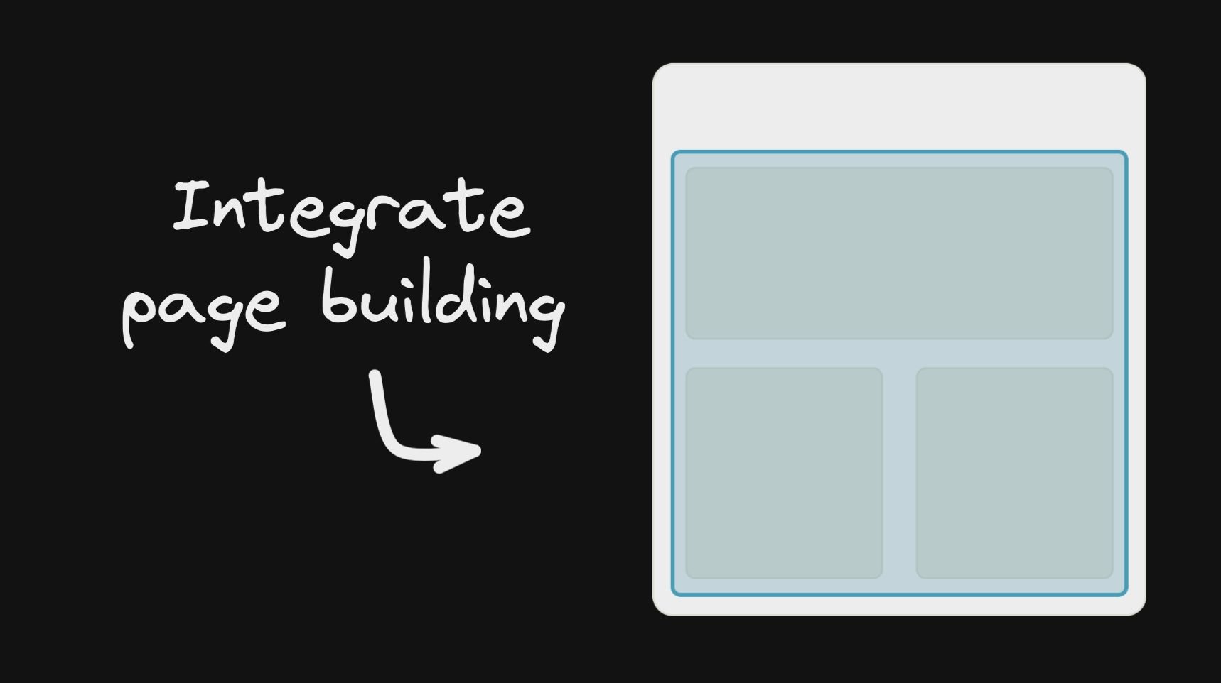
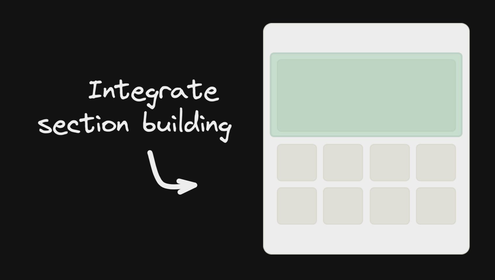
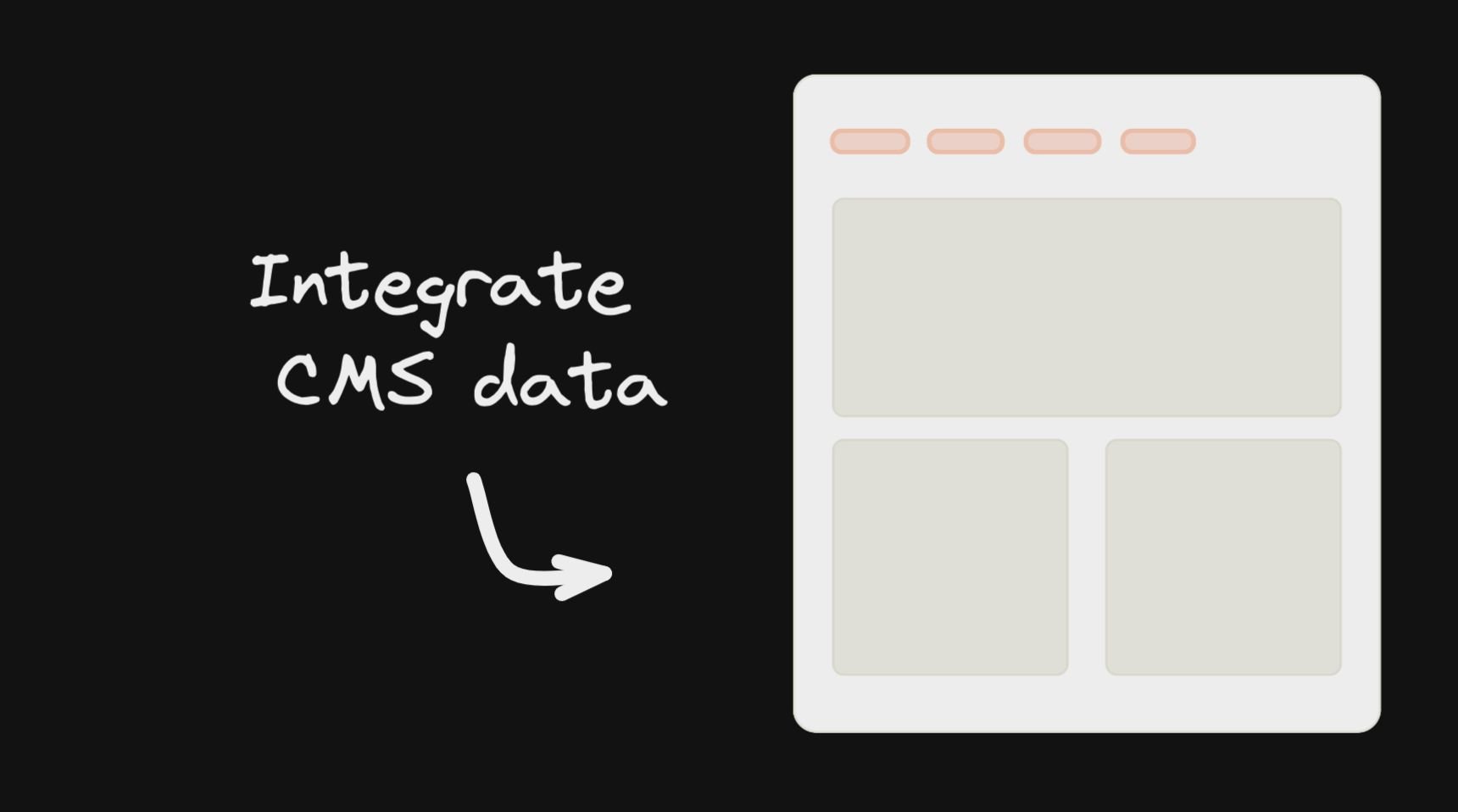
For a step-by-step guide, see the Angular instructions in Builder's official Integrating Pages documentation. While we recommend starting with Page building, you can also integrate sections and data:
| Integrate Page Building | Integrate Section Building | Integrate CMS Data |
|
|
|
If instead, you prefer to dive right into the code, stay here for some pointers for using the Builder Angular SDK.
Install:
npm install @builder.io/angular
npm install @angular/elements
Add the module:
import { BuilderModule } from '@builder.io/angular';

@NgModule({
  ...
  imports: [ BuilderModule.forRoot('YOUR_API_KEY') ],
  ...
})
export class MyAppModule { }
NOTE: You can get
YOUR_API_KEYfrom https://builder.io/account/space.
And then add the component wherever you like:
<!-- The model input can be any model of yours -->
<builder-component model="page" (load)="contentLoaded($event)" (error)="contentError($event)">
  <!-- Default content inside the tag shows while the builder content is fetching -->
  <div class="spinner"></div>
</builder-component>
Then, update your model's preview URL to enable on-site editing like in this guide, and you are done!
Next, see the below info for more advanced usage, as well as Intro to Models for creating custom models,
and Search Enging Optimization for SEO optimizing your content. (For Angular use the data from the load output to get the custom field data.)
Replace your 404 component with something like the below to allow creating new pages in Builder easily:
<!-- The model input can be any model of yours -->
<builder-component
  *ngIf="!noBuilderPageForUrl"
  model="page"
  (load)="noBuilderPageForUrl = $event ? false : true"
  (error)="noBuilderPageForUrl = true"
>
  <!-- Default content inside the tag shows while the builder content is fetching -->
  <div class="spinner"></div>
</builder-component>
<my-404-component *ngIf="noBuilderPageForUrl"> </my-404-component>Custom fields are a powerful feature when using customized models, for all sorts of customization, such as SEO optimization of your content.
<builder-component model="page" (load)="contentLoaded($event)">
  <!-- Default content inside the tag shows while the builder content is fetching -->
  <div class="spinner"></div>
</builder-component>contentLoaded(data) {
// Data object (via the output $event) includes your custom fields, e.g. if you have a custom field named
// "title"
document.title = data.data.title
}With section models you can use Builder.io components in/around existing pages (aka it doesn't have to control the whole page). See info on making custom models for this here
<!-- The first part of your page -->
<builder-component model="announcement-bar">Loading..</builder-component>
<!-- the rest of your page -->
You can then use queries and targeting to customize what content loads where
You can drag and drop to add your Angular components in the Builder editor with a minimal tag like below:
import { BuilderBlock } from '@builder.io/angular';
import { Component, Input } from '@angular/core';

@BuilderBlock({
  tag: 'custom-thing',
  name: 'Custom thing',
  inputs: [
    {
      name: 'name',
      type: 'string',
    },
  ],
})
@Component({
  selector: 'custom-thing',
  template: 'Hello: {{name}}',
})
export class CustomThing {
  @Input()
  name = '';
}
Note that custom Angular components use Angular elements and render in the browser only (no server-side rendering).
If you need server-side rendering in reusable components with Builder, consider using symbols
See here for full detail on input types available.
- Register inputs for each of your editable sections of type
blocks - Use
builder-blocks-outletcomponent to render those blocks withing your component template.
@Component({
  selector: 'custom-thing',
  template: `
    <h2>Section A</h2>
    <builder-blocks-outlet
      [blocks]="sectionA"
      [builderState]="builderState"
      [builderBlock]="builderBlock"
      dataPath="component.options.sectionA"
    ></builder-blocks-outlet>
    <h2>Section B</h2>
    <builder-blocks-outlet
      [blocks]="sectionB"
      [builderState]="builderState"
      [builderBlock]="builderBlock"
      dataPath="component.options.sectionB"
    ></builder-blocks-outlet>
  `,
})
export class CustomThing implements OnChanges {
  @Input()
  name = '';

  @Input()
  builderBlock = null;

  @Input()
  builderState = null;

  @Input()
  sectionA = null;

  @Input()
  sectionB = null;
}

BuilderBlock({
  tag: 'custom-thing',
  name: 'Custom thing',
  canHaveChildren: true,
  inputs: [
    {
      name: 'name',
      type: 'string',
    },
    {
      name: 'sectionA',
      type: 'blocks',
      hideFromUI: true,
      helperText: 'This is an editable region where you can drag and drop blocks.',
      defaultValue: [
        {
          '@type': '@builder.io/sdk:Element',
          component: {
            name: 'Text',
            options: {
              text: 'Section A Editable in Builder...',
            },
          },
          responsiveStyles: {
            large: {
              display: 'flex',
              flexDirection: 'column',
              position: 'relative',
              flexShrink: '0',
              boxSizing: 'border-box',
              marginTop: '20px',
              lineHeight: 'normal',
              height: 'auto',
              textAlign: 'center',
            },
          },
        },
      ],
    },
    {
      name: 'sectionB',
      type: 'blocks',
      hideFromUI: true,
      helperText: 'This is an editable region where you can drag and drop blocks.',
      defaultValue: [
        {
          '@type': '@builder.io/sdk:Element',
          component: {
            name: 'Text',
            options: {
              text: 'Section B Editable in Builder...',
            },
          },
          responsiveStyles: {
            large: {
              display: 'flex',
              flexDirection: 'column',
              position: 'relative',
              flexShrink: '0',
              boxSizing: 'border-box',
              marginTop: '20px',
              lineHeight: 'normal',
              height: 'auto',
              textAlign: 'center',
            },
          },
        },
      ],
    },
  ],
})(CustomThing);You can also pass data and functions down to the Builder component to use in the UIs (e.g. bind data values to UIs e.g. for text values or iterating over lists, and actions to trigger for instance on click of a button)
All data passed down is available in Builder actions and bindings as state.*, for instance in the below example state.resources, etc will be available
@Component({
  selector: 'app-root',
  template: '<builder-component [options]="options" [context]="context" [data]="data" model="page"></builder-component>',
})
export class AppComponent {
  options: any = {
    cacheSeconds: 1,
    data: {
      locale: 'en-US',
    },
  };

  data = {
    resources: [ { foo: 'bar'} ]
  };

  context= {
    myFunction: (text: string) => alert(text),
  }
You can also pass down functions, complex data like custom objects and libraries you can use context. Context passes all the way down (e.g. through symbols, etc). This data is not observed for changes and mutations
Context is available in actions and bindings as context.*, such as context.myFunction('hello world') in the example above
To see a full example integration see here for a simple Angular + Builder.io example project, or here for an Angular universal example