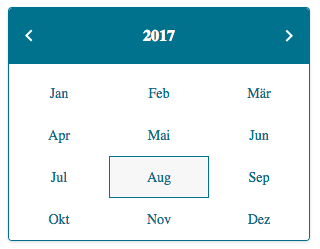
Simple, clean monthpicker component built with react, styled-components and date-fns
Installation
yarn add @compeon/monthpickerYou also need to have styled-components installed, so if that's not the case already
yarn add styled-componentsUsage
import Monthpicker from '@compeon/monthpicker'

<Monthpicker format='MM.yyyy' onChange={this.handleChange}>
  <div>Click me</div>
</Monthpicker>
Props
| prop | description | default |
|---|---|---|
| month | the currently selected month | new Date().getMonth() |
| year | the currently selected year | new Date().getFullYear() |
| locale | the locale that is used for displaying monthnames | de |
| format | format the onChange function is called with. Can be anything from this list |
MM.yyyy |
| onBlur | function that is called when the picker is blurred | - |
| onFocus | function that is called when the picker is focussed | - |
| onChange | function that is called when the selected month changes. Will be called with { month: 1, year: 2018 } as the first param when no format is specified. Second param is always the triggering event. |
- |
| children | node(s) which on click trigger the opening of the picker | - |
| allowedYears | either an object in the format { before: 2019, after: 2016 } (also works with only one of after or before) or an array with the allowed years [2016, 2017, 2018]
|
- |
| primaryColor | the primary color that is used | #27718c |
| secondaryColor | the secondary color that is used | white |
| hoverColor | the color that is used for hovering over a month | #d3d3d330 |
Author
License
MIT
