

Crossplatform React-Native-Core
Beautiful React-Native components using RN Paper by Callstack. If using a paper provider your theme should be applied to all the components.
These are some of the common use components Crossplatform use in our projects.
The components currently use FontAwesome v4 icons. Ability to customize this might be added.


Table of Contents
Table of contents generated with markdown-toc
Install
Install with react-native-paper if you don't already have it.
	npm i react-native-paper
	npm i @crossplatform/react-native-core
Or if you're hanging with the cool kids
	yarn add react-native-paper
	yarn add @crossplatform/react-native-core
Important Icons!
React-Native-Vector-Icons is required if you're not using Expo.
npm i react-native-vector-icons yarn add react-native-vector-iconsDocumentation
See our GitHub Pages generated from code comments. This documentation is also available as intellisense / auto complete.
The styles used by this library are exported for your convenience.
Components
CrossButton
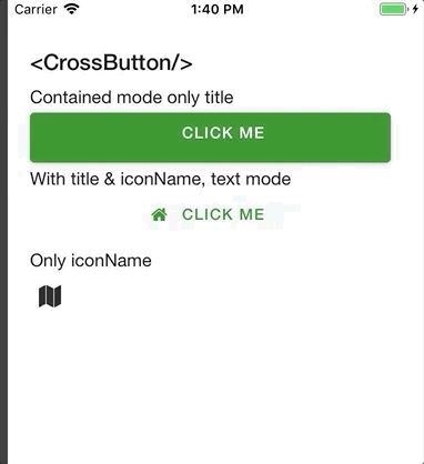
Renders an FontAwesome Button if only iconName is supplied, else an Paper Button.
For properties and documentation, see API reference - Class CrossButton.
Examples
Button with title, but no icon and mode contained (background color):
	import { CrossButton } from '@crossplatform/react-native-core';

	export const ButtonComp => () => (
 		<CrossButton
            title="Click me"
            mode="contained"
            onPress={() => OnButtonPress('Pressed button with no icon')}
          />
	);
Button with title and iconName, default text mode (no background):
	import { CrossButton } from '@crossplatform/react-native-core';

	export const ButtonComp => () => (
          <CrossButton
            title="Click me"
            iconName="home"
            onPress={() => OnButtonPress('Pressed button with icon')}
          />
	);
Clickable icon:
	import { CrossButton } from '@crossplatform/react-native-core';

	export const ButtonComp => () => (
          <CrossButton
            iconName="map"
            onPress={() => OnButtonPress('Pressed icon with no title')}
            backgroundColor="transparent"
          />
	);
CrossBusyIndicator
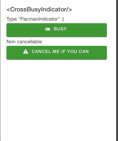
Renders a react-native-modal containing cool animations from react-native-indicators.
For properties and documentation, see API reference - Class CrossBusyIndicator.
Examples
Feedback message and PacmanIndicator type (because, why not).
	<CrossBusyIndicator
		  isBusy={this.state.isBusy}
		  type={CrossSpinnerType.PacmanIndicator}
		  isCancelButtonVisible={true}
		  message="Loading.."
		  onCancel={() => this.setState({ isBusy: false })}
	/>
Non-cancellable and custom styles for spinnerProps and messageStyle:
	<CrossBusyIndicator
		  key="busy2"
		  testID="busy2"
		  spinnerProps={{ color: 'red', type: CrossSpinnerType.WaveIndicator }}
		  messageStyle={{ color: 'red' }}
		  isBusy={this.state.isBusy2}
		  isCancelButtonVisible={false}
		  message="Resistance is futile"
	/>
CrossSpinner

Basically just wraps react-native-indicators so you can provide the type you want via property.
For properties and documentation, see API reference - Class CrossSpinner.
Examples
    <CrossSpinner
        type={CrossSpinnerType.MaterialIndicator}
        style={styles.spinner}
      />
CrossLabel
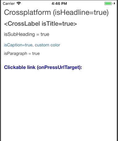
Wraps react-native-paper typhography components and can also act as a clickable text link.
For properties and documentation, see API reference - Class CrossLabel.
Examples
Headline component:
<CrossLabel isHeadline={true}>Crossplatform (isHeadline=true)</CrossLabel>Title component:
<CrossLabel isTitle={true}><CrossLabel isTitle=true></CrossLabel>Subheading (with custom style):
    <CrossLabel
      isSubheading={true}
      style={{ marginTop: 5 }}
    >
      isSubHeading = true
    </CrossLabel>
Caption component (with custom style):
    <CrossLabel
      isCaption={true}
      style={{ color: Colors.CrossLightBlue, marginTop: 10 }}
    >
      isCaption=true, custom color
    </CrossLabel>
Paragraph component (with custom style):
    <CrossLabel
      isParagraph={true}
      style={{ marginTop: 5 }}
    >
      isParagraph = true
    </CrossLabel>
URL link using onPressUrlTarget property. You can also set color using linkColor.
    <CrossLabel
      onPressUrlTarget="https://www.typescriptlang.org/"
      isSubheading={true}
      style={{ marginTop: 20, marginBottom: 10 }}
    >
      Clickable link (onPressUrlTarget):
    </CrossLabel>
Regular onPress event:
    <CrossLabel
      onPress={() => Message('CrossLabel onPress')}
      style={{ marginTop: 20, marginBottom: 10 }}
    >
      onPress message
    </CrossLabel>
Can not run ShellScript
Adjust the rights on SH-files for your user (in root). Remarks: we use bash terminal in VS Code
yarn read-shOr manually:
sudo find . -name "\*.sh" | xargs chmod u+xTools
Java
We use version 8 of the Java JDK. On OSX, remove any older versions according to this process
    brew cask remove java
    sudo rm -rf "/Library/Internet Plug-Ins/JavaAppletPlugin.plugin"
    sudo rm -rf "/Library/PreferencePanes/JavaControlPanel.prefPane"
    sudo rm -rf "~/Library/Application Support/Oracle"
    sudo rm -rf "~/Library/Java"
http://www.oracle.com/technetwork/java/javase/downloads/jdk8-downloads-2133151.html
Git
We're using latest stable. Install the version for your OS from:
Git Credential Manager
You need the manager to log in to Microsoft from MacOS using Git.
If you've updated Java, re-install GCM after.
git-credential-manager installNode
These versions provides stable compatibility with React Native and other frameworks:
-
Node v8.9.4 (
node --version) -
npm 5.6.0 (
npm --version)
Yarn
We install and run our scripts with yarn, as an alternative to npm:
Visual Studio Code
We use Visual Studio Code with relevant plugins.
Scripts
yarn dev
Always run after pull / clone!
- Installs global tools (npm packages, CLI tools)
- Cleans code using
yarn lint
yarn read-sh
yarn install-globals
Install global CLI tools required by the project
yarn lint
Executes lint.sh that runs prettier and tslint code formatting, fixing inconsistencies.
yarn build
Start TypeScript compiler. Run at least once to generate /lib folder where JavaScript resides. You can also...
yarn build-watch
Start TypeScript compiler and watch for changes.
yarn start
Start the React-Native packager. You can also start it with options:
	npm start -- --reset-cache
	# or
	yarn start -- --reset-cache
yarn test-watch
Run tests in watch mode, for development, updating snapshots as needed.
Runs the jest test runner on your tests in watch mode with interactive console. Remember to run u option when prompted to update snapshots. This is alias to npm run test
yarn test
Run tests as CI, not updating any snapshots. Run this before commit to ensure tests will work on build server.
You can run CI style tests in respective folder using
yarn test
But in development you would want to test and update Jest snapshots (--u):
yarn test-watch
yarn docs
Generate documentation. Read more
npm-version
Up the NPM package version before running npm publish. Automatically run as prepublishOnly command.
Debugging
Use VS Code's debugging capabilities to maintain a effective development cycle.
Launch.json configuration is not checked in, but here is the debug launch.json for React-Native
        {
            "name": "Attach to packager",
            "program": "${workspaceRoot}/.vscode/launchReactNative.js",
            "type": "reactnative",
            "request": "attach",
            "sourceMaps": true,
            "outDir": "${workspaceRoot}/.vscode/.react"
        },
        {
            "name": "Debug in Expo",
            "program": "${workspaceRoot}/.vscode/launchReactNative.js",
            "type": "reactnative",
            "request": "launch",
            "platform": "exponent",
            "sourceMaps": true,
            "outDir": "${workspaceRoot}/.vscode/.react"
        },
        {
            "name": "Debug Android",
            "program": "${workspaceRoot}/.vscode/launchReactNative.js",
            "type": "reactnative",
            "request": "launch",
            "platform": "android",
            "sourceMaps": true,
            "outDir": "${workspaceRoot}/.vscode/.react"
        },
        {
            "name": "Debug iOS",
            "program": "${workspaceRoot}/.vscode/launchReactNative.js",
            "type": "reactnative",
            "request": "launch",
            "platform": "ios",
            "sourceMaps": true,
            "outDir": "${workspaceRoot}/.vscode/.react"
        },
And finally Jest Test debugging:
    	{
            "type": "node",
            "request": "launch",
            "name": "Jest All",
            "program": "${workspaceRoot}/node_modules/jest/bin/jest",
            "args": [
                "--runInBand"
            ],
            "console": "integratedTerminal",
            "internalConsoleOptions": "neverOpen"
        },
        {
            "type": "node",
            "request": "launch",
            "name": "Jest Current File",
            "program": "${workspaceRoot}/node_modules/jest/bin/jest",
            "args": [
                "${file}"
            ],
            "console": "integratedTerminal",
            "internalConsoleOptions": "neverOpen"
        },
Release
The project is released through NPM
The source code is available on the Crossplatform GitHub.
Publish new version
- Update the version. This will also run build and linting.
yarn npm-version- Publish the new version on NPM (if not logged in run
npm adduserfirst)
npm publish --access publicPublish GitHub documentation
Generate documentation using the docscommand
yarn docsThis will
- Generate docs using the
typedoclibrary (yarn generate-docs) - Publish to GitHub pages using the
gh-pageslibrary (yarn gh-pages)