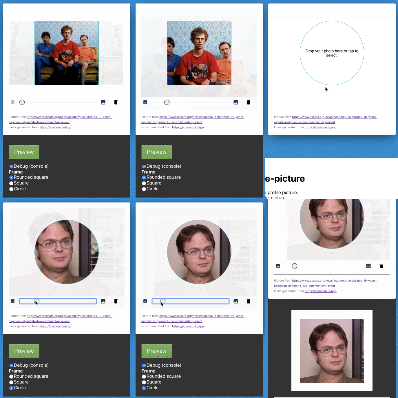
Profile Picture (React Component)
Setup
The better option would be to add this component into your project by cloning this repository and building it yourself with the design changes that you might want to make.
⚠️ Breaking changes
Starting from version 1.0.0, use this package installing from NPM or Yarn.
yarn add @dsalvagni/react-profile-picture
Example
import React, { Component } from 'react';

import ProfilePicture from "@dsalvagni/react-profile-picture"
import "@dsalvagni/react-profile-picture/dist/ProfilePicture.css"

class App extends Component {
  constructor(props) {
    super(props)

    this.profilePictureRef = React.createRef();
  }

  handleUpload() {
    const PP = this.profilePicture.current;
    const imageData = PP.getData();
    const file = imageData.file;
    const imageAsDataURL = PP.getImageAsDataUrl();

    ...
    //add here the upload logic...
  }

  render() {
    return <ProfilePicture
      ref={this.profilePictureRef}
      useHelper={true}
      debug={true}
    />

    <button onClick={this.handleUpload.bind(this)}>Upload</button>
  }
}
Options
| Property | Type | Description |
|---|---|---|
| image | PropTypes.string |
Set an startup image |
| frameSize | PropTypes.number.isRequired |
Set the app editor preview size |
| frameFormat | PropTypes.oneOf(["circle", "square", "rounded-square"]) |
Set the app editor preview format |
| cropSize | PropTypes.number.isRequired |
Set the size of cropped image. |
| minZoom | PropTypes.number.isRequired |
Minimum zoom required. |
| maxZoom | PropTypes.number.isRequired |
Maximum zoom required. |
| minImageSize | PropTypes.number.isRequired |
Minimum image size desired. |
| maxImageSize | PropTypes.number.isRequired |
Maximum image size desired. |
| useHelper | PropTypes.bool.isRequired |
Enable/Disable the use of a background helper image. |
| debug | PropTypes.bool.isRequired |
Enable/Disable logging events on console |
| messages | PropTypes.object |
Custom status messages |
Status Messages
| Property | Default Value | Description |
|---|---|---|
| DEFAULT | Drop your photo here or tap to select. | Default states, when there's no phot selected |
| DRAGOVER | Drop your photo | When the user is dragging the photo over the component |
| INVALID_FILE_TYPE | Only images allowed. | File different from image type |
| INVALID_IMAGE_SIZE | Your photo must be larger than 350px. | Invalid image size |
Status Message Object Example
messages: {
  DEFAULT: "Drop your photo here or tap to select.",
  DRAGOVER: "Drop your photo",
  INVALID_FILE_TYPE: "Only images allowed.",
  INVALID_IMAGE_SIZE: "Your photo must be larger than 350px."
}
Callbacks
| Callback | Description |
|---|---|
| onImagePropertiesChange | Triggered always that any image property changes: Zoom, Position, etc.. Returns image data object. |
| onImageLoading | Triggered while the image is being processed. |
| onImageLoaded | Triggered when the image processing is finished. |
| onImageRemoved | Triggered when the user removes the image. |
| onError | Triggered when something goes wrong. Returns an error code. |
| onZoomChange | Triggered when the image scale is changed. |
| onStatusChange | Triggered when the app status changes, e.g: empty, loaded, drag over, etc. |
Methods
| Method | Parameters | Description |
|---|---|---|
| getImageAsDataUrl |
quality. Image quality from 0.1 to 1 where 1 is the max quality. |
Returns the image result as a Base64 image string. Use this if you want to use an image string to upload. |
| getData | Returns the image data. Use this to upload an image to be cropped by backend. | |
| setImage | image url/File | Set a new image to app trough API. |
Contributing
Contributions, issues and feature requests are very welcome. Please make sure to read the Contributing Guide before making a pull request.
