
A secure PIN input component for Vue.js applications with a virtual keyboard and PIN masking, specifically designed for financial applications.
Check out the interactive Storybook demo to see the component in action.
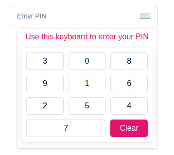
- Secure PIN Entry: Automatically masks PIN input for privacy
- Virtual Keyboard: Prevents keylogging and enhances security
- Shuffle Option: Randomizes keypad numbers for added security
- TypeScript Support: Full type definitions and type safety
- Customizable: Easy to style and adapt to your application's design
- Simple API: Straightforward props and events
- Vue.js 3.0 or higher
- Node.js 20.0 (LTS) or higher
- TypeScript 4.5+ (for TypeScript users)
# Using npm
npm install @engr-lukman/vue-secure-pin

# Using yarn
yarn add @engr-lukman/vue-secure-pin

# Using pnpm
pnpm add @engr-lukman/vue-secure-pin// main.ts
import { createApp } from "vue";
import App from "./App.vue";
import SecurePinPlugin from "@engr-lukman/vue-secure-pin";
const app = createApp(App);
app.use(SecurePinPlugin);
app.mount("#app");// In your Vue component with script setup
import { SecurePin } from "@engr-lukman/vue-secure-pin";
// For Vue 3 script setup syntax
// No further registration needed<template>
<div>
<SecurePin
:max-length="5"
:is-error="hasError"
:error-message="errorMessage"
:is-enable-shuffle="true"
@callback-event="handlePinChange"
/>
</div>
</template>
<script setup lang="ts">
import { ref } from 'vue';
import { SecurePin } from "@engr-lukman/vue-secure-pin";
import type { PinEventPayload } from "@engr-lukman/vue-secure-pin";
const hasError = ref<boolean>(false);
const errorMessage = ref<string>("");
const handlePinChange = (payload: PinEventPayload): void => {
// Get the actual and masked PIN values
const { pin, pinMasked } = payload;
// Example validation
if (pin === "12345") {
hasError.value = false;
} else if (pin.length === 5) {
hasError.value = true;
errorMessage.value = "Invalid PIN. Please try again.";
}
};
</script>
// For Vue 3 Options API or Vue 2
export default {
components: {
SecurePin
}
}<template>
<div class="form-group">
<label>{{ $t("pin.label") }}</label>
<secure-pin
:max-length="5"
:is-error="v$.pinMasked.$error"
:error-message="v$.pinMasked.$errors[0]?.$message"
:placeholder="$t('pin.placeholder')"
:is-enable-shuffle="true"
:show-keyboard="true"
:title="$t('keyboard.title')"
:clear-label="$t('keyboard.clear')"
@callback-event="onPinHandler"
/>
</div>
</template>
<script setup lang="ts">
import useVuelidate from "@vuelidate/core";
import { helpers, required } from "@vuelidate/validators";
import { reactive } from "vue";
import { useI18n } from "vue-i18n";
// Import the SecurePin component and its types
import { SecurePin } from "@engr-lukman/vue-secure-pin";
import type { PinEventPayload } from "@engr-lukman/vue-secure-pin";
const { t } = useI18n();
// Define validation rules
const rules = {
pin: { required: helpers.withMessage(t("pin.required"), required) },
pinMasked: {
required: helpers.withMessage(t("pin.required"), required),
policy: helpers.withMessage(
t("pin.validation"),
helpers.regex(/^[\d*]{4,5}$/)
),
},
};
// Type-safe reactive form payload
interface PinPayload {
pin: string;
pinMasked: string;
}
const payload = reactive<PinPayload>({
pin: "",
pinMasked: "",
});
const v$ = useVuelidate(rules, payload, { $autoDirty: true });
// Type-safe callback handler
const onPinHandler = (event: PinEventPayload): void => {
const { pin, pinMasked } = event;
console.log("Actual PIN:", pin); // Shows "12345" (the actual PIN)
console.log("Masked PIN:", pinMasked); // Shows "*****"
payload.pin = pin;
payload.pinMasked = pinMasked;
};
</script>The Secure PIN component consists of:
- SecurePin.vue: Main component that provides the input field and keyboard functionality
- NumericKeyboard.vue: Virtual keyboard with shuffle capability for enhanced security
- useSecurePin.ts: TypeScript composable function that manages PIN state and masking
- constants.ts: TypeScript types and default configuration values
| Prop | Type | Default | Description |
|---|---|---|---|
| maxLength | number |
5 | Maximum PIN length |
| isError | boolean |
false | Shows error styling when true |
| errorMessage | string |
"" | Error message to display |
| placeholder | string |
"Enter PIN" | Placeholder text when empty |
| isEnableShuffle | boolean |
true | Randomize keypad numbers for additional security |
| showKeyboard | boolean |
true | Show keyboard when component loads |
| title | string |
"Use this keyboard to enter your PIN" | Title above virtual keyboard |
| clearLabel | string |
"Clear" | Label for the clear button |
| Event | Payload Type | Description |
|---|---|---|
| callbackEvent | PinEventPayload |
Emitted when PIN value changes or clears |
// PinEventPayload interface
interface PinEventPayload {
  pin: string;       // Actual PIN value (e.g. "1234")
  pinMasked: string; // Masked PIN value (e.g. "****")
}- PIN Masking: PIN is automatically masked with asterisks to protect sensitive information
- Virtual Keyboard: Prevents keylogging attacks by using an on-screen keyboard
- Keyboard Shuffling: Option to randomize numbers on the keypad for enhanced security
- No DOM Storage: PIN values are kept in memory and not stored in the DOM
- Click Outside Detection: Keyboard automatically closes when clicking outside the component
The component uses BEM-based CSS classes which you can target for styling. Below are the key CSS selectors you can customize:
-
.pin__field- The main input field container -
.pin__field--error- Error state styling -
.pin__error- Error message text -
.pin__display- PIN display area
-
.numeric-keyboard- Main keyboard container -
.numeric-keyboard__button- Individual number keys -
.numeric-keyboard__button--clear- Clear button
When using the component in Vue files with scoped styles, remember to use the :deep() selector (Vue 3) to target the component's internal elements.
<style scoped>
/* Target the pin field container */
:deep(.pin__field) {
  border-color: #3498db;
}

/* Target the keyboard buttons */
:deep(.numeric-keyboard__button) {
  background-color: #f8f9fa;
}
</style>This package includes full TypeScript support with:
- Type definitions for all props, events, and methods
- Type-safe component usage
- Exported interfaces for payload objects
- Complete IDE autocompletion
- Optimized for Node.js 20 LTS and modern TypeScript features
// Example of importing types
import { SecurePin } from '@engr-lukman/vue-secure-pin';
import type {
  SecurePinProps,
  PinEventPayload,
  SecurePinExpose
} from '@engr-lukman/vue-secure-pin';

// Type-safe component ref
const pinComponent = ref<InstanceType<typeof SecurePin> | null>(null);

// Access exposed methods with proper types
const clearPin = () => {
  pinComponent.value?.clearHandler();
};MIT © 2025 Mohammad Lukman Hussain