中文 · English
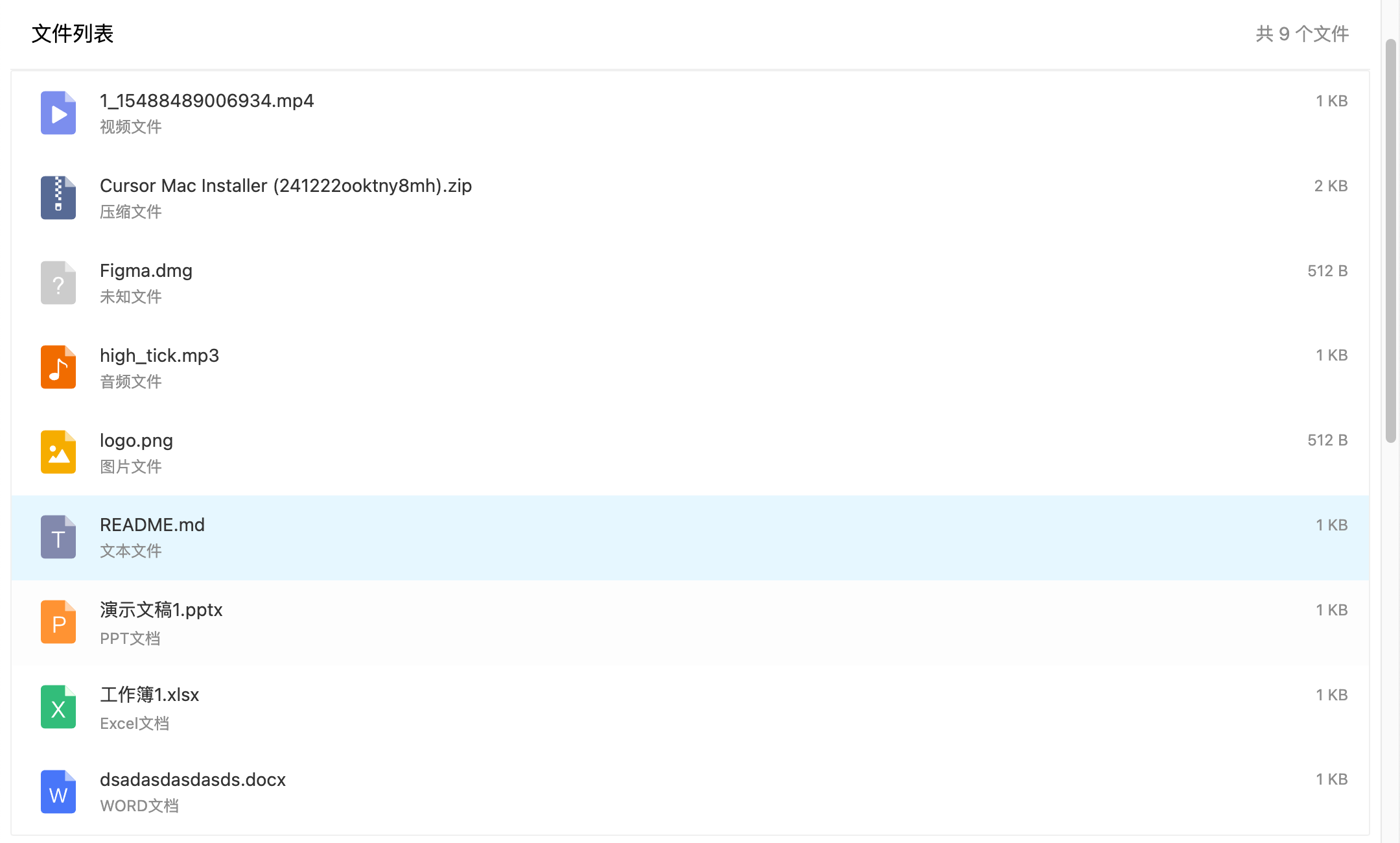
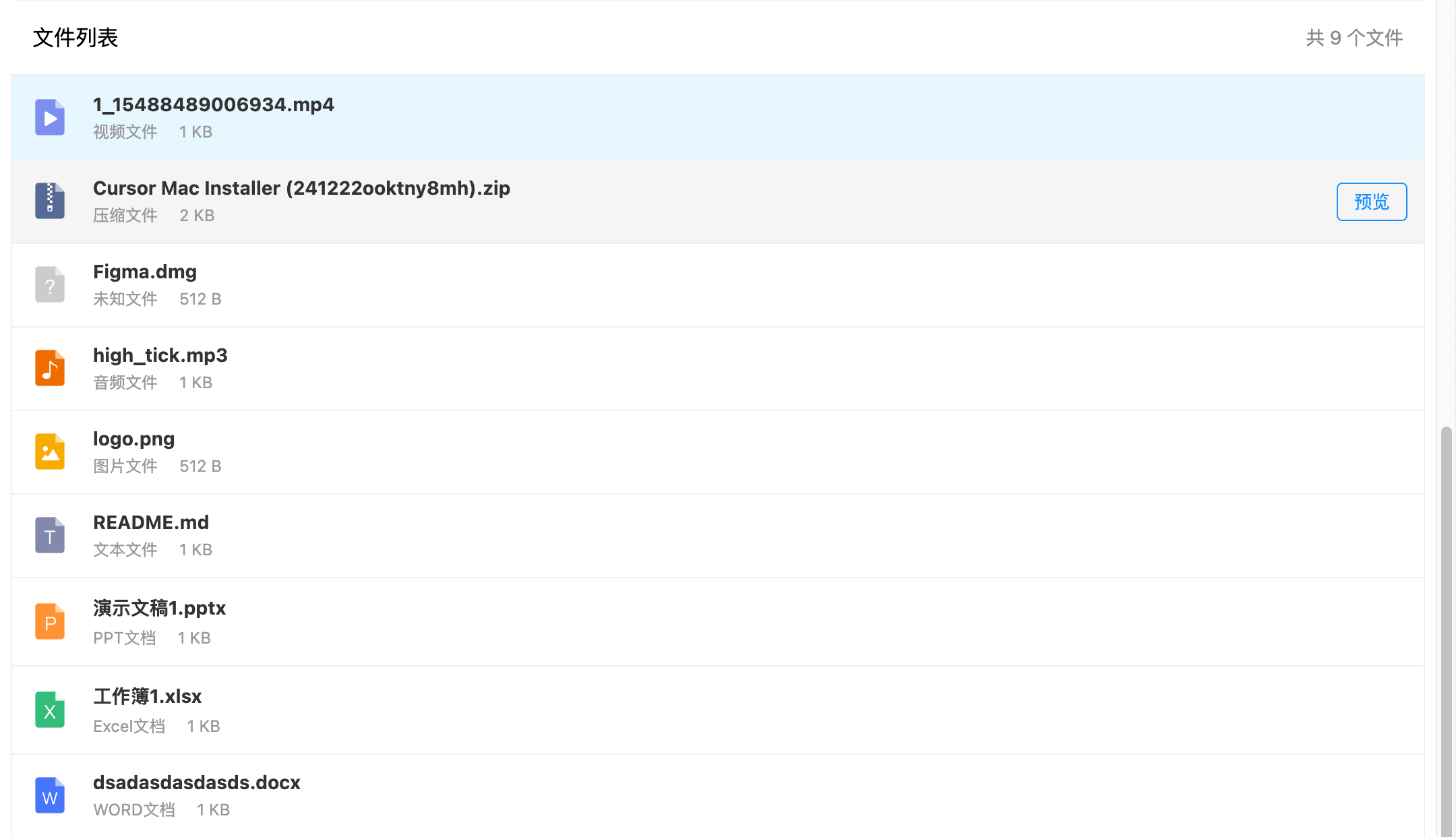
NGX File Preview is a powerful Angular file preview component library that supports previewing a wide variety of file formats and offers flexible customization options, providing an efficient and user-friendly solution for developers.
| File Type | Preview Effect |
|---|---|
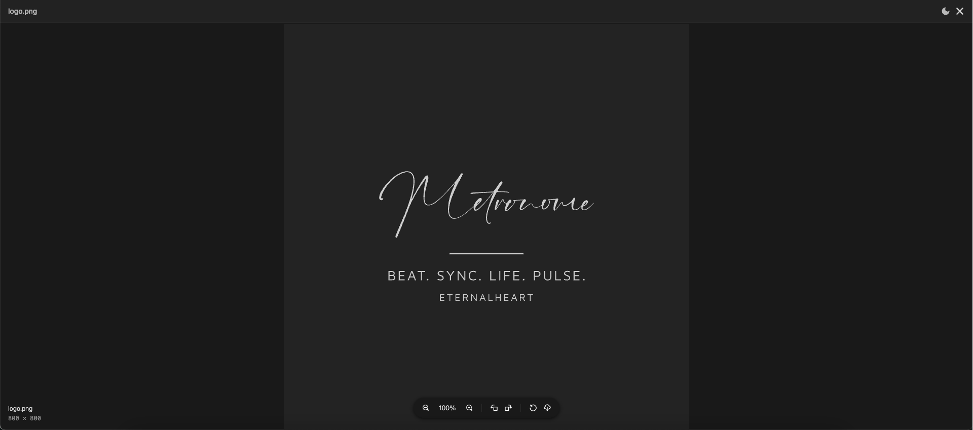
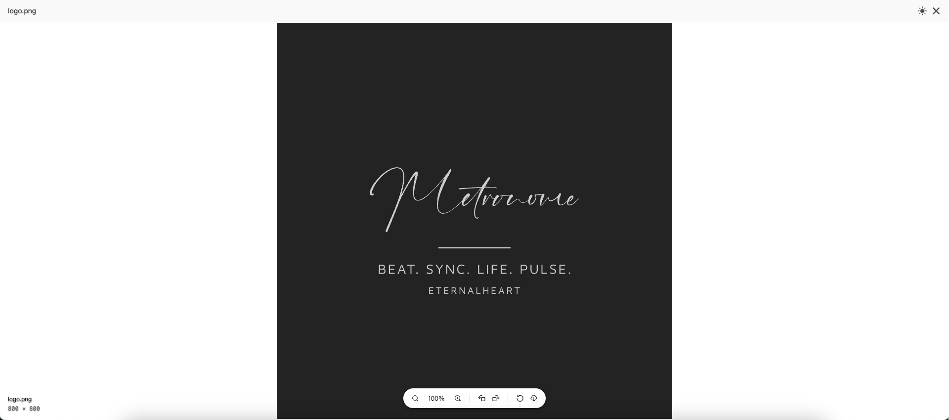
| Image |
|
| Video |
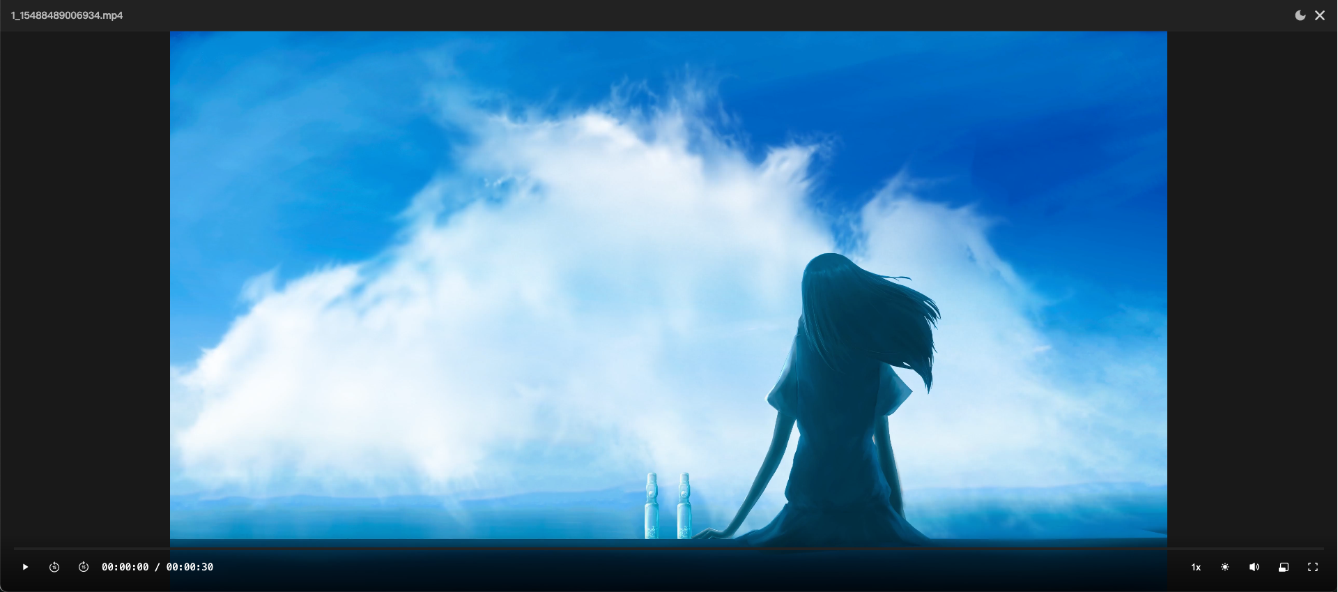 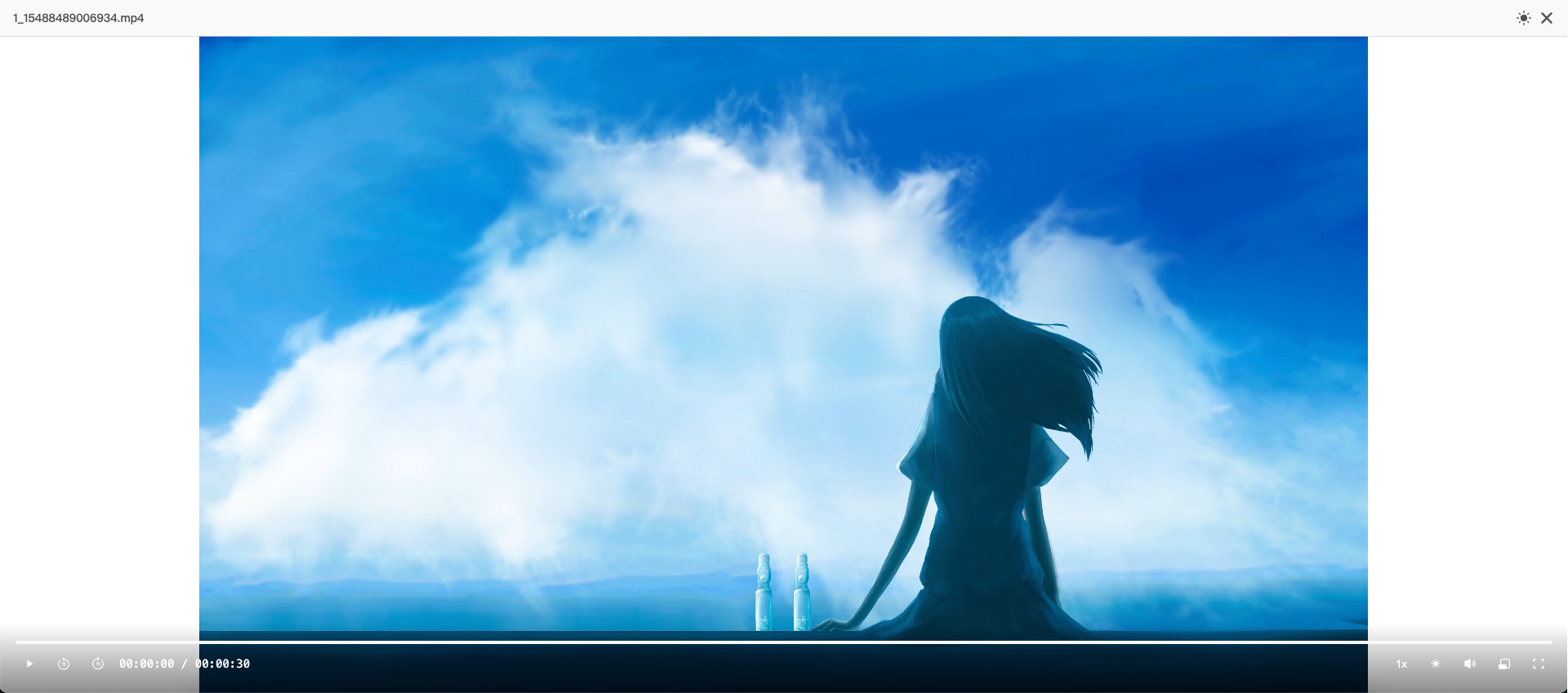
|
| Audio |
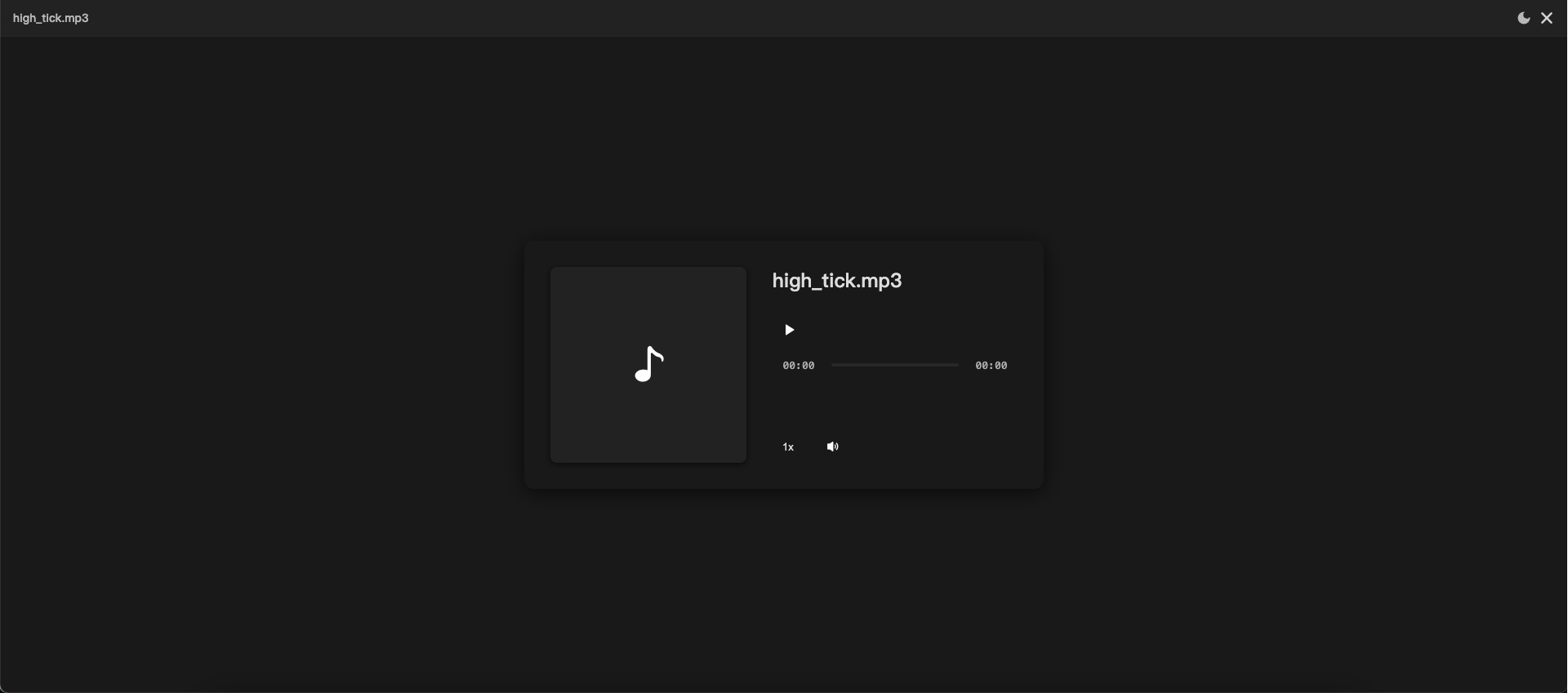 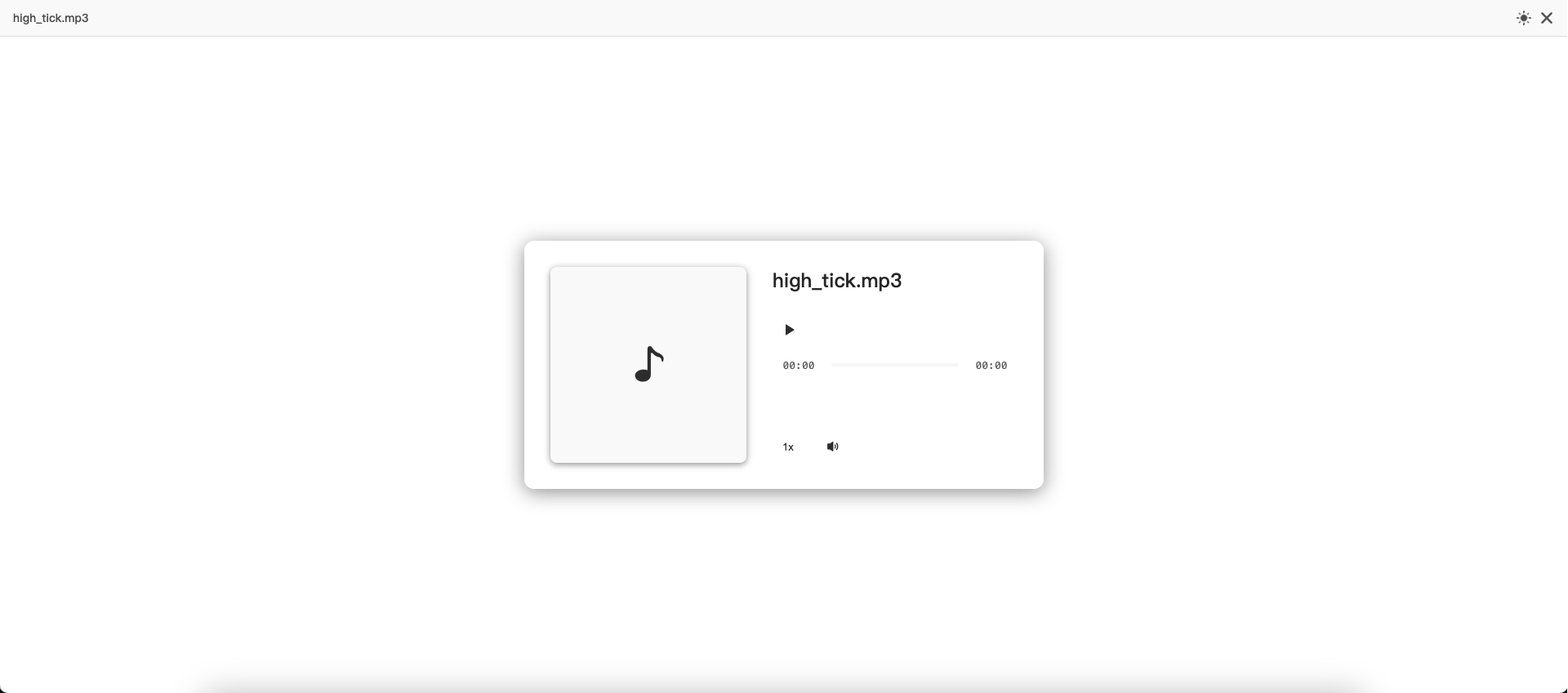
|
| PPT |
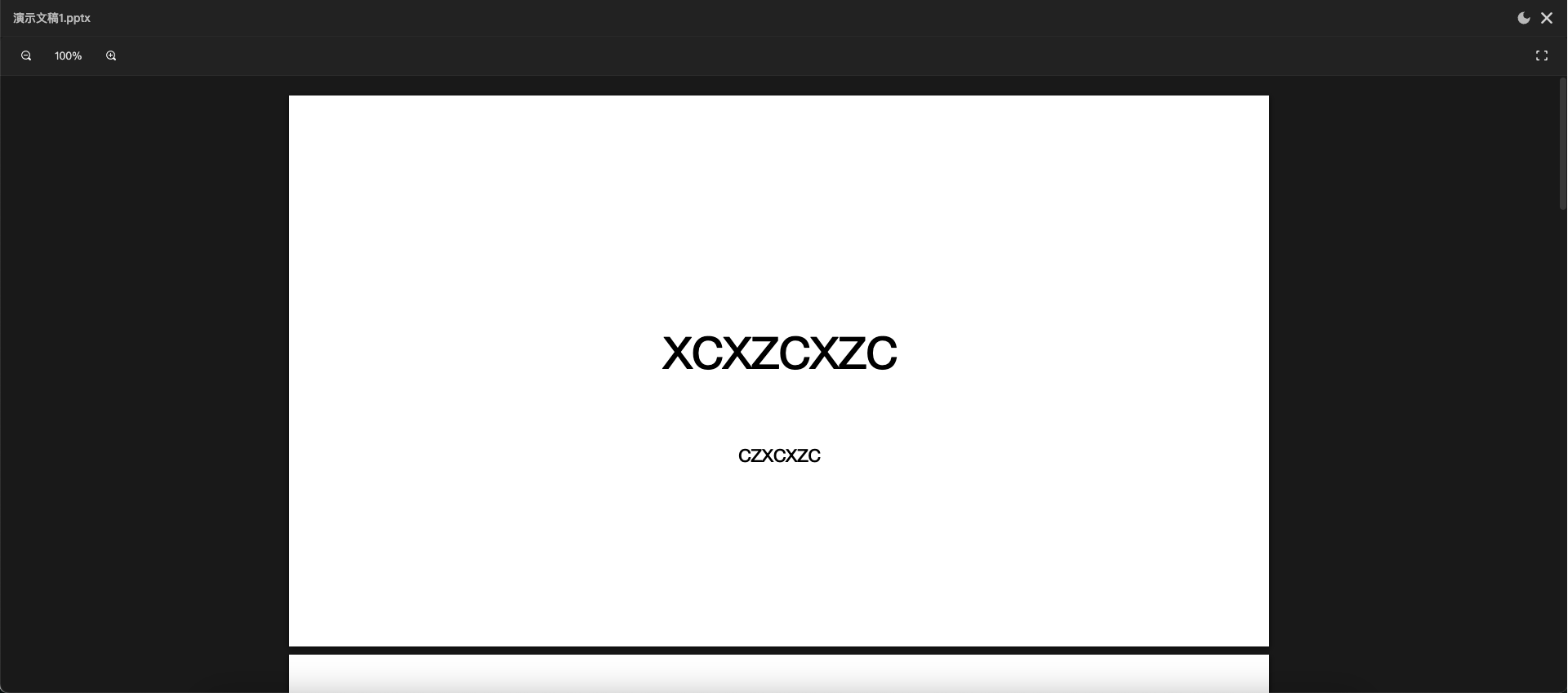 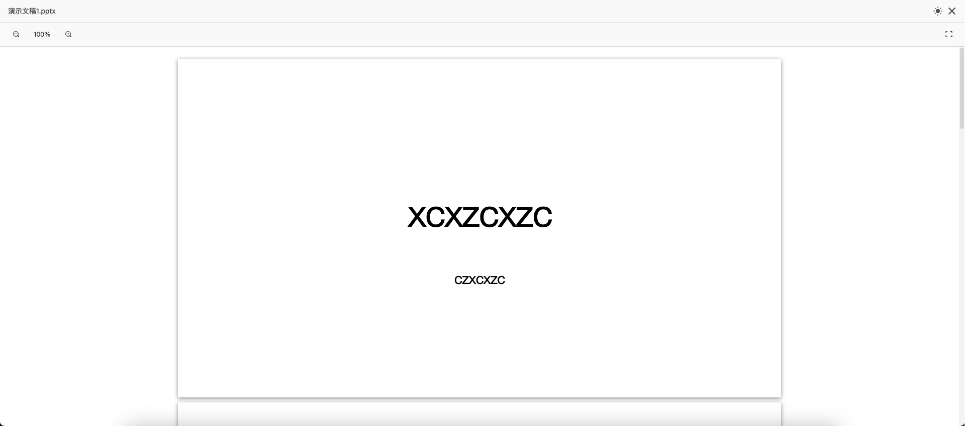
|
| Word |
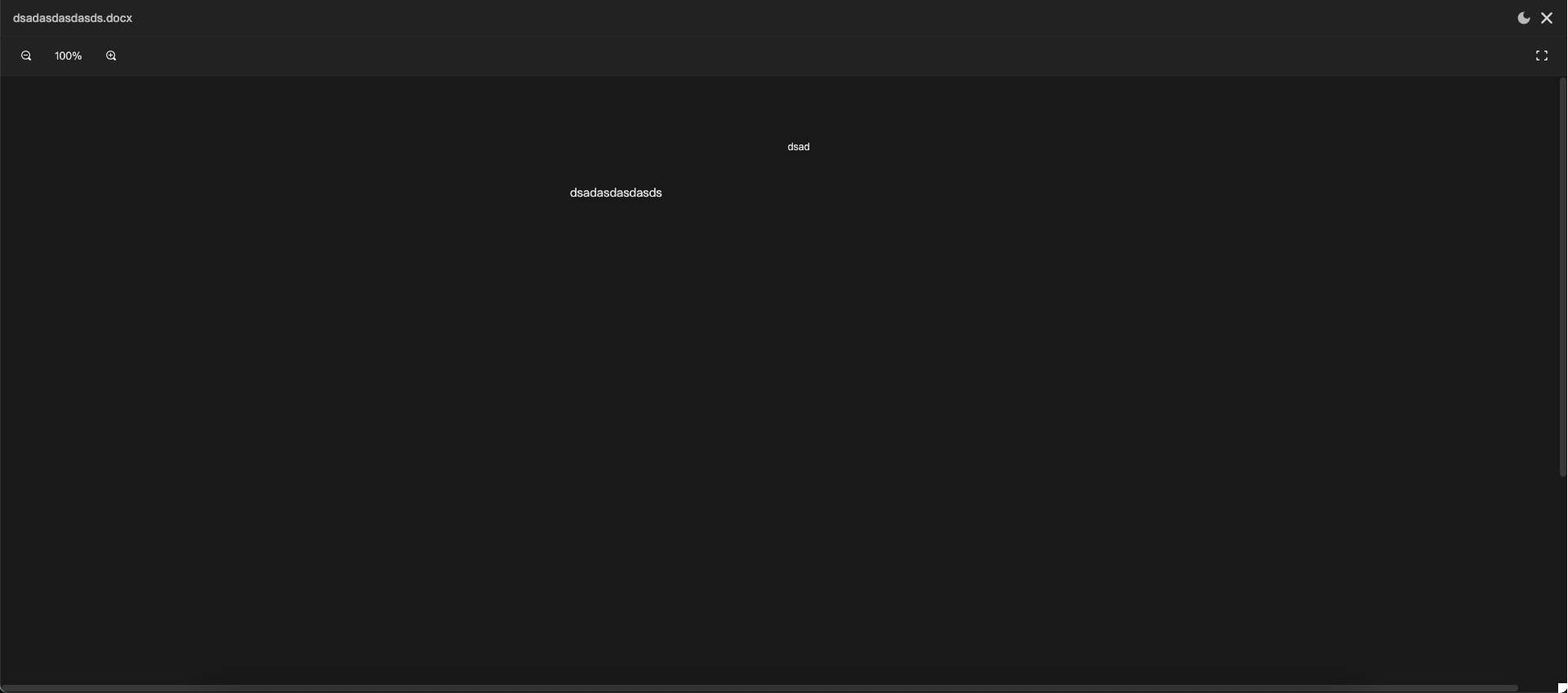 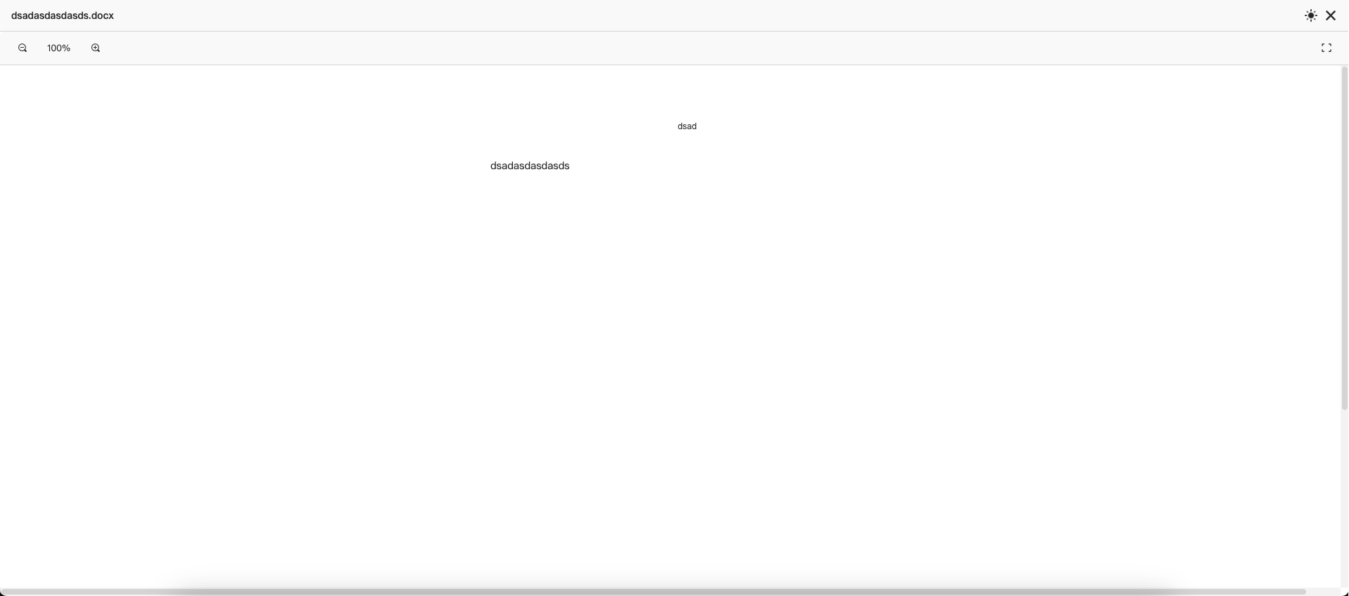
|
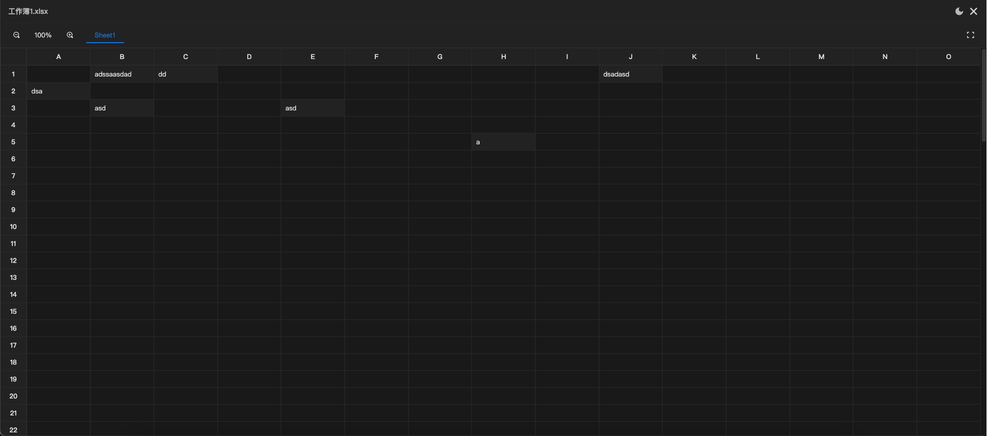
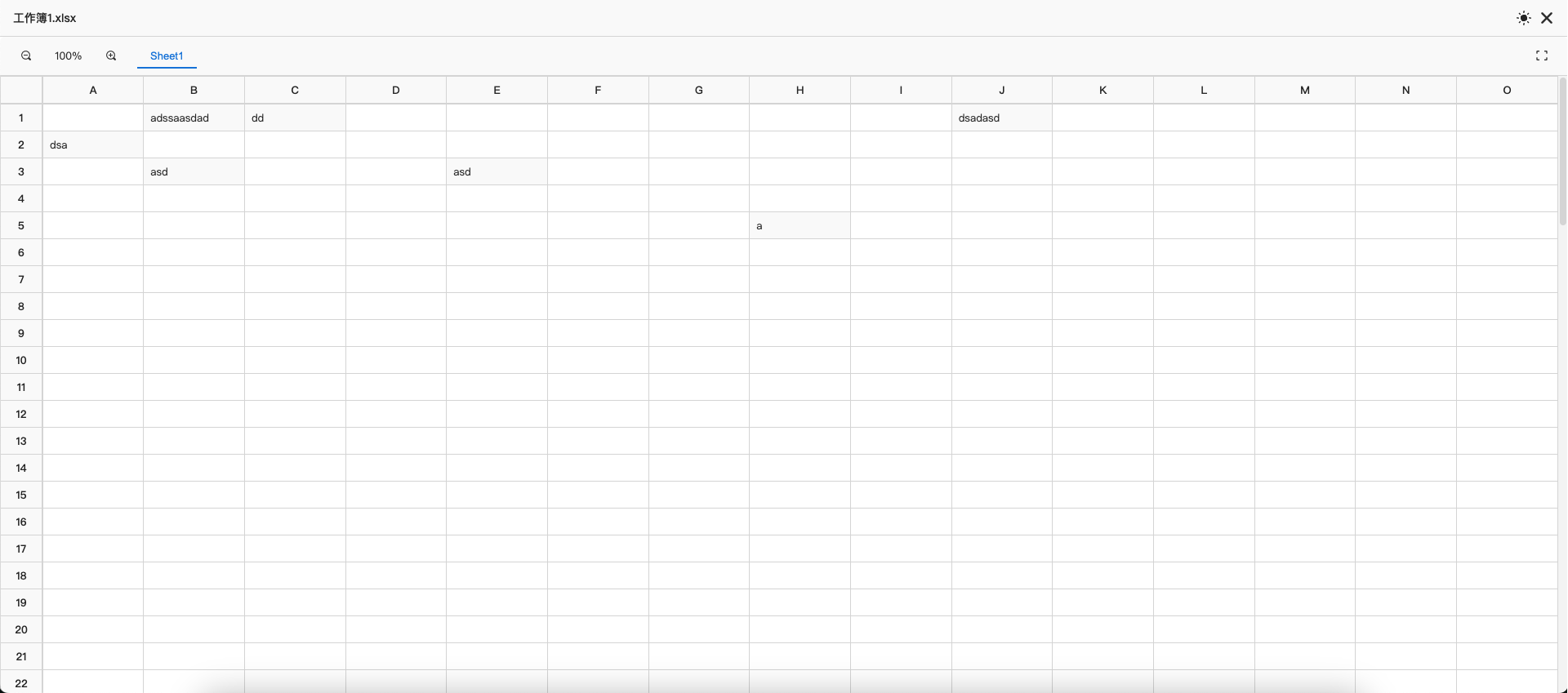
| Excel |
|
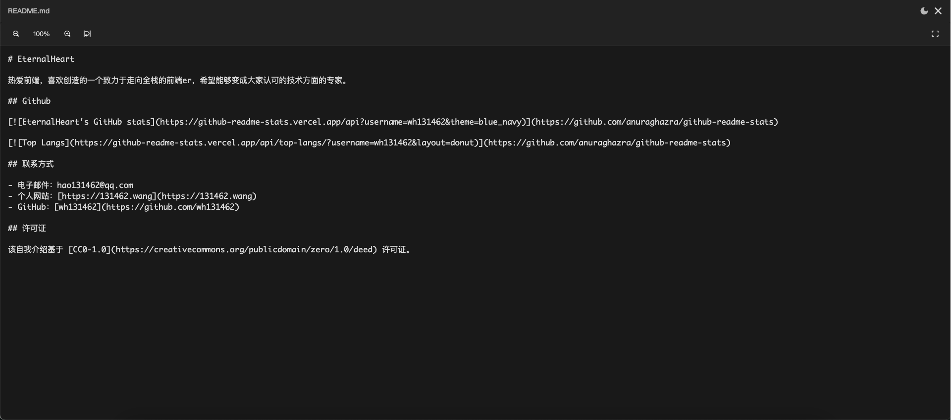
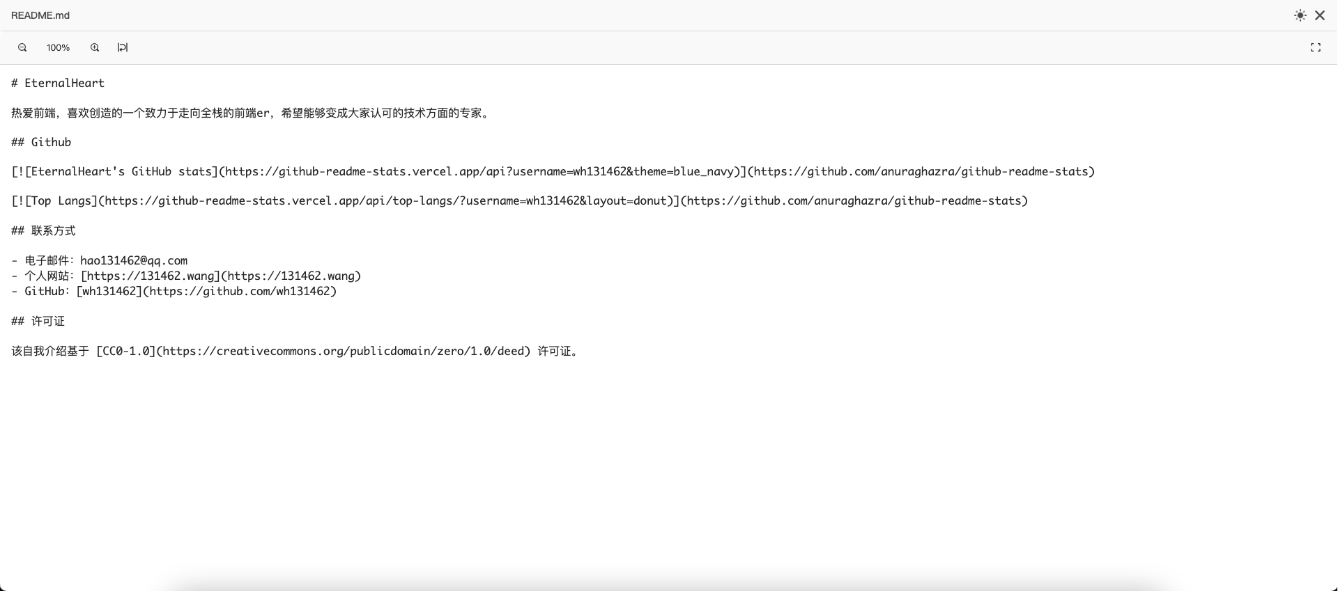
| Text |
|
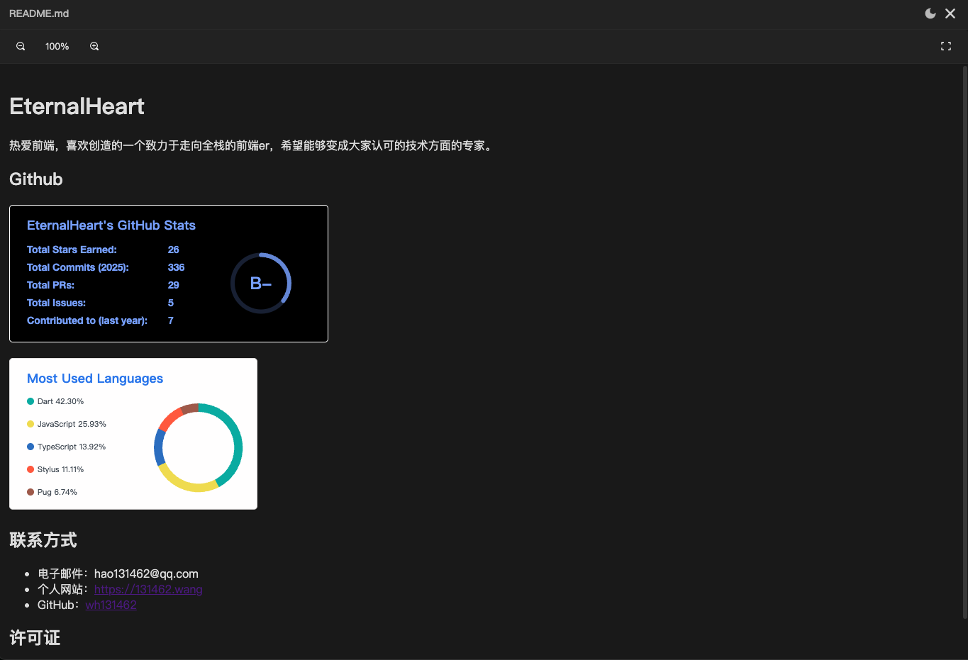
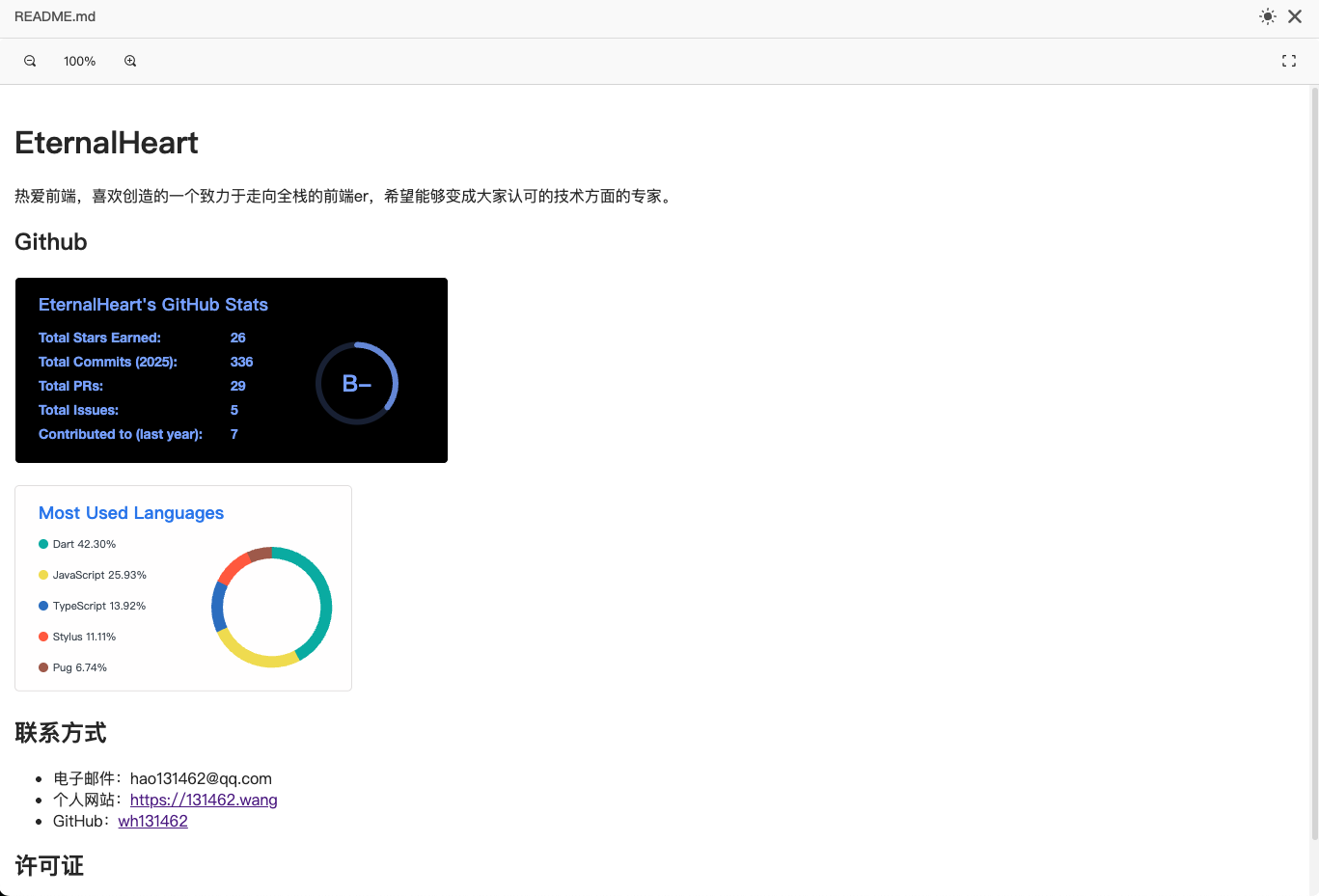
| Markdown |
|
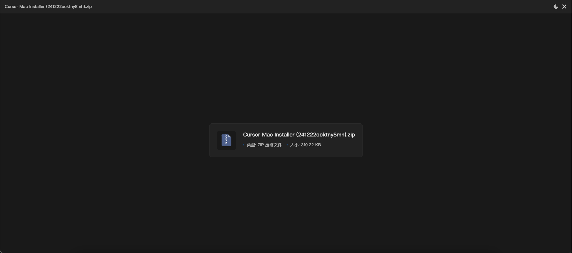
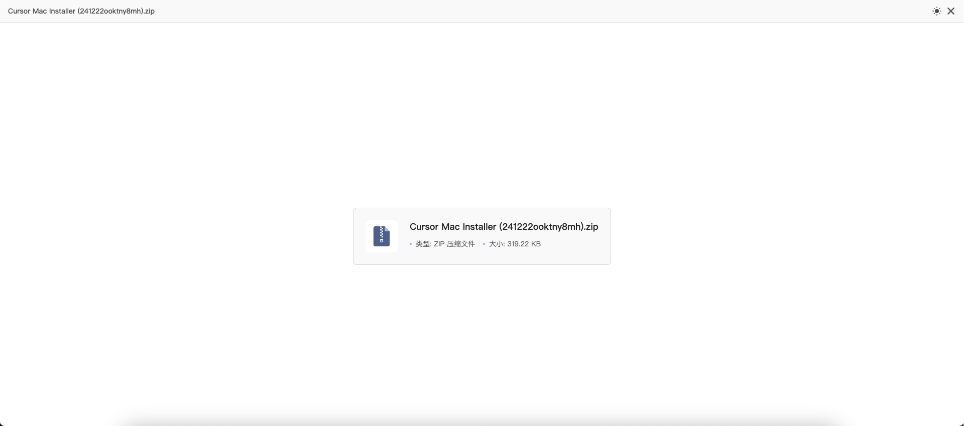
| Zip |
|
| Unknown |
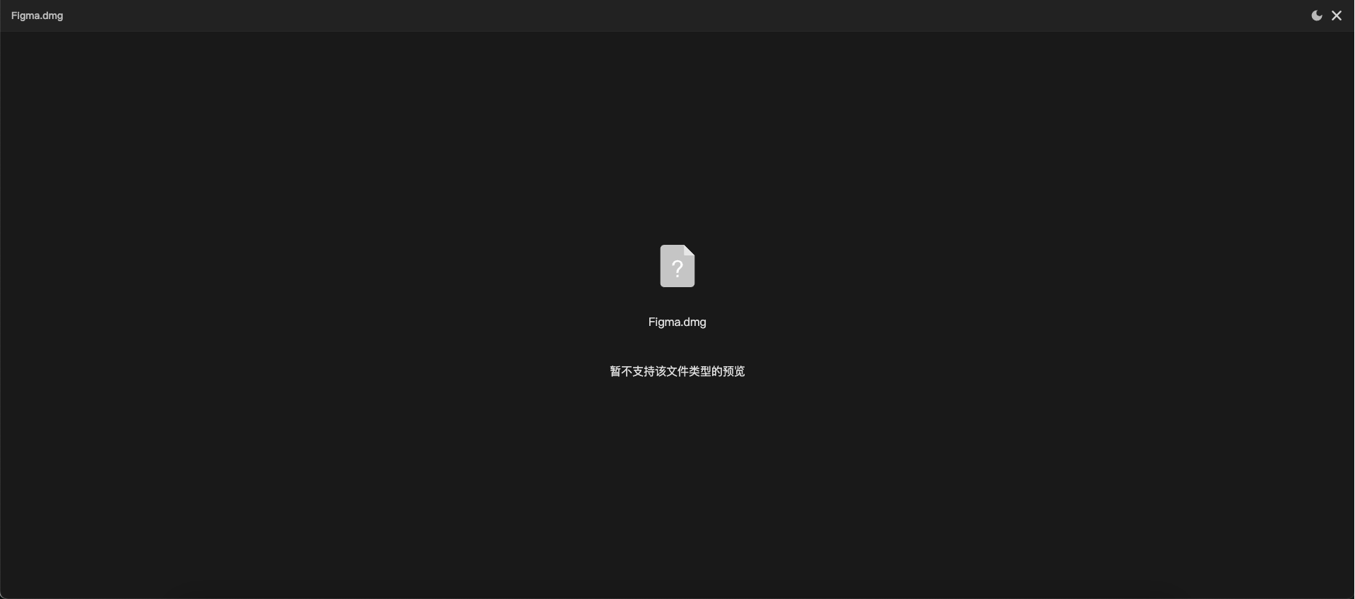 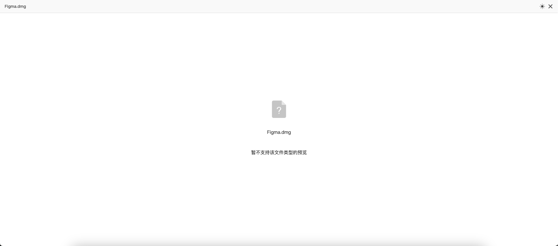
|
- Support for Multiple File Formats: Fully compatible with image, PDF, PPT, Word, Excel, text, markdown, audio, video, and many other common file types.
- Intuitive User Experience: Provides clear indicators for unknown file types and supports user-friendly interactions for different file formats.
- Dark Mode and Light Mode: Adapts to various use cases with visual preferences for both dark and light modes, including auto mode switching.
- Flexible Usage: Supports both directive-based and component-based usage, offering flexibility to meet different development requirements.
- Lightweight Design: Optimized for performance and easy integration into any project, ensuring smooth and efficient operation.
- Keyboard Shortcut Support: Increases efficiency by allowing easy navigation and closing of the preview with keyboard shortcuts.
- Internationalization Support: Built-in i18n support with easy language pack registration and switching capabilities.
npm install @eternalheart/ngx-file-preview --save docx-preview hls.js pptx-preview xlsx ngx-extended-pdf-viewer markdown-it highlight.jsYou can specify the language when using the directive:
<div [ngxFilePreview]="file" lang="en">Click to preview</div>Register a custom language pack using I18nUtils.register:
import { I18nUtils } from '@eternalheart/ngx-file-preview';

// Register a new language pack
I18nUtils.register('fr', {
  preview: {
    error: {
      noFiles: 'Aucun fichier à afficher'
    },
    toolbar: {
      zoomIn: 'Zoom avant',
      zoomOut: 'Zoom arrière'
      // ... other translations
    }
  }
  // ... more translation keys
});Use the i18n pipe in templates to translate text:
{{ 'preview.toolbar.zoomIn' | i18n }}
// With parameters
// Use ${0} as a numeric placeholder in the corresponding text. The number of placeholders is unlimited, but you must pass the corresponding number of arguments when using them.
// example: list.total ==> "共${0}个文件"
{{ 'list.total' | i18n:filesCount }}Add the necessary assets , styles and scripts to your angular.json file:
{
  "projects": {
    "your-app": {
      "architect": {
        "build": {
          "options": {
            "assets": [
              {
                "glob": "**/*",
                "input": "node_modules/ngx-extended-pdf-viewer/assets",
                "output": "assets"
              }
            ],
            "styles": [
              "node_modules/@eternalheart/ngx-file-preview/src/assets/icon/font/nfp.css"
            ],
            "scripts": [
              "node_modules/@eternalheart/ngx-file-preview/src/assets/icon/color/nfp.js"
            ]
          }
        }
      }
    }
  }
}Import the required components in your Angular module:
import {
  PreviewDirective,
  PreviewListComponent,
  PreviewModalComponent
} from '@eternalheart/ngx-file-preview';

@Component({
  imports: [
    PreviewDirective,
    PreviewListComponent,
  ]
})The simplest usage method: Apply the directive directly to an element:
import {PreviewDirective, PreviewEvent} from '@eternalheart/ngx-file-preview';

@Component({
  imports: [PreviewDirective],
  template: `
    <!-- Use themeMode to specify the display mode (dark/light). By default, it automatically switches based on time, but can also be manually toggled inside the preview page -->
    <div [ngxFilePreview]="file" themeMode="light">Click to preview a single file</div>
    <div [ngxFilePreview]="file" themeMode="dark" (previewEvent)="handlePreviewEvent($event)">Click to preview a single file</div>
    <div [ngxFilePreview]="file" themeMode="auto" [autoConfig]="{dark: {start: 19, end: 7}}">Click to preview a single file</div>
    <div [ngxFilePreview]="files">Click to preview multiple files</div>
  `
})
export class YourComponent {
  file: PreviewFile = {
    name: 'example.jpg',
    type: 'image',
    url: 'path/to/file.jpg'
  };

  files: PreviewFile[] = [
    // ... file array
  ];

  handlePreviewEvent(event: PreviewEvent) {
    const {type, message, event: targetEvent} = event;
    if (type === "error") {
      console.log(message); // Handle error event
    }
    if (type === "select") {
      console.log(targetEvent); // Handle file selection event
    }
  }
}import {PreviewListComponent} from '@eternalheart/ngx-file-preview';
@Component({
imports: [PreviewListComponent],
template: `
<ngx-preview-list [files]="files" (fileSelect)="onFileSelect($event)">
</ngx-preview-list>
`
})@Component({
template: `
<ngx-preview-list [files]="files">
<ng-template #itemTemplate
let-file
let-index="index"
let-isActive="isActive"
let-preview="preview">
<div class="custom-item"
[class.active]="isActive"
(click)="preview()">
<span>{{ file.name }}</span>
<span>{{ formatFileSize(file.size) }}</span>
</div>
</ng-template>
</ngx-preview-list>
`
})interface PreviewFile {
url: string; // File URL
name: string; // File name
type?: PreviewType; // File type - Not nessary
size?: number; // File size (optional)
lastModified?: number;// Last modified time (optional)
coverUrl?: string; // Cover image URL (for video/audio, optional)
}type PreviewType =
| 'image' // Image
| 'pdf' // PDF Document
| 'ppt' // PPT Presentation
| 'word' // Word Document
| 'txt' // Text File
| 'video' // Video
| 'excel' // Excel Spreadsheet
| 'audio' // Audio
| 'zip' // Compressed File
| 'unknown' // Unknown Type| Property | Type | Default | Description |
|---|---|---|---|
| files | PreviewFile[] | [] | List of files to preview |
| themeMode | 'light' | 'dark' | 'auto' | 'auto' | Theme mode for the preview |
| autoConfig | { dark: { start: number, end: number } } | { dark: { start: 19, end: 7 } } | Auto theme mode configuration |
| lang | string | 'zh' | Internationalization language setting, 'zh' and 'en' are registered by default |
| (fileSelect) | EventEmitter | - | Event emitted when a file is selected |
| (previewEvent) | EventEmitter | - | Event emitted during preview actions |
| Variable | Type | Description |
|---|---|---|
| file | PreviewFile | Current file object |
| index | number | Current file index |
| type | string | File type |
| isActive | boolean | Whether the current item is selected |
| select | () => void | Method to select the current file |
| preview | () => void | Method to preview the current file |
| Selector | Property | Type | Default | Description |
|---|---|---|---|---|
| [ngxFilePreview] | ngxFilePreview | PreviewFile | PreviewFile[] | - | File(s) to preview |
| themeMode | 'light' | 'dark' | 'auto' | 'auto' | Theme mode for the preview | |
| autoConfig | { dark: { start: number, end: number } } | { dark: { start: 19, end: 7 } } | Auto theme mode configuration | |
| lang | string | 'zh' | Internationalization language setting, 'zh' and 'en' are registered by default | |
| (previewEvent) | EventEmitter | - | Event emitted during preview actions |
| Event Type | Description | Event Data |
|---|---|---|
| error | Error event | { type: 'error', message: string } |
| select | File selection event | { type: 'select', event: MouseEvent } |
In preview mode, the following shortcuts are available:
-
←Previous file -
→Next file -
EscClose preview
- Clone the repository:
git clone https://github.com/wh131462/ngx-file-preview.git- Install dependencies:
npm install- Start the development server:
npm run start- Build the library:
npm run buildFeel free to submit Issues and Pull Requests to help improve this project!
MIT
This project uses the following excellent open-source libraries:
- docx-preview - Word document preview
- pptx-preview - PPT presentation preview
- xlsx - Excel spreadsheet preview
- ngx-extended-pdf-viewer - PDF document preview
- hls.js - HLS video stream support
- markdown-it - Markdown support
- highlight.js - The code in Markdown is highlighted by Markdown support
We appreciate the contributions from these open-source projects to the community!


