Installation
Our React package is available from npm. Simply install using a package manager of your choice.
Installation with npm:
npm install @getgrover/react-partner-widget --save
Installation with yarn:
yarn add @getgrover/react-partner-widget
Set up
Import the component at the desired location:
import GroverWidget from "@getgrover/react-partner-widget"GroverWidget imports the original default design. Future releases will add more designs that can be selectively imported.
Property Interface
In order to display the Grover button and apply agreed-upon recirculation rules, we'll need some data. Here's a list of all the props the component accepts:
articleId Required String: Pass your article ID so that we can match with the right product variant.
accessToken Required String: Authenticates and identifies your request.
stockAbsolute Required Number: See Passing stock levels
stockEnumerated Required String Enumeration: See Passing stock levels.
locale String: Language. Supports de, en and es. Defaults to de.
eans Array of Strings: Provide EANs associated with this product variant for improved matching.
className String: See Customizing the design
classNames Object: See Customizing the design
moreInformationUrl String: Link to open when user clicks "More Information". Links to Grover checkout page by default.
deliveryDate Date String: See Passing Delivery estimates.
deliveryTime Number: See Passing Delivery estimates
serverUrl String: Override URL for Grover API. Defaults to api.getgrover.com. See Testing and QA Environments
onButtonClick Function: Called on rental button click with React SyntheticEvent parameter. Can be used for analytics.
showOnlyDiscountedPrice Boolean: If true - only the discounted price will be displayed.
Passing Stock Levels
Stock levels are required to decide if the button should be displayed, as well as for applying recirculation rules. You have the choice to pass stock levels either as an absolute value using the stockAbsolute property, or pass an enumeration using the stockEnumerated property. You need to provide either-or, otherwise, the widget won't display.
If you want to use enumerated values, import our stock enumeration value constants along with the component:
import GroverWidget, { STOCK_LEVEL_ENUM } from "@getgrover/react-partner-widget"Available enumerations are:
const STOCK_LEVEL_ENUM = {
    low: 'low',
    medium: 'medium',
    high: 'high',
    none: 'none',
};
When initializing the component, map the values available to you onto these constants, then pass to the stockEnumerated property.
For example, let's say your API returns a stock level enumeration with the following possible values: out-of-stock, few, some or lot. You could set your mapping up like this:
function mapStockValue(stockValue) {
    switch (stockValue) {
        case 'out-of-stock':
            return STOCK_LEVEL_ENUM.none;
        case 'lot':
            return STOCK_LEVEL_ENUM.high;
        case 'some':
            return STOCK_LEVEL_ENUM.medium;
        case 'few':
            return STOCK_LEVEL_ENUM.low;
        default:
            return null;
    }
}
Then, pass the translated enumeration to the component:
stockEnumerated={{ mapStockValue(yourEnumeratedStockLevel) }}Passing Delivery estimates
Delivery time estimates are required in order to fulfill some recirculation agreements. If you're unsure if you should pass this data, please ask your account manager. You have the choice to either pass an absolute delivery estimation date in the format YYYY.MM.DD to the deliveryDate property, or pass a relative amount of days from now to deliveryTime. For example, if your system estimates a delivery time of 3 days, pass 3.
Customizing the design
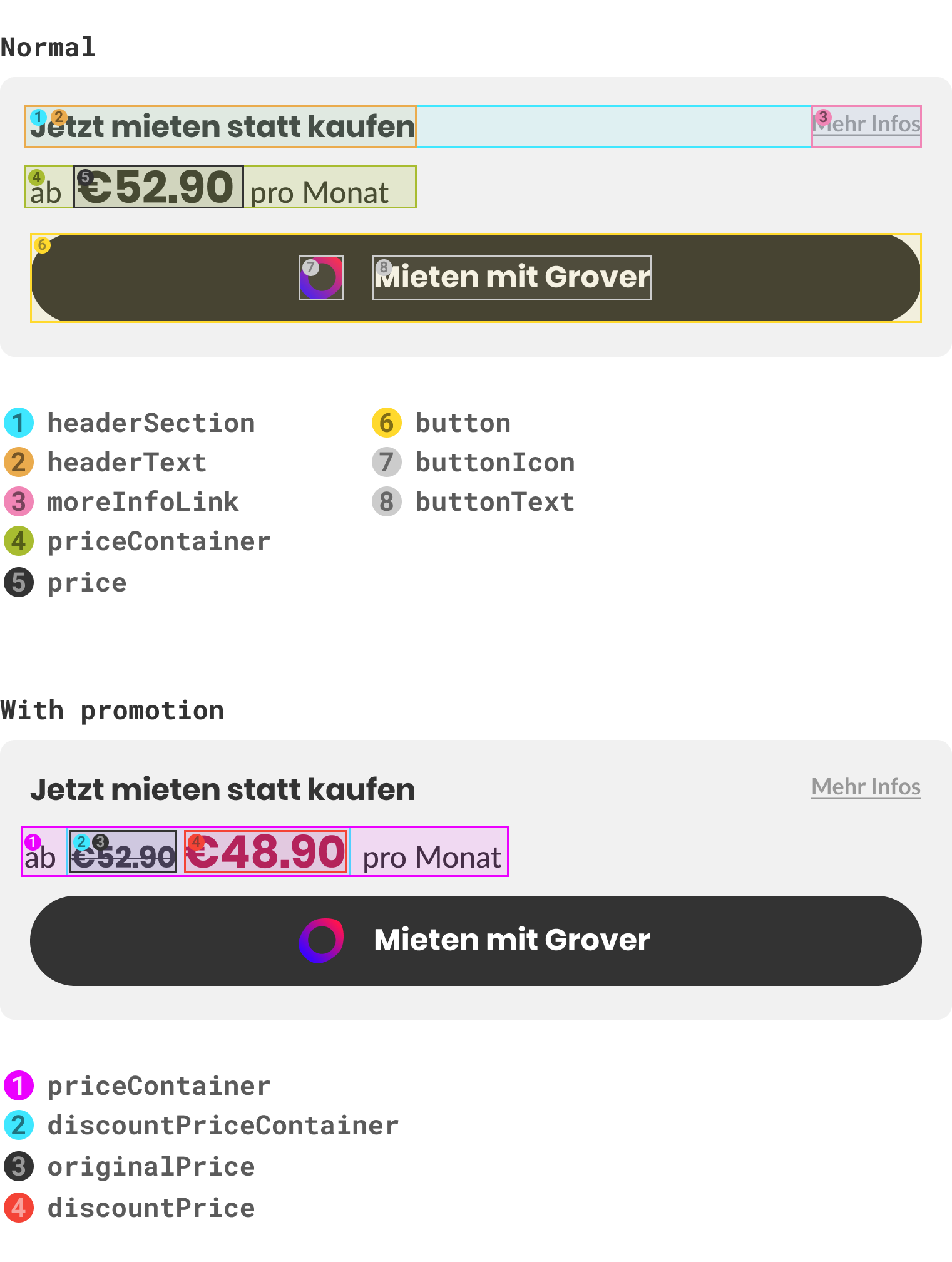
You can customize any element of the button flexibly. To do so, we allow you to add your own custom classes to any of the button's elements. That way, you can structure your CSS however you want, and just tell our component what classes to add.
Override elements in the component
Use the classNames property to specify what class names should be applied to what elements. Here's a list of the component's elements:
classNames: PropTypes.shape({
        headerSection: PropTypes.string,
        headerText: PropTypes.string,
        moreInfoLink: PropTypes.string,
        priceContainer: PropTypes.string,
        price: PropTypes.string,
        discountPriceContainer: PropTypes.string,
        discountPrice: PropTypes.string,
        originalPrice: PropTypes.string,
        button: PropTypes.string,
        buttonIcon: PropTypes.string,
        buttonText: PropTypes.string,
    }),
Let's say you want to change the background of the button to yellow, and the price to blue. Simply write your CSS classes anywhere like this:
.custom-btn { /* class name can be anything you want */
  background-color: yellow;
}

.custom-price { /* class name can be anything you want */
  background-color: blue;
}
Then, let the component know what classes to apply to the button and price elements by specifying them in the classNames property:
classNames={{ button: "custom-btn",
              price: "custom-price" }}
Your custom classes should now be applied.
Overriding the main container
If you want to override the component's main container, you'll need to pass the className property. That means that if you want to add a style to the whole widget as well as target specific elements, you'll need to pass both className (applied to the container) and classNames (applies specific classes to specific elements).
className="custom-container-styles"Let's say you want to put a maximum size of 500px on the whole component. Simply define your CSS class anywhere like this:
.custom-container { /* class name can be anything you want */
    max-width: 500px;
}
Then, assign the className property:
className="custom-container"Your custom styles are now applied to the whole component.
Testing and QA environments
We can provide you with special tokens for your QA and Staging environments. To set up a new environment, please contact us. We'll synchronize some Article IDs and set up some example products so that you can get testing.
In your testing environments, pass your special staging accessToken, and override the component's serverUrl to our staging API, hosted at https://apist.getgrover.com/api/v1.
Development Guide
Development guide is here.
Releasing a new version
This repository follows the principles of semantic-release. All PRs must be squashed and followed up with the correct prefixes!
