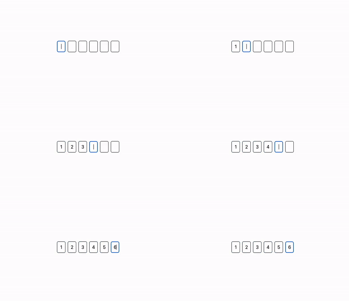
A simple input component for one time passcodes (OTP) for Svelte.
npm install @hellocoop/svelte-otp
or
yarn add @hellocoop/svelte-otp
Getting started is as easy as importing the SvelteOtp component and just using it.
<script>
    import SvelteOtp from ‘@hellocoop/svelte-otp’;
</script>

<SvelteOtp />You can easily control the state of the value by binding it to the value prop.
You can also change the number of inputs through the numOfInputs prop.
<script>
	import SvelteOtp from ‘@hellocoop/svelte-otp’;

    let value = 'abc12'

</script>

<SvelteOtp numOfInputs={5} bind:value />
You can also restrict it to only accept numbers by adding the numberOnly attribute.
Separators can be set through the separator prop. Placeholders can be added through placeholder prop.
<script>
    import SvelteOtp from ‘@hellocoop/svelte-otp’;

    let value = '12';
</script>

<SvelteOtp
    numberOnly
    bind:value
    separator="-"
    placeholder="********"
/>You can style the component however you want by passing one of inputStyle, wrapperStyle, separatorStyle or add custom class names through inputClass, wrapperClass, separatorClass. You can also disable all the default styling by adding the disableDefaultStyle attribute.
Here's an example component, styled using tailwindcss
<SvelteOtp
	inputClass="rounded-md bg-gray-200"
	separatorClass="border-blue-700 text-3xl font-bold"
	separator="-"
/>| Name | Default Value | Description |
|---|---|---|
| numOfInputs | 6 | Quantity of input to show |
| value | '' | The value of the input |
| separator | '' | Separator between the individual inputs |
| onlyShowMiddleSeparator | false | Only show one separator in the middle (numOfInputs % 2 = 0) |
| placeholder | '' | Placeholder value for the inputs |
| numberOnly | false | Restrict the values to numbers only |
| disableDefaultStyle | false | Disable default styling of component |
| wrapperClass | '' | Custom class to be added to the wrapper element |
| inputClass | '' | Custom class to be added to the individual inputs |
| separatorClass | '' | Custom class to be added to the separators |
| wrapperStyle | '' | Inline style to be added to the wrapper element |
| inputStyle | '' | Inline style to be added to the individual inputs |
| separatorStyle | '' | Inline style to be added to the separators |
| divisor | '' | Show separator between {divisor} inputs |
| autofocus | false | Autofocus on the first input field |
