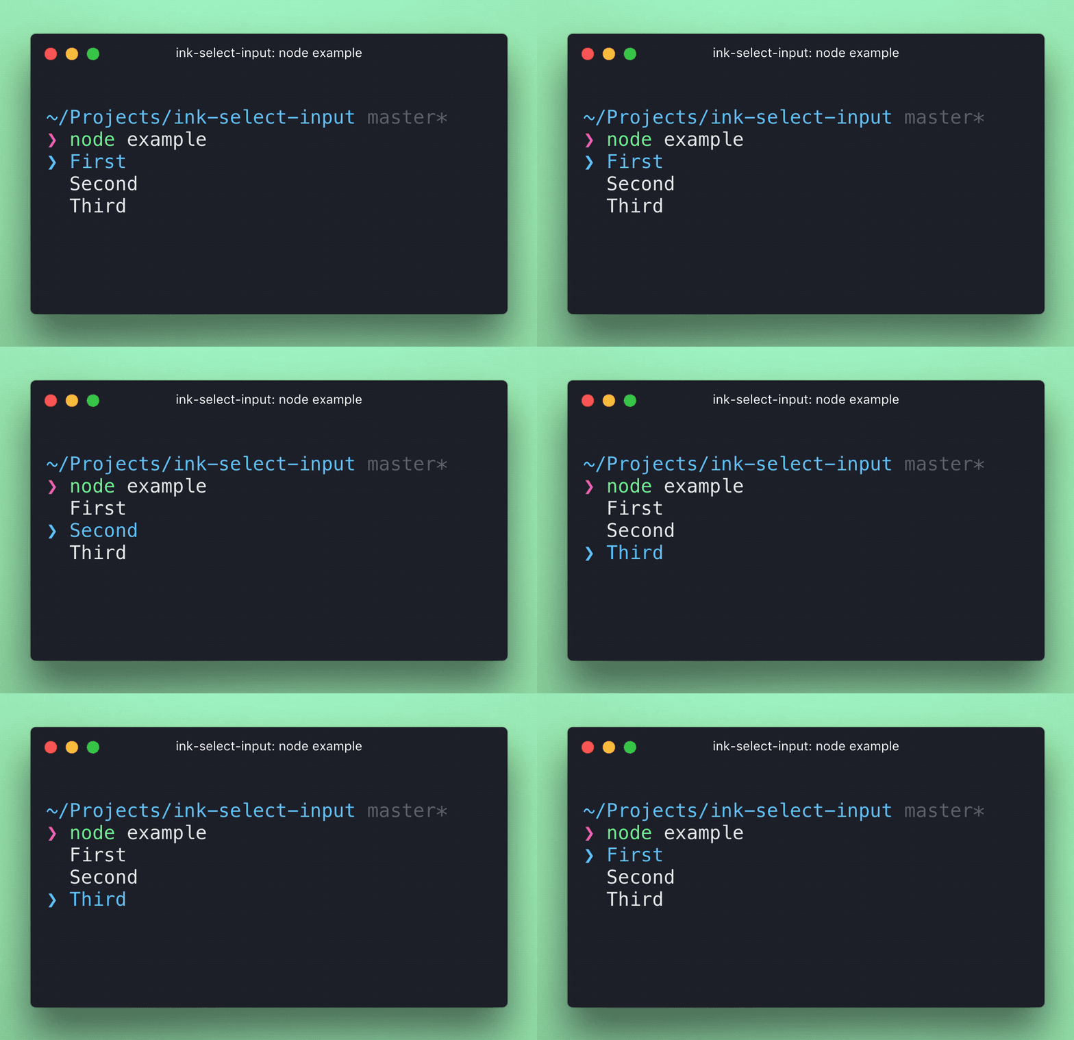
A fork of the SelectInput component for Ink with additional layout features.
npm install @jcarpenter-tessl/ink-select-inputimport React from 'react';
import {render} from 'ink';
import SelectInput from 'ink-select-input';
const Demo = () => {
const handleSelect = item => {
// `item` = { label: 'First', value: 'first' }
};
const items = [
{
label: 'First',
value: 'first'
},
{
label: 'Second',
value: 'second'
},
{
label: 'Third',
value: 'third'
}
];
return <SelectInput items={items} onSelect={handleSelect} />;
};
render(<Demo />);The user can navigate using arrow up/down keys or the j k keys, then press return to select. Alternatively, press the number key corresponding to an option to select it instantly.
Type: array
Default: []
Items to display in a list. Each item must be an object and have label and value props, it may also optionally have a key prop.
If no key prop is provided, value will be used as the item key.
Type: boolean
Default: true
Listen to user's input. Useful in case there are multiple input components at the same time and input must be "routed" to a specific component.
Type: number
Default: 0
Index of initially-selected item in items array.
Type: number
Number of items to display.
Type: Component
Custom component to override the default indicator component.
Type: Component
Custom component to override the default item component.
Type: function
Function to call when user selects an item. Item object is passed to that function as an argument.
Type: function
Function to call when user highlights an item. Item object is passed to that function as an argument.
Type: 'row' | 'column'
Default: 'column'
Controls the layout direction of the select input. When set to 'row', items will be displayed horizontally.
Type: Component
Custom component to render between items when in 'row' direction. This is useful for adding visual separators between horizontal items.
The component supports multiple navigation methods:
- Arrow keys (↑/↓ for vertical, ←/→ for horizontal)
-
j/kkeys (vertical only) - Tab/Shift+Tab for cycling through items
- Number keys (1-9) for direct selection
- Return key to select the highlighted item
When using Tab/Shift+Tab navigation, the selection will loop from last to first item (and vice versa). This behavior is different from arrow key navigation, which stops at the boundaries.
