react-custom-share
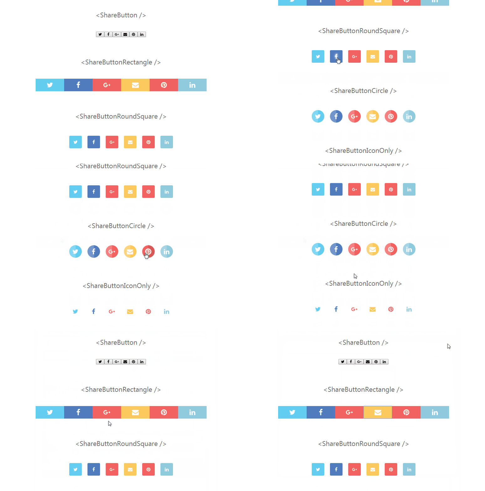
Social media share buttons for ReactJS. Use one of the built-in button themes or create a custom one from scratch.
Docs & Demos
Table of Content
Features
- opens a share-window popup
- built-in share scripts for:
- Google+
- flexibility to add share buttons for unsupported networks
- built-in styled for buttons:
- Rectangle
- RoundSquare
- Circle
- IconOnly
- Outline
- build-in styled blocks:
- Standard
Installation
Install npm package
yarn add react-custom-share
If you prefer you can equally use npm.
Install icons
yarn add react-icons
The examples use icons provided by the react-icons package, but you can use any icons. However, if you want to use built-in styled buttons you have to provide svg icons.
Install CSS-in-JS library
The styled buttons use the Emotion library to add CSS styles to the components.
yarn add emotion
Usage
// import emotion
import { css } from 'emotion';

// import icons
import FaTwitter from 'react-icons/lib/fa/twitter';
import FaFacebook from 'react-icons/lib/fa/facebook';
import FaGooglePlus from 'react-icons/lib/fa/google-plus';
import FaEnvelope from 'react-icons/lib/fa/envelope';
import FaPinterest from 'react-icons/lib/fa/pinterest';
import FaLinkedin from 'react-icons/lib/fa/linkedin';
import FaWhatsapp from 'react-icons/lib/fa/whatsapp';

// import react-custom-share components
import { ShareButtonRectangle, ShareBlockStandard } from 'react-custom-share';

const ShareComponent = props => {
  // create object with props for shareBlock
  const shareBlockProps = {
    url: 'https://mywebsite.com/page-to-share/',
    button: ShareButtonRectangle,
    buttons: [
      { network: 'Twitter', icon: FaTwitter },
      { network: 'Facebook', icon: FaFacebook },
      { network: 'GooglePlus', icon: FaGooglePlus },
      { network: 'Email', icon: FaEnvelope },
      { network: 'Whatsapp', icon: FaWhatsapp },
      { network: 'Pinterest', icon: FaPinterest, media: 'https://mywebsite.com/image-to-share.jpg' },
      { network: 'Linkedin', icon: FaLinkedin },
    ],
    text: `Give it a try - mywebsite.com `,
    longtext: `Take a look at this super website I have just found.`,
  };

  return <ShareBlockStandard {...shareBlockProps} />;
};
API
import {
  // base components (unstyled)
  ShareButton,
  ShareBlock,

  // styled button components
  ShareButtonRoundSquare,
  ShareButtonRectangle,
  ShareButtonCircle,
  ShareButtonIconOnly,
  ShareButtonOutline,

  // styled block components
  ShareBlockStandard,
} from 'react-custom-share';
ShareButton props
ShareButton.propTypes = {
  /* REQUIRED props */

  // network: social network name, one of the list: Twitter, Facebook, GooglePlus, Pinterest, Whatsapp, Linkedin or Email
  network: PropTypes.string.isRequired,
  // url: the address of the page you want to share, 'https://mywebpage.com/'
  url: PropTypes.string.isRequired,
  // children: for the styled components it must be a svg icon, in other case it could be anything
  children: PropTypes.node.isRequired,

  /* SPECIAL props */

  // media: this is a special 'prop' it's required is network's value is 'Pinterest'
  media: function(props, propName, componentName) {
    const key = props['network'].toLowerCase();
    if (key === 'pinterest' && props[propName] === undefined) {
      return new Error(
        `The prop '${propName}' is marked as required in '${componentName}' for the 'Pinterest' network, but it's value is 'undefined'.`
      );
    }
  },

  /* OPTIONAL props */

  // text: short version of message you want to share with the url
  text: PropTypes.string,
  // longtext: additional text message, if it's possible and set it's concatenated to the `text` and serve as a comment with the shared url
  longtext: PropTypes.string,
  // className: CSS style class applied to the button
  className: PropTypes.string,
  // link: 'share link' for not built-in networks
  link: PropTypes.string,
};
ShareBlock props
ShareBlock.propTypes = {

  /* BUTTON's props */

  // props applied to each one of the buttons rendered by the block, explained already above
  url: PropTypes.string.isRequired,
  button: PropTypes.func.isRequired,
  buttons: PropTypes.array.isRequired,
  text: PropTypes.string,
  longtext: PropTypes.string,

  /* BLOCK's own props */

  // CSS style class applied to the block's outer div element
  className: PropTypes.string,
};
Built-in styled components
Styled components have the same api as its base versions. They work as wrappers for the base components and set the value of the className prop of the inner component they wrap.
Below is the simplified code of ShareButtonCircle, one of the built-in styled buttons.
import { css } from 'emotion';

const ShareButtonCircle = props => {
  return (
    <ShareButton
      className={css`
        border-radius: 50%;
        /* ... for the clarity most of the real CSS code was removed */
      `}
      {...props}
    />
  );
};

export default ShareButtonCircle;
Repository
To run DEMO on localhost
1. Clone react-custom-share repository.
git clone https://github.com/greglobinski/react-custom-share.git
2. Move into newly created folder and install dependencies.
cd react-custom-share
yarn install
3. After installation run the develop npm script.
yarn develop
4. Open the http://localhost:3001/ address in your browser.
Tutorials
- Add custom social sharing buttons to a GatsbyJS blog's home page
- Add custom social sharing buttons to GatsbyJS blog's posts
- more coming soon
License
The MIT License (MIT)
Copyright (c) 2018 greg lobinski
Permission is hereby granted, free of charge, to any person obtaining a copy of this software and associated documentation files (the "Software"), to deal in the Software without restriction, including without limitation the rights to use, copy, modify, merge, publish, distribute, sublicense, and/or sell copies of the Software, and to permit persons to whom the Software is furnished to do so, subject to the following conditions:
The above copyright notice and this permission notice shall be included in all copies or substantial portions of the Software.
THE SOFTWARE IS PROVIDED "AS IS", WITHOUT WARRANTY OF ANY KIND, EXPRESS OR IMPLIED, INCLUDING BUT NOT LIMITED TO THE WARRANTIES OF MERCHANTABILITY, FITNESS FOR A PARTICULAR PURPOSE AND NONINFRINGEMENT. IN NO EVENT SHALL THE AUTHORS OR COPYRIGHT HOLDERS BE LIABLE FOR ANY CLAIM, DAMAGES OR OTHER LIABILITY, WHETHER IN AN ACTION OF CONTRACT, TORT OR OTHERWISE, ARISING FROM, OUT OF OR IN CONNECTION WITH THE SOFTWARE OR THE USE OR OTHER DEALINGS IN THE SOFTWARE.


