
Simple Angular accordion component with smooth transitions/animations. This package is an update of squeezebox
Running sample can be seen here , but this is not for real use case, so for real usage take a look at the following references: installation via npm, typescript usage, etc
npm i @kevinpqh/squeezebox
Import the module wherever is going to be used:
import { SqueezeBoxModule } from '@kevinpqh/squeezebox';
Import the module also in your app module, like:
@NgModule({
  imports:      [BrowserModule, SqueezeBoxModule], // here
  declarations: [AppComponent],
  bootstrap:    [AppComponent]
})
export class AppModule { }
Start using it in the component template:
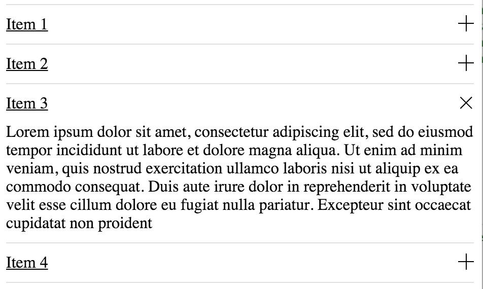
<squeezebox>
    <sb-item>
        <sb-item-head>Title 1</sb-item-head>
        <sb-item-body>Lorem ipsum dolor sit amet</sb-item-body>
    </sb-item>
</squeezebox>
or iterate a data list
<squeezebox>
    <sb-item  *ngFor="let item of itemsList">
        <sb-item-head>{{item.title}}</sb-item-head>
        <sb-item-body>{{item.description}}</sb-item-body>
    </sb-item>
</squeezebox>
Styles needs to be included or imported, also feel free to modify the styles:
@import '@kevinpqh/squeezebox/assets/styles/styles.css';
-
multiple:boolean (default: true) => this attribute enable/disable the multiple item expanded at the same time, for example:
... <squeezebox [multiple]="false"> ... -
collapsed:boolean (default: true) => this attribute enable/disable collapse from the beginning when component is rendered, for example:
... <sb-item [collapsed]="false"> ... -
collapsed:boolean (default: true) => this attribute enable/disable collapse from the beginning when component is rendered, for example:
... <sb-item [collapsed]="false"> ...
-
onToggled => this output is triggered everytime item is expanded or collapsed, returns
trueif collapsed orfalseif expanded, for example:
<sb-item  *ngFor="let item of itemsList" (onToggled)="itemWasToggled($event)">
   ...
</sb-item>

...

itemWasToggled(event) {
    console.log('collapsed:', event);
}
...
-
refresh => This method is useful when accordion is hidden for example when using tabs or panels that go visible and hidden. It can be called from a SqueezeBox reference via
@ViewChildor@ViewChildren, for example following code can refresh all the available squeezeboxes in the current component :
...
@ViewChildren(SqueezeBox) squeezeboxes: QueryList<SqueezeBox>;
...

...
onTabActive(event:Event) {
    event.preventDefault();
    this.squeezeboxes.toArray().forEach(function(s) {
        s.refresh();
    });
}
...