⚡ Phelia
React for Slack Apps
Build interactive Slack apps without webhooks or JSON headache. If you know React, you know how to make a Slack app.
Quick start
-
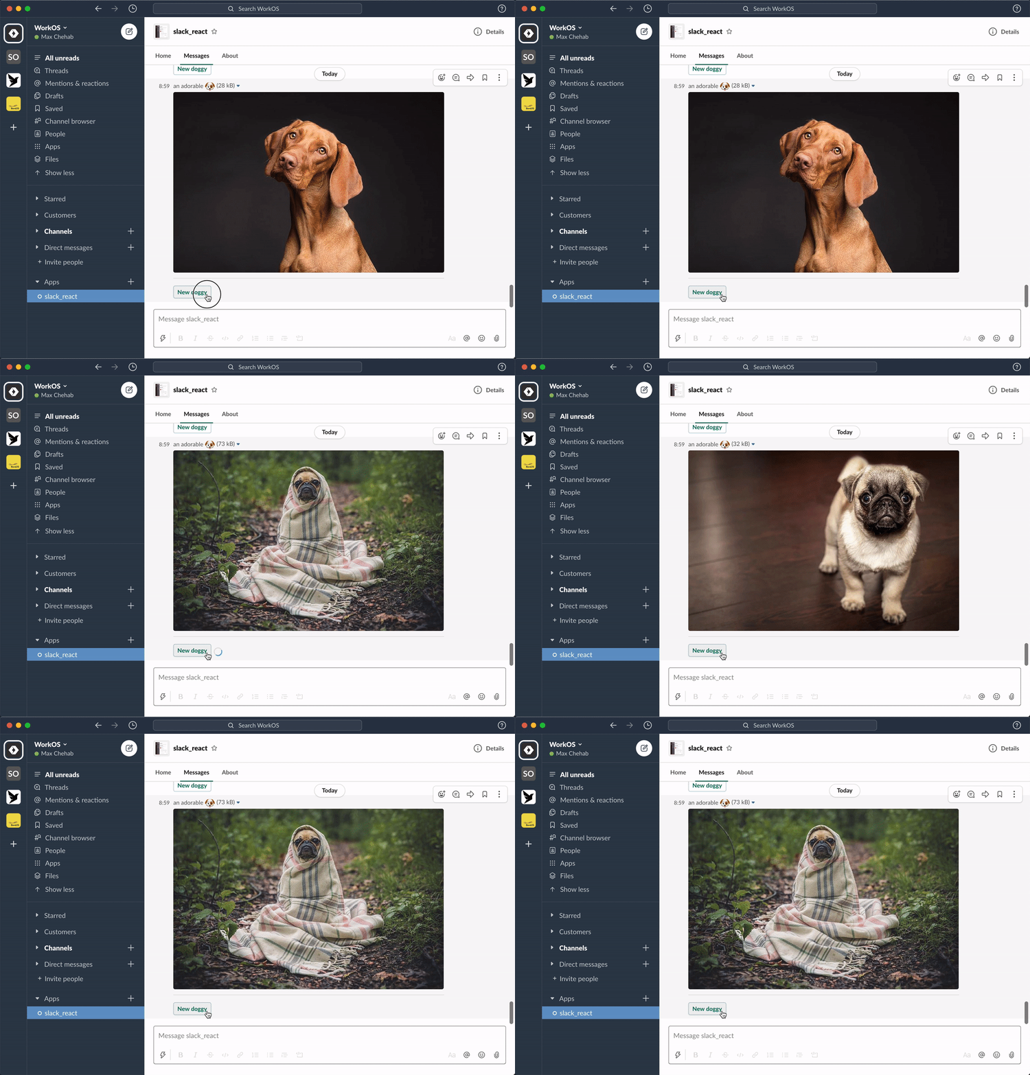
Create your message with React:
import randomImage from "../utils";

export function RandomImage({ useState }: PheliaMessageProps) {
  const [imageUrl, setImageUrl] = useState("imageUrl", randomImage());

  return (
    <Message text="Choose a dog">
      <ImageBlock
        title="an adorable :dog:"
        alt="a very adorable doggy dog"
        imageUrl={imageUrl}
        emoji
      />
      <Divider />
      <Actions>
        <Button
          style="primary"
          action="randomImage"
          onClick={() => setImageUrl(randomImage())}
        >
          New doggy
        </Button>
      </Actions>
    </Message>
  );
}
-
Register your component
const client = new Phelia(process.env.SLACK_TOKEN);

app.post(
  "/interactions",
  client.messageHandler(process.env.SLACK_SIGNING_SECRET, [RandomImage])
);

client.postMessage(RandomImage, "@max");
-
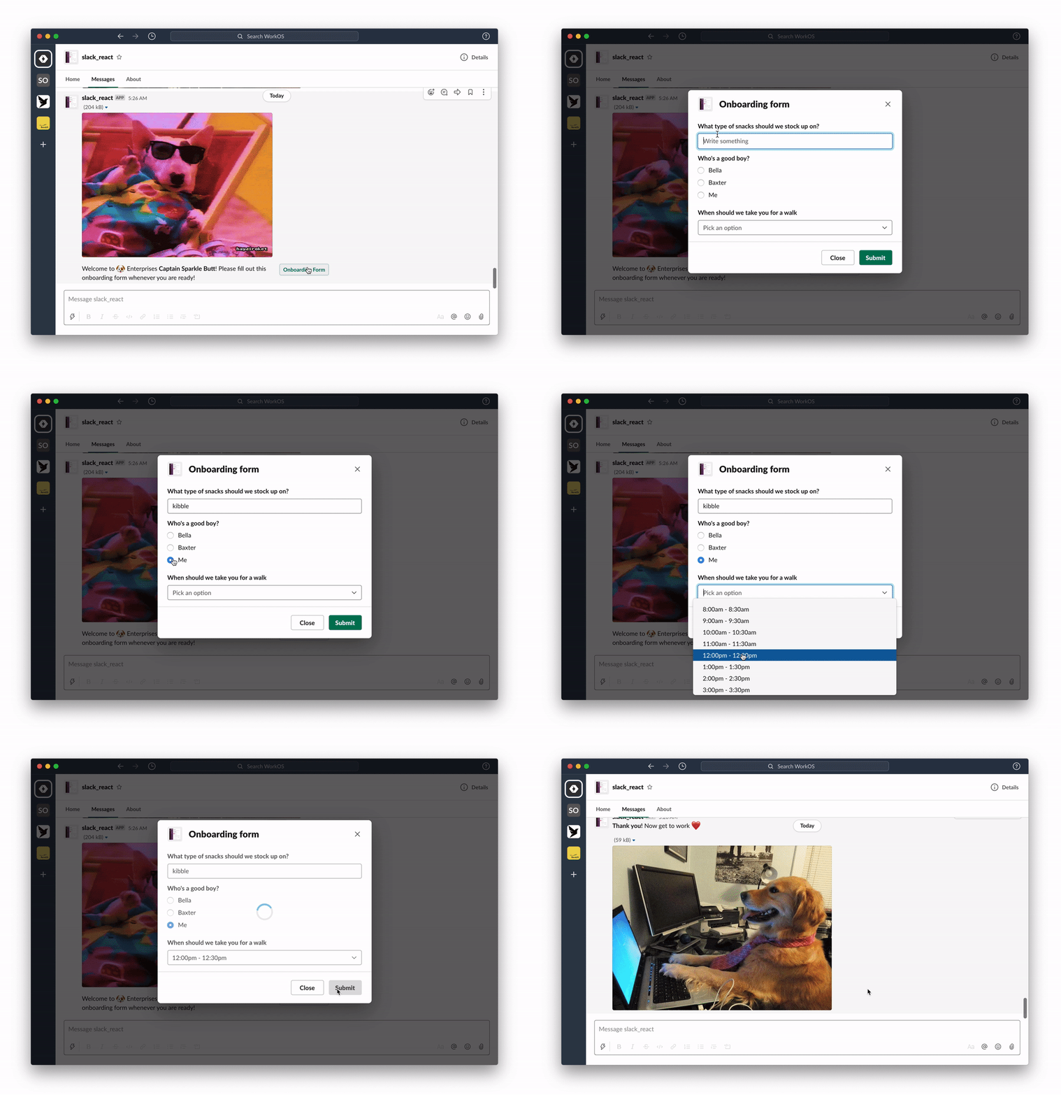
Interact with your message:
See: docs for more info or join our community Slack.
How this works
Phelia transforms React components into Slack messages by use of a custom React reconciler. Components (with their internal state and props) are serialized into a custom storage. When a user interacts with a posted message Phelia retrieves the component, re-hydrates it's state and props, and performs any actions which may result in a new state.
Components
Each component is a mapping of a specific object type for a slack block. There are 3 categories of components, each with special rules for how that component can be used with other components.
- Surface Components (Message, Home, Modal) - Root components that contains Block Components
- Block Components (Actions, Context, Divider, Image, Input, Section) - Direct descendants of a Surface Component. Contains Block Components
- Block Element Components (Text, CheckBoxes, TextField, etc) - Direct descendants of a Block Components.
Feature Support
To request a feature submit a new issue.


