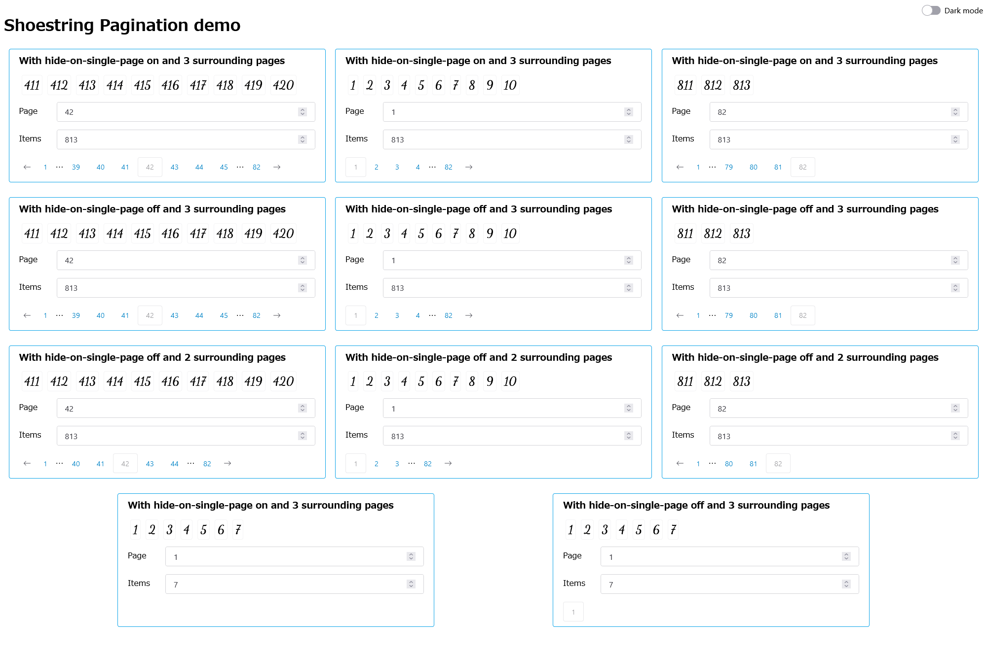
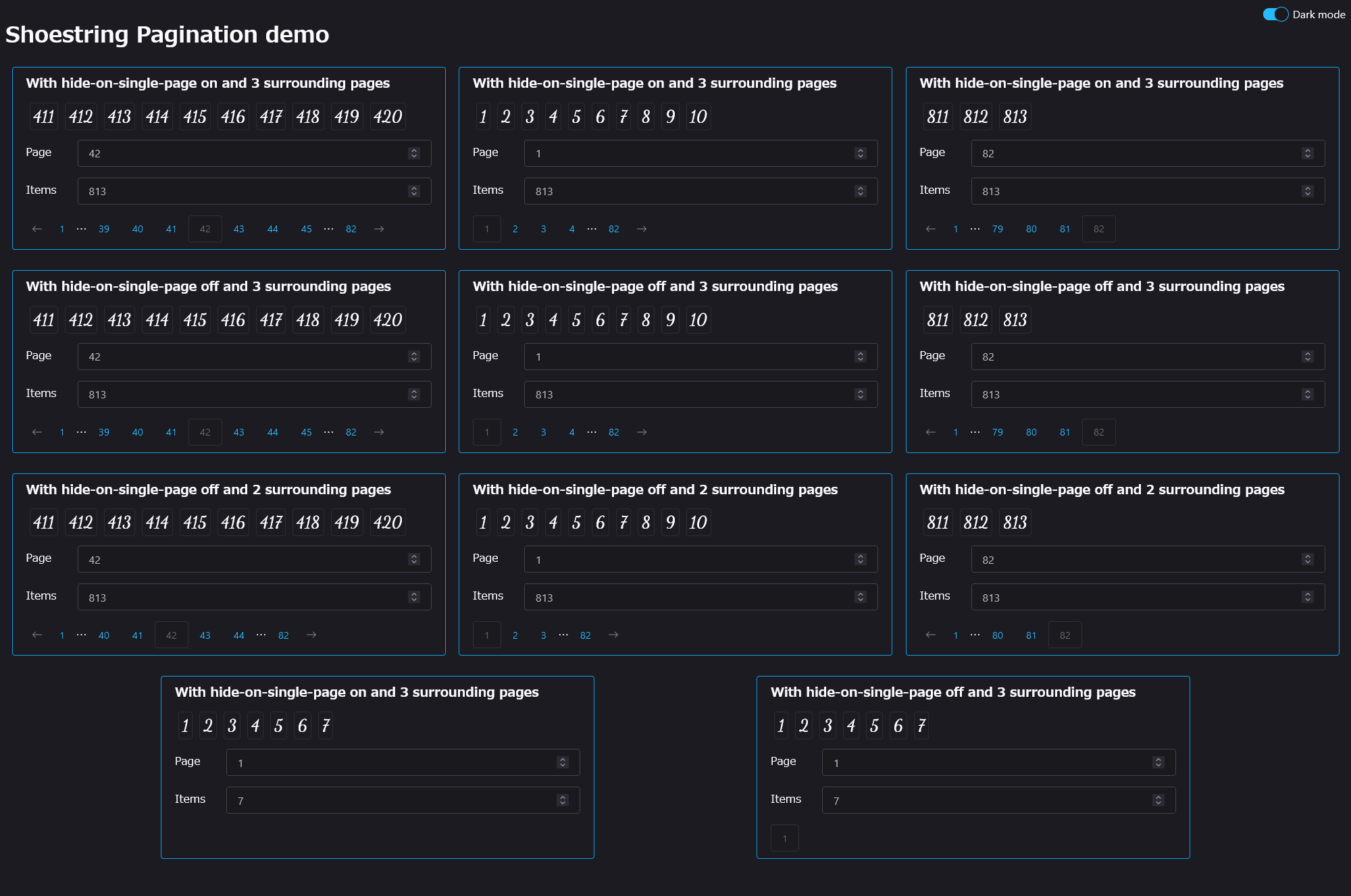
<shoestring-pagination>
A web component for pagination that uses Shoelace buttons for consistent UI.
Written with Lit 3.0, but you can use it anywhere you can use Shoelace!
Usage
<shoestring-pagination
  hide-on-single-page
  surrounding-pages="3"
  current="42"
  total="813"
></shoestring-pagination>
Example use in Lit:
import '@lalomartins/shoestring-pagination';

class MyPagedThing extends LitElement {
  // …

  render() {
    return html`
      <shoestring-pagination
        hide-on-single-page
        surrounding-pages="3"
        current=${currentPage}
        total=${items.length}
        @page-change=${this._setPage}
      ></shoestring-pagination>
    `;
  }
}
customElements.define('my-paged-thing', MyPagedThing);
If you're using Shoelace in your own project and you want to avoid loading two different copies, import like this:
import '@shoelace-style/shoelace/dist/components/switch/switch.js';
import '@shoelace-style/shoelace/dist/components/icon/icon.js';
import '@lalomartins/shoestring-pagination/shoestring-pagination.js';
Otherwise, if you want to use the bundled Shoelace, do this somewhere in your project (just once):
import {setBasePath} '@lalomartins/shoestring-pagination';
// …
setBasePath("node_modules/@lalomartins/shoestring-pagination/node_modules/@shoelace-style/shoelace/dist/");
(You can also use CDNed Shoelace if you prefer.)
API
Attributes:
- current - The current page
- total - Total number of items
- page-size (default: 10) - How many items are in a page
- surrounding-pages (default: 2) - How many pages to display before and after current at most
- hide-on-single-page - If set, and all items fit in one page, hide the element
If accessing props directly in JS (or Lit's .prop=${}), convert the names to camelCase, e.g. pageSize.
Events:
- page-change - Indicates when the page changes; value is in
event.detail.page
Install
npm i @lalomartins/shoestring-pagination
You don't need to import Shoelace on your own code if you're not using it, but you do need to load your own CSS, whether it's from CDN, or from node_modules, or copying it into your build. You can check the Shoelace install instructions for details.
CDN
<link
  rel="stylesheet"
  href="https://cdn.jsdelivr.net/npm/@shoelace-style/shoelace@2.12.0/cdn/themes/light.css"
/>
<link
  rel="stylesheet"
  href="https://cdn.jsdelivr.net/npm/@shoelace-style/shoelace@2.12.0/cdn/themes/dark.css"
/>
<script
  type="module"
  src="https://cdn.jsdelivr.net/npm/@shoelace-style/shoelace@2.12.0/cdn/shoelace-autoloader.js"
></script>
<script
  type="module"
  src="https://cdn.jsdelivr.net/npm/@lalomartins/shoestring-pagination@1.0.2/cdn/shoestring-pagination.js"
></script>
If the arrows don't show up, tweak your import order to make sure you have the Shoelace base path set before Pagination loads.


