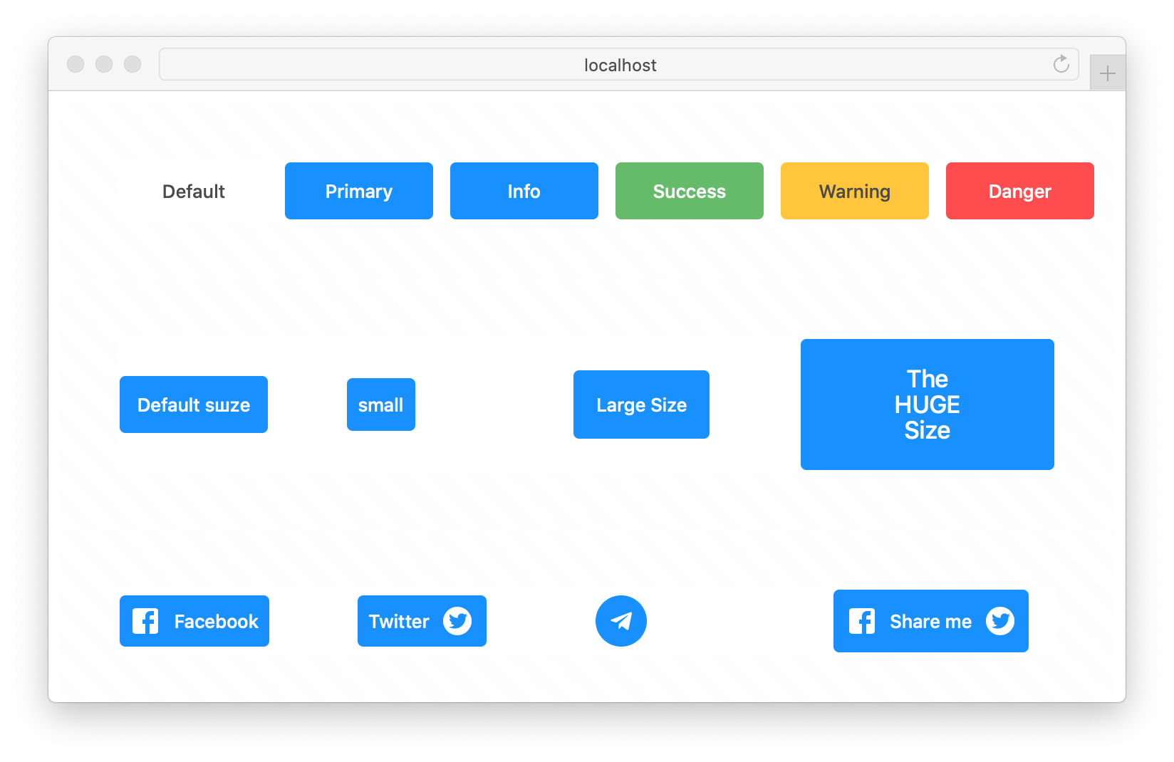
React component for buttons creation
The easiest way to use is to install it from npm and build it into your app with Webpack.
npm install @lskjs/buttonThen use it in your app:
import Button from '@lskjs/button';

const App = (
  <Button variant="primary">Primary button</Button>
);
For more examples and usage, please refer
-
appearance // atlas
-
variants = [ // bootstrap default primary secondary success warning danger info light dark ]
-
views = [ transparent text ]
-
alternatives = [ normal, outline, empty // link ]
-
shape = [ circle ]
-
sizes = [xs, sm, md, lg, xl]
-
states = [ active, focusable, disabled]
-
colors={{}}
See the props documentation for complete documentation on the props react-select supports.
import Button from '@lskjs/button/Button';
import ButtonGroup from '@lskjs/button/ButtonGroup';

export default () => (
  <ButtonGroup>
    <Button variant="primary">Primary button</Button>
    <Button variant="outline-secondary">Secondary Button</Button>
    <Button as="input" type="submit" value="Submit Button" />
    <Button size="lg">Large Button</Button>
    <Button block>Block Button</Button>
    <Button active>Active Button</Button>
    <Button disabled>Disabled Button</Button>
    <Button type="primary" shape="circle" icon={<SearchOutlined />} />
  </ButtonGroup>
)
See the more examples in Storybook.
- change variants colors
- new variants from theme
пока нету но скоро будет
- withFetch
- withState
- withRipple
// TODO: // TODO: // TODO: - ButtonGroup
- Dropdown
- Menu
- Tutorial
- Docs
- Storybook
- Changelog
- Please read CONTRIBUTING.md for details on our code of conduct, and the process for submitting pull requests to us.
|
Igor Suvorov 💻 🎨 🤔 |
Thanks goes to these wonderful people (emoji key):
This project is licensed under the MIT License - see the LICENSE file for details
- https://github.com/react-bootstrap/react-bootstrap/blob/master/src/Button.js
- https://react-bootstrap.netlify.com/components/buttons/#buttons
- https://atlaskit.atlassian.com/packages/core/button
- http://elemental-ui.com/buttons
- https://reakit.io/docs/button/
- https://ant.design/components/button/
- Fork it (https://github.com/yourname/yourproject/fork)
- Create your feature branch (
git checkout -b feature/fooBar) - Commit your changes (
git commit -am 'Add some fooBar') - Push to the branch (
git push origin feature/fooBar) - Create a new Pull Request

