
<mwc-card> 

Cards contain content and actions about a single subject.
For additional information, see the API.
MWC Card encapsulates MDC Card.
Installation
npm install @maicol07/mwc-cardNOTE: The Material Web Components are distributed as ES2017 JavaScript Modules, and use the Custom Elements API. They are compatible with all modern browsers including Chrome, Firefox, Safari, Edge, and IE11, but an additional tooling step is required to resolve bare module specifiers, as well as transpilation and polyfills for Edge and IE11. See here for detailed instructions.
Example Usage
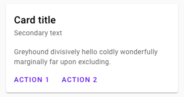
Standard
<mwc-card>
  Content
</mwc-card>
Outlined card
Just add the outlined attribute.
<mwc-card outlined>
  Content
</mwc-card>
Primary action
If a majority of the card (or even the entire card) should be actionable, you can add the background attribute to add a background image to the card (the value of this attribute should be the URL/path to your image). You can also add a title attribute to display it in front of the image. You can also add an aspect-ratio attribute to choose the format of the background image (check attributes below) or use the media-content and primaryAction-content slots (check slots below).
<mwc-card background="myImage.png" title="MyCard">
  Content
</mwc-card>
Actions
This area is used to show different actions the user can take, typically at the bottom of a card.
Buttons
You can add buttons in your card via the actionButtons slot:
<mwc-card>
  Content
  <div slot="actionButtons">
    <mwc-button label="Action 1"/>
    <mwc-button label="Action 2"/>
  </div>
</mwc-card>
Icon Buttons
You can add icon buttons in your card via the actionIcons slot:
<mwc-card>
  Content
  <div slot="actionIcons">
    <mwc-button label="Action 1"/>
    <mwc-button label="Action 2"/>
  </div>
</mwc-card>
API
Slots
| Name | Description |
|---|---|
| default | The card contents |
header |
Content to display in the primaryAction header |
mediaContent |
Content to display on the background image |
primaryActionContent |
Content to display in the primary action section |
actionButtons |
Actions (i.e. some mwc-button) to display in the card footer |
actionIcons |
Icon actions (i.e. some mwc-icon-button) to display in the card footer |
Attributes
| Name | Type | Default | Description |
|---|---|---|---|
outlined |
boolean |
false |
Removes the shadow and displays a hairline outline instead. |
disabled |
boolean |
false |
Disables ripple effect on the primary action |
background |
string |
'' |
Path or URL of the background image in the Primary Action section |
aspectRatio |
string |
16-9 |
Aspect ratio of the background image in the Primary Action section |
title |
string |
'' |
Title to display as first text in the card or on the primary action image if background has a value |
subtitle |
string |
'' |
Subtitle to display below the card title or below primary action image if background has a value |
full-bleed-actions |
string |
'' |
Removes the action area's padding and causes its only child to consume 100% of the action area's width. |
Methods
None
Events
None
CSS Custom Properties
| Name | Default | Description |
|---|---|---|
--mdc-card-width |
350px |
Specifies the width of the card. |
--mdc-card-height |
350px |
Specifies the height of the card. |
--mdc-card-height |
16px |
Specifies the padding of the card. |