Tooltip
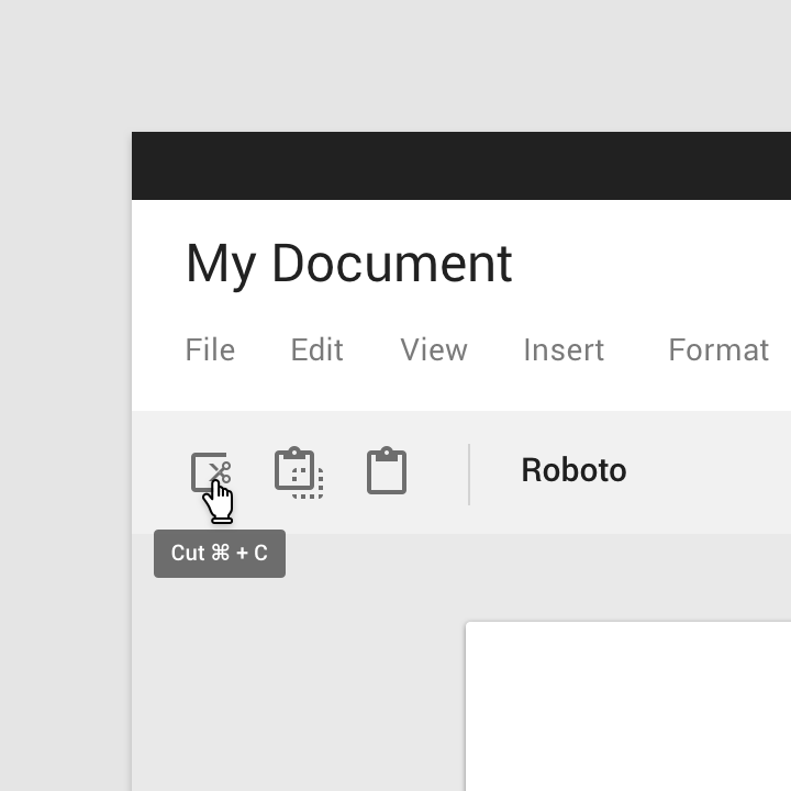
Tooltips display informative text when users hover over, focus on, or tap an element.
Contents
Using tooltips
Plain tooltips, when activated, display a text label identifying an element, such as a description of its function. Tooltips should include only short, descriptive text and avoid restating visible UI text.
Common use cases include:
- Displaying full text that has been truncated
- Identifying a UI affordance
- Describing differences between similar elements
- Distinguishing actions with related iconography
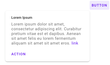
Rich tooltips provide greater context and assistance for taking action through the additions of an optional title and buttons.
Common use cases include:
- Guidance on a particular section of the page or object
- Providing informative and contextual actions
Installing tooltips
npm install @material/tooltip
Styles
@use "@material/tooltip/styles";JavaScript instantiation
import {MDCTooltip} from '@material/tooltip';
const tooltip = new MDCTooltip(document.querySelector('.mdc-tooltip'));
See Importing the JS component for more information on how to import JavaScript.
Making tooltips accessible
Each tooltip element placed into the DOM is expected to have a unique id.
Their corresponding anchor element must be labeled with the aria-describedby
attribute, establishing a relationship between the two elements.
Anchor elements for rich tooltips without interactive contents (a link or an
action button), are similarly labeled with aria-describedby. Rich tooltips
without interactive content also have the aria-role tooltip.
Anchor elements for rich tooltips with interactive elements are labeled with
data-tooltip-id. This prevents the screen reader from announcing the contents
prior to the user navigating into the tooltip, and giving focus to the
interactive elements. Rich tooltips with interactive content have the aria-role
dialog instead of tooltip and their anchor elements has their
aria-haspopup property set to dialog, and aria-expanded set to the
visibility of the interactive rich tooltip.
Tooltips
There are two types of tooltips:
Plain tooltips
Plain tooltip example
<div id="tooltip-id" class="mdc-tooltip" role="tooltip" aria-hidden="true">
  <div class="mdc-tooltip__surface mdc-tooltip__surface-animation">
    lorem ipsum dolor
  </div>
</div>
To ensure proper positioning of the tooltip, it's important that this tooltip
element is an immediate child of the <body>, rather than nested underneath the
anchor element or other elements.
<a aria-describedby="tooltip-id" href="www.google.com"> Link </a>The aria-describedby attribute (which is given the id for the associated
tooltip) designates an element as being the anchor element for a particular
tooltip.
Other MDC components can be designated as anchor elements by adding this attribute.
Rich tooltips
Rich tooltips have two variants: default and persistent.
Default rich tooltips are shown when users hover over or focus on their anchor element. They remain shown when users focus/hover over the contents of the rich tooltip, but becomes hidden if the users focus/hover outside of the anchor element or the tooltip contents. If the user clicks within the contents of the tooltip, the tooltip will also be hidden.
Persistent rich tooltips' visibility is toggled by clicks and enter/space bar keystrokes on their anchor element. When shown, they remain visible when users focus/hover over the contents of the rich tooltip, as well as when users hover outside of the anchor element or the tooltip contents. However, they become hidden when the users focus outside of the anchor element or the tooltip contents. If the user clicks within the contents of the tooltip, the tooltip remains shown. If the user clicks outside the contents of the tooltip, the tooltip will be hidden. It is recommended that persistent rich tooltips are not added to anchor elements that already have an click action; the click action for the anchor element should be used solely to toggle the visibility of the rich tooltip.
Rich tooltip example
Default rich tooltip without interactive content
<div class="mdc-tooltip-wrapper--rich">
  <button class="mdc-button" aria-describedby="tt0">
    <div class="mdc-button__ripple"></div>
    <span class="mdc-button__label">Button</span>
  </button>
  <div id="tt0" class="mdc-tooltip mdc-tooltip--rich" aria-hidden="true" role="tooltip">
     <div class="mdc-tooltip__surface mdc-tooltip__surface-animation">
       <p class="mdc-tooltip__content">
         Lorem ipsum dolor sit amet, consectetur adipiscing elit. Curabitur
         pretium vitae est et dapibus. Aenean sit amet felis eu lorem fermentum
         aliquam sit amet sit amet eros.
       </p>
     </div>
  </div>
</div>
The rich tooltip element should be a sibling of the anchor element; the anchor
and the tooltip element should be wrapped in a parent div with the class
mdc-tooltip-wrapper--rich or the tooltip will not be positioned correctly.
Default rich tooltip with interactive content
<div class="mdc-tooltip-wrapper--rich">
  <button class="mdc-button" data-tooltip-id="tt0" aria-haspopup="dialog" aria-expanded="false">
    <div class="mdc-button__ripple"></div>
    <span class="mdc-button__label">Button</span>
  </button>
  <div id="tt0" class="mdc-tooltip mdc-tooltip--rich" aria-hidden="true" role="dialog">
     <div class="mdc-tooltip__surface mdc-tooltip__surface-animation">
        <h2 class="mdc-tooltip__title"> Lorem Ipsum </h2>
        <p class="mdc-tooltip__content">
          Lorem ipsum dolor sit amet, consectetur adipiscing elit. Curabitur
          pretium vitae est et dapibus. Aenean sit amet felis eu lorem fermentum
          aliquam sit amet sit amet eros.
          <a class="mdc-tooltip__content-link" href="google.com">link</a>
        </p>
        <div class="mdc-tooltip--rich-actions">
            <button class="mdc-button">
              <div class="mdc-button__ripple"></div>
              <span class="mdc-button__focus-ring"></span>
              <span class="mdc-button__label">Action</span>
            </button>
        </div>
     </div>
  </div>
</div>
Note that any links used within the rich tooltip has the class
mdc-tooltip__content-link. This is to ensure that the color of links within
rich tooltips are consistent with the color theming.
Persistent rich tooltip with interactive content
<div class="mdc-tooltip-wrapper--rich">
  <button class="mdc-button" data-tooltip-id="tt0" aria-haspopup="dialog" aria-expanded="false">
    <div class="mdc-button__ripple"></div>
    <span class="mdc-button__label">Button</span>
  </button>
  <div id="tt0" class="mdc-tooltip mdc-tooltip--rich" aria-hidden="true" tabindex="-1" data-mdc-tooltip-persistent="true" role="dialog">
     <div class="mdc-tooltip__surface mdc-tooltip__surface-animation">
        <h2 class="mdc-tooltip__title"> Lorem Ipsum </h2>
        <p class="mdc-tooltip__content">
          Lorem ipsum dolor sit amet, consectetur adipiscing elit. Curabitur
          pretium vitae est et dapibus. Aenean sit amet felis eu lorem fermentum
          aliquam sit amet sit amet eros.
          <a class="mdc-tooltip__content-link" href="google.com">link</a>
        </p>
        <div class="mdc-tooltip--rich-actions">
          <button class="mdc-button">
            <div class="mdc-button__ripple"></div>
            <span class="mdc-button__focus-ring"></span>
            <span class="mdc-button__label">Action</span>
          </button>
        </div>
     </div>
  </div>
</div>
Note that persistent rich tooltips have tabindex set to -1. This is added to
ensure that the tooltip is not hidden when clicked on.
MDC Button:
<button class="mdc-button mdc-button--outlined" aria-describedby="tooltip-id">
  <div class="mdc-button__ripple"></div>
  <span class="mdc-button__label">Button</span>
</button>
MDC Icon Button:
<button class="mdc-icon-button material-icons" aria-describedby="tooltip-id">favorite</button>If the information provided in the tooltip is duplicated from the anchor
element's aria-label, the tooltip can be hidden from the screenreader by
annotating the anchor element with data-tooltip-id instead of
aria-describedby. Hiding the tooltip from the screenreader will prevent the
same information from being announced twice (once from the aria-label and a
second time from the tooltip).
<button class="mdc-icon-button material-icons"
        aria-label="toggle favorite"
        data-tooltip-id="tooltip-id">
  favorite
</button>

<div id="tooltip-id" class="mdc-tooltip" role="tooltip" aria-hidden="true">
  <div class="mdc-tooltip__surface mdc-tooltip__surface-animation">
    toggle favorite
  </div>
</div>
Tooltip positioning
Tooltip positioning is based on the anchor element.
Plain tooltips appear directly below or above this anchor element and can be placed flush with either the end, center, or start of the anchor.
*Plain tooltip aligned with the end, center, and start of an anchor element (in a LTR page flow).*
Rich tooltips appear directly below or above this anchor element, and can be placed at the corner of either the end or start of the anchor.
*Rich tooltip aligned with the end and start of an anchor element (in a LTR page flow).*
A threshold distance of 32px is expected to be maintained between the tooltip and the viewport edge. A valid tooltip position is calculated based on which of the position options (start, center, or end for x-axis alignment and above or below for y-axis alignment) maintain this threshold. If all possible alignment options violate the threshold, then a valid tooltip position is one that does not collide with the viewport.
A user specified position is honored only if the specified position is considered valid based on the logic outlined above.
API
Sass mixins
Access to theme mixins require importing the tooltip's theme style module.
@use "@material/tooltip";| Mixin | Description |
|---|---|
fill-color($color) |
Sets the fill color of the tooltip. |
rich-fill-color($color) |
Sets the fill color of the rich tooltip. |
label-ink-color($color) |
Sets the color of the tooltip's label text. |
rich-text-ink-color($title-color, $content-color, $content-link-color) |
Sets the color of the text for the content inside a rich tooltip. |
shape-radius($radius, $rtl-reflexive) |
Sets the rounded shape to tooltip surface with given radius size. Set $rtl-reflexive to true to flip radius values in RTL context, defaults to false. |
word-break($value, $fallbackValue) |
Sets the word-break property for the tooltip label. This is used to force-wrap long tooltip labels that lack spaces and hyphens. The optional $fallbackValue param can be used for IE11 as it does not support the break-word option. Users for IE11 who do not want their tooltip labels to be broken in the middle of the word can use this mixin to remove the default IE11 behavior of break-all. |
z-index($z-index) |
Sets the z-index of the tooltip. |
show-transition($enter-duration) |
Sets the duration for the animation that shows the tooltip. |
exit-transition($exit-duration) |
Sets the duration for the animation that hides the tooltip. |
rich-max-height($max-height) |
Sets the max-height of a rich tooltip. |
MDCTooltip Methods
| Method Signature | Description |
|---|---|
setTooltipPosition(position: {xPos?: XPosition, yPos?: YPosition}) => void |
Specify how the tooltip should be aligned with the anchor element. See tooltip positioning section for more information. |
setAnchorBoundaryType(type: AnchorBoundaryType) => void |
Specify whether the anchor element is bounded (element has an identifiable boundary such as a button) or unbounded (element does not have a visually declared boundary such as a text link). Tooltips are placed closer to bounded anchor elements compared to unbounded anchor elements. If no type is specified, defaults to bounded. |
hide() => void |
Proxies to the foundation's hide method, immediately hides the tooltip if it is shown. |
isShown() => boolean |
Returns whether or not the tooltip is shown. |
attachScrollHandler(addEventListenerFn: (event, handler) => void) |
Provided with a method that registers an event listener on a given element, will attach a scroll event handler on said element when the tooltip is shown. This should be used in situations where the anchor element is placed inside a scrollable container (that is not the body element), and will keep the tooltip "attached" to the anchor element when this element is scrolled. |
removeScrollHandler(removeEventHandlerFn: (event, handler) => void) |
Should be used in conjunction with the above attachScrollHandler method. Removes the additional scroll handlers attached in the above method when the tooltip is hidden. |
setShowDelay(delayMs: number) => void |
Specify the delay prior to a tooltip being shown. |
setHideDelay(delayMs: number) => void |
Specify the delay prior to a tooltip being hidden. |
Usage Within Frameworks
If you are using a JavaScript framework, such as React or Angular, you can create a Tooltip for your framework. Depending on your needs, you can use the Simple Approach: Wrapping MDC Web Vanilla Components, or the Advanced Approach: Using Foundations and Adapters. Please follow the instructions here.
See MDCTooltipAdapter and MDCTooltipFoundation for up-to-date code documentation of tooltip foundation APIs.


