Media Queries with superpowers 

mq()+ is a Sass
library that helps you compose media queries in an elegant way.
If you already use @kaelig's mixin, you know how to use MQ+.
This fork provides various, often much-requested, enhancements over the original mixin.
Features
👋 Note: This fork matches the same version tags of the original package.
- Moved core operations from the mixin to a function
- This separation allows media queries to be chained through the
$andand new$orparameters - Added a
$range-featureparameter to allow media queries to target a different feature (device dimensions, aspect ratios, color, and resolution)
See breaking changes to the API.
A variant of the mixin using Jacket, for rasterization, can be found here:
mj().
Here is a very basic example:
@use 'mq' as * with (
  $breakpoints: (
    mobile: 320px,
    tablet: 740px,
    desktop: 980px,
    wide: 1300px,
  )
);

.foo {
  @include mq($from: mobile, $until: tablet) {
    background: red;
  }
  @include mq($from: tablet, $or: mq($until: mobile)) {
    background: green;
  }
  @include mq($from: 600px, $range-feature: height) {
    font-size: 1.25em;
  }
}
Compiles to:
@media (min-width: 20em) and (max-width: 46.24em) {
  .foo {
    background: red;
  }
}
@media (min-width: 46.25em), (max-width: 19.99em) {
  .foo {
    background: green;
  }
}
@media (min-height: 37.5em) {
  .foo {
    font-size: 125em;
  }
}
How to use it
👋 Note: This library will assume you are familiar with the original mixin and Dart Sass.
-
Install:
- with Bower:
bower install mcaskill-sass-mq@6 --save - with npm:
npm install @mcaskill/sass-mq@6 --save - with yarn:
yarn add @mcaskill/sass-mq@6
OR Download _mq.scss into your Sass project.
- with Bower:
-
Import the partial in your Sass files and override default settings with your own preferences:
// Name your breakpoints in a way that creates a ubiquitous language
// across team members. It will improve communication between
// stakeholders, designers, developers, and testers.
$breakpoints: (
  mobile: 320px,
  tablet: 740px,
  desktop: 980px,
  wide: 1300px,
  // Tweakpoints
  desktopAd: 810px,
  mobileLandscape: 480px,
);

// If you want to display the currently active breakpoint in the top
// right corner of your site during development, add the breakpoints
// to this list, ordered by width. For examples: (mobile, tablet, desktop).
$show-breakpoints: (mobile, mobileLandscape, tablet, desktop, wide);

@use 'path/to/mq' with (
  $breakpoints: $breakpoints,
  $show-breakpoints: $show-breakpoints,
  $range-feature: height
);
Breaking changes
While the original mixin takes up to five parameters, the enhanced mixin and function take up to seven parameters which changes the position of the last two parameters:
  @mixin mq(
    $from: false,                   // One of the mapped breakpoints
    $until: false,                  // One of the mapped breakpoints
    $and: false,                    // Additional media query parameters
+   $or: false,                     // Alternate media query parameters
+   $range-feature: $range-feature  // Media range feature (width, height…)
    $media-type: $media-type,       // Media type (screen, print…)
    $breakpoints: $breakpoints      // Map of breakpoints
  )
Responsive mode
mq() takes up to four optional parameters:
-
$from: inclusivemin-*boundary -
$until: exclusivemax-*boundary -
$and: additional custom directives -
$or: alternate custom directives
Note that $until as a keyword is a hard limit i.e. it's breakpoint - 1.
@use 'mq';

.responsive {
  // Apply styling to mobile and upwards
  @include mq.mq($from: mobile) {
    color: red;
  }
  // Apply styling up to devices smaller than tablets (exclude tablets)
  @include mq.mq($until: tablet) {
    color: blue;
  }
  // Same thing, in landscape orientation
  @include mq.mq($until: tablet, $and: '(orientation: landscape)') {
    color: hotpink;
  }
  // Apply styling to tablets up to desktop (exclude desktop)
  @include mq.mq(tablet, desktop) {
    color: green;
  }
}
Adding custom breakpoints
@include add-breakpoint(tvscreen, 1920px);

.hide-on-tv {
  @include mq(tvscreen) {
    display: none;
  }
}
Seeing the currently active breakpoint
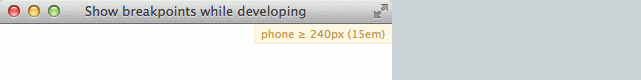
While developing, it can be nice to always know which breakpoint is
active. To achieve this, set the $show-breakpoints variable to
be a list of the breakpoints you want to debug, ordered by width.
The name of the active breakpoint and its pixel and em values will
then be shown in the top right corner of the viewport.
// Adapt the list to include breakpoint names from your project
$show-breakpoints: (phone, phablet, tablet);

@use 'path/to/mq' with (
  $show-breakpoints: $show-breakpoints
);
Changing range feature
If you want to specify a range feature, for example to write breakpoints
for height first, set $range-feature:
SCSS
@use 'mq' with (
  $range-feature: height
);

.hero {
  @include mq.mq(mobile) {
    height: 300px;
  }
}
CSS output
@media screen and (max-height: 19.99em) {
  .hero {
    height: 300px;
  }
}
Changing media type
If you want to specify a media type, for example to output styles
for screens only, set $media-type:
SCSS
@use 'mq' with (
  $media-type: screen
);

.screen-only-element {
  @include mq.mq(mobile) {
    width: 300px;
  }
}
CSS output
@media screen and (max-width: 19.99em) {
  .screen-only-element {
    width: 300px;
  }
}
Implementing sass-mq in your project
Please see the examples folder which contains a variety of examples on how to implement "sass-mq"
Backward compatibility with @import
Just in case you need to have backward compatibility and want to use@import instead of @use,
you can do so by importing _mq.import.scss instead of _mq.scss.
Please see legacy.scss on examples folder.
Running tests
npm testGenerating the documentation
Sass MQ is documented using SassDoc.
Generate the documentation locally:
sassdoc .Generate & deploy the documentation to https://mcaskill.github.io/sass-mq/:
npm run sassdocSass MQ was crafted in-house at the Guardian and is improved upon by many contributors.
Thank you to @kaelig, @sndrs, @area73, and contributors for the original mixin.