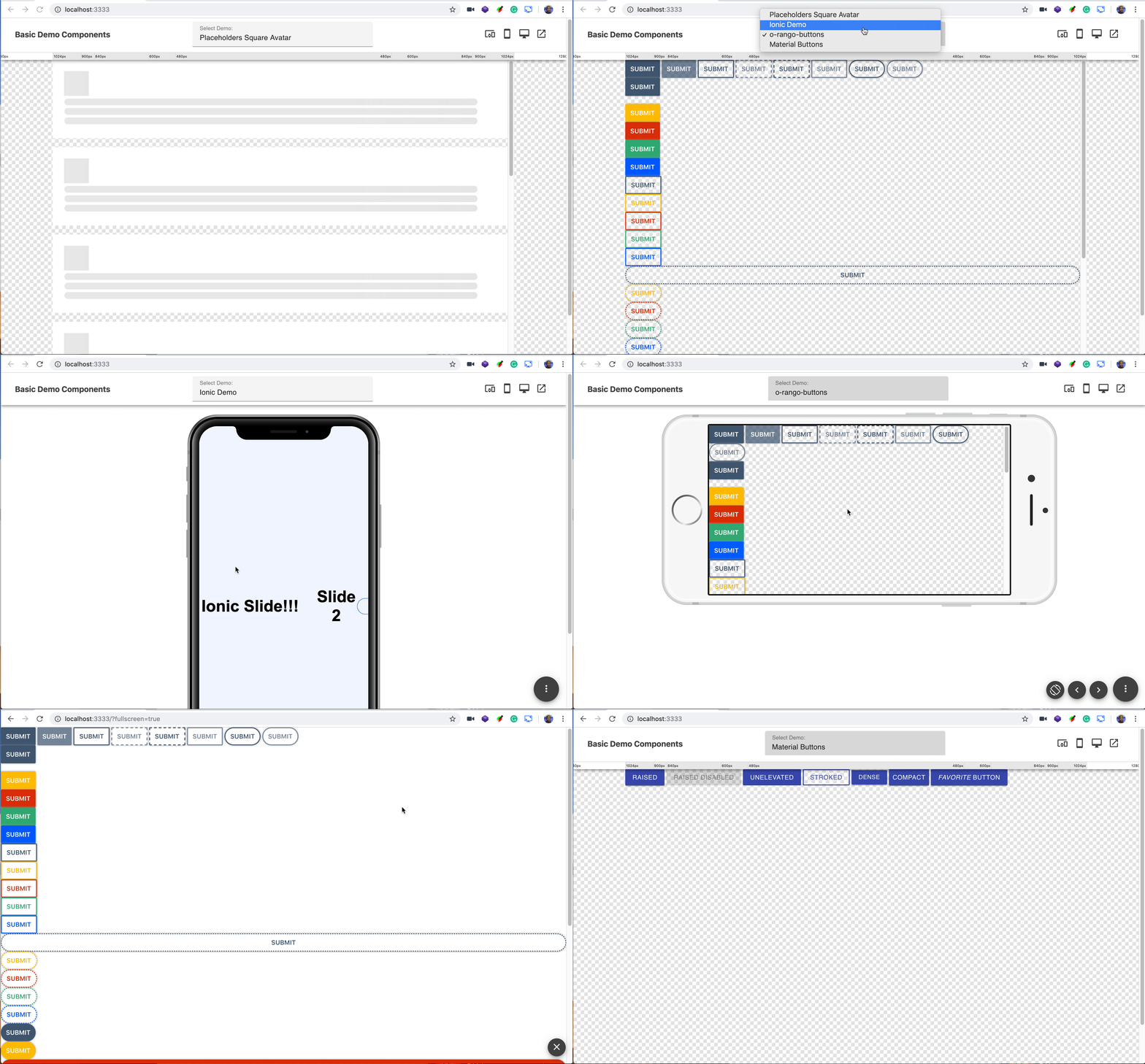
Breaking change UNPKG : To correctly load library from UNPKG use 1.0.0 version :
<script async src="https://unpkg.com/@o-rango/orango-demo-tools@1.0.0/dist/orango-demo-tools.js"></script>o-rango: o-demo-bar
Simple and customizable showcase for your components built with Stenciljs
Getting Started
o-demo-bar is a simple and flexible demo bar component for developers and showcase your components, heavily inspired in storybook.js.org having the main goal to work directly with all JS frameworks, being based in web component standards and built with stencilsjs.
Initial working version
Install
Script tag
- Put a script tag similar to this
<script src="https://unpkg.com/@o-rango/orango-demo-tools/dist/orango-demo-tools.js"></script>in the head of your index.html - Then you can add o-demo-case tags in your code
Node Modules
- Run
npm install o-rango/orango-demo-tools --save-dev - Put a script tag similar to this
<script src='@o-rango/orango-demo-tools/dist/orango-demo-tools.js'></script>in the head of your index.html - Then you can add o-demo-case tags in your code
Usage
Simple usage with no dependencies and 2 demo cases
after include o-demo-tools in your index.html you can start building your demos using the following code and add script tags for your demos
    <o-demo-bar name="Material Demo">
         <o-demo-case name="Buttons Click">
           <template>
          <button onClick="showMe(event)">click me </button>
              <script>
                  function showMe(evt){
                      alert(evt);
                  }
              </script>
               <template>
         <o-demo-case>

        <o-demo-case name="Buttons Alert">
           <template>
           <button onClick="showMe2(event)">click me </button>
              <script>
                  function showMe2(evt){
                      alert(evt);
                  }
              </script>
               <template>
         <o-demo-case>
</o-demo-bar> <o-demo-bar name="Material Demo">
<o-demo-case name="Placeholders Rounded Avatar">
<template>
<script src="https://unpkg.com/@o-rango/o-content-placeholder@0.1.1/dist/o-content-placeholder.js"></script>
<style>
// Place Your Styles
.container {
background-color: white;
width: 90%;
margin: auto auto;
padding: 20px 25px 25px 20px;
margin-bottom: 20px;
}
</style>
<div class="container">
<o-content-placeholder-img size="55" animate="true" format="circle"></o-content-placeholder-img>
<o-content-placeholder-block line-height="10" random-size="true" animate="true" lines="5"></o-content-placeholder-block>
</div>
</template>
</o-demo-case>
... all your demo cases
</o-demo-bar>Listen events from your components
If you want o-demo-bar to listen certain events from your components just add the your events with events attribute and a toast will show the payload of the event when triggered
    <o-demo-bar name="Material Demo" events="myEvents,myAnotherEvent">
    </o-demo-bar>
RoadMap / Todo's
- Add resizer options for mobiles using Marvel Devices
- Fix and improve desktop resizer inspired in Resizer
- Add posibility to change background color and patterns in context menu
- Store Preferences in localstorage
- Show Code panel
Contributing
We welcome contributions to O-RANGO projects!
- ⇄ Pull requests and ★ Stars are always welcome.

