Welcome to the react wrapper of Openbridge Web Components!
We are currently developing the code in a joint industry project, with funding from industry partners. The code is only available for the partners until the release in March 2026. It is possible to get access to the code in active development by joining the project.
👉 Click here to read more about the project.
❗Caution❗ This repository is currently in early development and may not be stable. Please use with caution.
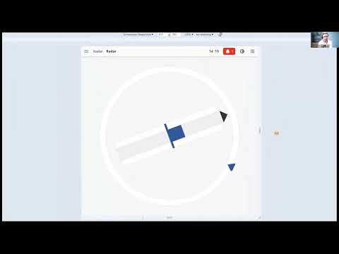
We have made an short introduction to the library. You can watch it here
Join our discord server to get the latest updates and to ask questions. Join here.
Storybook is a development environment for UI components. It allows you to browse a component library, view the different states of each component, and interactively develop and test components in isolation.
To access the Storybook for this project, click here.
The demo showcases the project's functionality using react. It provides a live demonstration of the project's features and allows you to interact with the application.
To access the demo, click here.
To use the components in your project, you can install the package from npm:
npm install @oicl/openbridge-webcomponents-reactSee also the react demo
-
Add the css file to your project:
import "@oicl/openbridge-webcomponents/src/palettes/variables.css";
-
Select the pallet by setting the
data-obc-themeattribute on thehtmltag:<html lang="en" data-obc-theme="day"></html>
-
Install the Noto Sans font by using the attached
NotoSans.ttffile. Add the following to your css:@font-face { font-family: "Noto Sans"; src: url("path/to/NotoSans.ttf"); } * { font-family: Noto Sans; }
-
Import the desired components in your project, for instance:
import { ObcTopBar } from "@oicl/openbridge-webcomponents-react/components/top-bar/top-bar";
-
Use the components in your project:
<ObcTopBar></ObcTopBar>
Contributions are welcome!