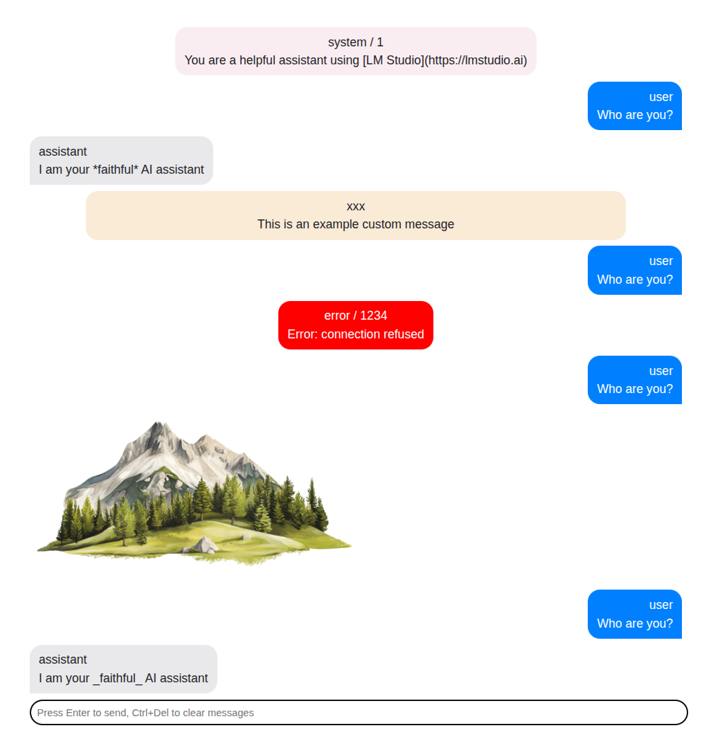
This package implements a simple chat interface for reuse in many projects where a chat is required.
It was created during my study of AI capabilities and since I was creating the same thing over and over again I decided to extract it as a separate package.
To install the package issue the following command:
$ npm install --save-dev @padcom/chat-uiThen in your application add the following:
<template>
  <Chat class="chat">
    <Messages :messages />
    <Prompt placeholder="Press Enter to send" @query="ask" />
  </Chat>
</template>

<script lang="ts" setup>
import { ref } from 'vue'
import { Messages, Prompt type ChatMessage } from '@padcom/chat-ui'

const messages = ref<ChatMessage[]>([
  { id: '1', role: 'system', content: 'You are a helpful and friendly AI assistant' },
  { id: '2', role: 'user', content: 'What is the meaning of life?' },
  { id: '3', role: 'assistant': content: '42' },
])

function ask(question: string) {
  messages.value.push({ id: '4', role: 'user', content: question })
}
</script>

<style>
@import "@padcom/chat-ui/dist/index.css";
</style>
If you want to center the chat on the screen add the following styles:
<style>
/* make sure the body covers the entire visible viewport */
html, body {
  margin: 0;
  padding: 0;
  width: 100dvw;
  height: 100dvh;
}
</style>

<style scoped>
/* control the max width and position */
.chat {
  max-width: clamp(400px, 50%, 50%);
  margin-inline: auto;
}
</style>There is a number of ways you can customize the chat. Pretty much every aspect of the user interface is customizable.
To use a custom message display use the default slot of Messages:
<template>
  <Chat class="chat">
    <Messages v-slot="{ message }" :messages>
      <div class="my-message">{{ message.content }}</div>
    </Messages>
    <Prompt placeholder="Press Enter to send" @query="ask" />
  </Chat>
</template>
Sometimes all you will want is to add some styling to the message. For example,
to add github-markdown-css.
In those cases you can reuse the Message component exposed from the library:
<template>
  <Chat class="chat">
    <Messages v-slot="{ message }" :messages>
      <Message :message class="markdown-body" />
    </Messages>
    <Prompt placeholder="Press Enter to send" @query="ask" />
  </Chat>
</template>

<script lang="ts" setup>
import { ref } from 'vue'
import { Messages, Message, Prompt type ChatMessage } from '@padcom/chat-ui'

...
</script>

<style>
@import "github-markdown-css";
@import "@padcom/chat-ui/dist/index.css";
</style>
Finally, you might want to customize the message displayed while the content of the
message is empty. By default a ... is displayed but you can override it using the default
slot of the Message, like so:
<template>
  <Chat class="chat">
    <Messages v-slot="{ message }" :messages>
      <Message :message>
        Waiting for response...
      </Message>
    </Messages>
    <Prompt placeholder="Press Enter to send" @query="ask" />
  </Chat>
</template>The Prompt component allows for a number of customizations. There are 3 slots in total and all
receive the function ask() and the current question as scope variables.
These slots are to the left and to the right of the input.
This slot by default renders the input. You can use it to for example render a completely different
component for the prompt while retaining the layout. However, if you're going this way you probably
don't want to use the Prompt component at all and you want something custom-made.
The ChatMessage interface is very sparse. Sometimes you might want to include additional information
about the message for custom display.
You can add any property to your messages - the ChatMessage implements indexed properties. However,...
The messages property of Messages component as well as message property of Message component
accept interfaces extended from ChatMessage:
<template>
  <Chat class="chat">
    <Messages v-slot="{ message }" :messages>
      <Message :message class="markdown-body">
        {{ message.extra }}
      </Message>
    </Messages>
    <Prompt placeholder="Press Enter to send" @query="ask" />
  </Chat>
</template>

<script lang="ts">
import { ref } from 'vue'
import { Chat, Messages, Message, Prompt, type ChatMessage } from '.'

interface Msg extends ChatMessage {
  extra?: string
}

const messages = ref<Msg[]>([])
</script>
In which case you'll get full code completion for your custom properties of messages:
The component library will evolve over time. All customizations are usually tested in App.vue,
which is also the playground for me to work with the library.
Usually the format of the message, when chatting with an LLM is markdown.
By default there is no preprocessing done on the content of a Message and so the text is displayed as-is.
To format the message use one of the available message formatters from npm. For example to use the marked install it via npm:
$ npm install --save-dev @padcom/chat-ui-formatter-markedIt registers itself automatically so the only thing you need to do is to make sure it is imported:
import '@padcom/chat-ui-formatter-marked'If you'd like to use a different package for formatting messages, or you'd like them to be presented in a different way (e.g. to display messages in JSON format) you can register your own formatter:
import { setChatMessageFormatter, type: ChatMessage } from '@padcom/chat-ui'

setChatMessageFormatter((message: ChatMessage) => JSON.stringify(message, null, 2))
Please note that in this case the Message needs to be given the markdown-body class as described above.
Colors and direction of messages have been ripped off from iPhone messages app.

