Grid Component
Description
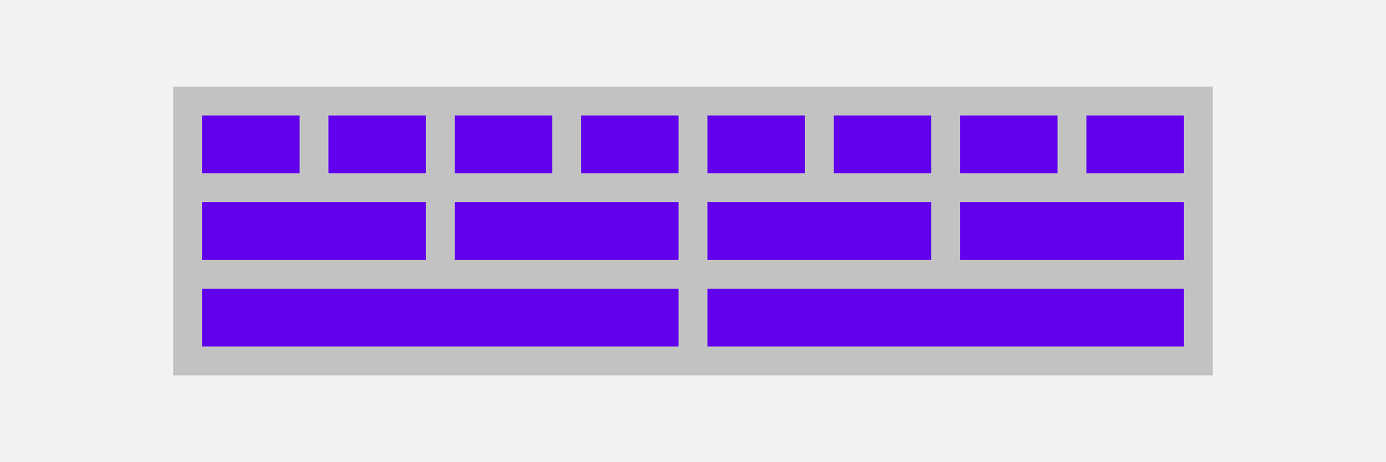
Responsive UI is based on a column-variate grid layout. It has 12 columns on desktop, 8 columns on tablet and 4 columns on phone.
Pitaya-framework template component.
This documentation assumes you are at least slightly familiar with aurelia and its usage. If not, we highly suggest you take a look at its Quick Start section first to get a better understanding of the approaches that are presented it here.


