React Native Chooser
Simple yet fully customizable select menu for React Native.
- Simple: Alot of optional inputs makes it easier to use as you only need to pass inn data for a simple version.
- Customizable: All elements can be changed to you what you need. Custom components can be added.
- Standards: Everything is after React`s latest standards.
- iOS and Android: Supports both platforms out of the box.
PLEASE NOTE: BREAKING CHANGES IN V2.
Installation
npm i react-native-chooser --save
or
yarn add react-native-chooser
Usage
import React, { Component } from 'react';
import {Select, Option} from "react-native-chooser";

import {
  AppRegistry,
  StyleSheet,
  Text,
  View
} from 'react-native';

export default class AwesomeProject extends Component {

  onSelect(data) {
    alert(data);
  }

  render() {
    return (
      <View style={styles.container}>
        <Select
            onSelect = {this.onSelect.bind(this)}
            defaultText  = "Select Me Please"
            style = {{borderWidth : 1, borderColor : "green"}}
            textStyle = {{}}
            backdropStyle  = {{backgroundColor : "#d3d5d6"}}
            optionListStyle = {{backgroundColor : "#F5FCFF"}}
          >
          <Option value = {{name : "azhar"}}>Azhar</Option>
          <Option value = "johnceena">Johnceena</Option>
          <Option value = "undertaker">Undertaker</Option>
          <Option value = "Daniel">Daniel</Option>
          <Option value = "Roman">Roman</Option>
          <Option value = "Stonecold">Stonecold</Option>
          <Option value = "Rock">Rock</Option>
          <Option value = "Sheild">Sheild</Option>
          <Option value = "Orton">Orton</Option>

        </Select>
      </View>
    );
  }
}
Props
Props for Select
| Prop Name | Data Type | Default Values | Description |
|---|---|---|---|
| onSelect | function | null | function that executes on selection of an option |
| defaultText | string | Click To Select | Text to show as default text |
| style | object | null | To style the select box. |
| backdropStyle | object | null | To style the overlay |
| textStyle | object | null | To style the text shown in the box |
| optionListStyle | object | null | To style the selection box |
| transparent | boolean | false | To set the transparent prop on Modal |
| animationType | string | "none" | To set the animationType prop on Modal |
| indicator | string | "none", "up" or "down" | "none" |
| indicatorColor | string | "black" | The color of the indicator arrow |
| indicatorSize | number | 10 | The size of the indicator arrow |
| indicatorStyle | object | null | To style the indicator arrow |
| selected | string | null | Give it same value as you give to Option |
| selectedStyle | object | null | Apply styles to the selected Option |
Functions for Select
| Function Name | Description |
|---|---|
| setSelectedText(text) | Set default text in the select option, often used to reset text. |
Props for Option
| Prop Name | Data Type | Default Values | Description |
|---|---|---|---|
| style | object | null | To style each option |
| styleText | object | null | To style the text shown in the option |
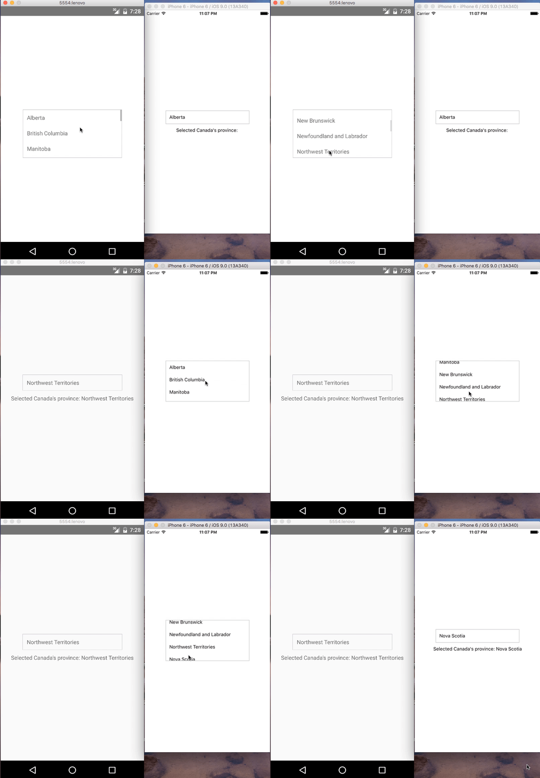
Demo
IOS and Android:
Contributions
Your contributions and suggestions are heartily♡ welcome. (✿◠‿◠)


