button-beans
🍇 Responsive React button primitives built with Styled Components andreact-sugar-styledtheming dictionary.
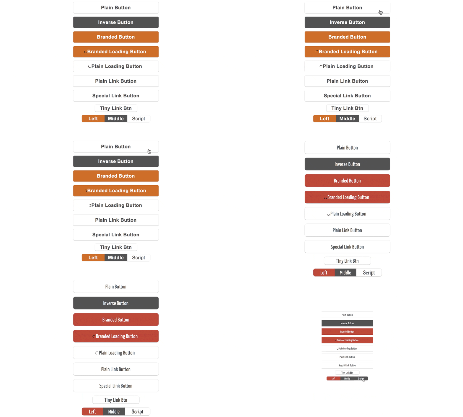
- Responsive with tons of customization and switchable "modes".
- Links and button elements; available in two sizes with wrap elements.
- Built for Styled Components and
react-sugar-styledCSS styling tools.
Installation:
yarn add @roast-cms/react-button-beans
Note that you will also need to install the following dependencies in your project:
"peerDependencies": {
  "@roast-cms/react-sugar-styled": "^1.0.0",
  "react": "^16.0.0",
  "react-dom": "^16.0.0",
  "styled-components": "3.0.2"
}
Then, in your project:
import styled, { ThemeProvider } from "styled-components"
import { Sugar } from "@roast-cms/react-sugar-styled"
//
import { Button } from "@roast-cms/react-button-beans"
//
// your button component
const App = props =>
  <ThemeProvider theme={Sugar()}>
    <Button>My Button</Button>
  </ThemeProvider>
For more comprehensive example uses check out examples here.
Why?
These components were built specifically for use with Styled Components. They are light-weight, and meant for a variety of screens and uses. Although simple in nature, they could be customized in a number of ways and useful in variety of situations.
Available components:
<Button />
Returns <button /> HTML element. Accepts inverse and branded theme props to manipulate colour scheme. Also accepts loading prop that makes it disabled when true but requires loadingComponent prop that's usually an animated SVG or an image. You can use included <Loader /> component available in this package (see below).
<LinkButton />
Returns <a /> HTML element. This component requires linkComponent prop, which can either be a simple "a" for a link, a NavLink component from React Router, or a special link component that either your built or available from @roast-cms/react-link-filter. In case of a simple "a" component, you may want to pass src URL via prop, in other cases involving React Router you'll need to pass to prop.
<TinyButton />
TinyButton is a differently-styled <LinkButton /> component, nothing else is different.
<ButtonStrip />
This is a convenience wrapping component that you may use to create a strip of tiny buttons. This component requires that you have all your buttons as <Item /> components, wrapped in a <div />.
<Item />
These components are styled <TinyButton />/<LinkButton /> components which also take left and right props. It also accepts script prop which, if true, will change the font to the text from title dictionary definition.
<Loader />
This is an animated SVG component that you may use with your <Button /> components.
Contributions welcome!
To get started with the code: clone the repo, run yarn install then yarn start and open up http://localhost:3002 in your browser.
