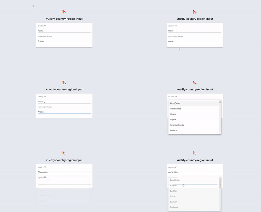
vuetify-country-region-input
This package provides a pair of Vuetify components for countries/region select inputs. Components may be used together or standalone. Vue-i18n is also supported.
Installation
npm i --save @timbouc/vuetify-country-region-input
# or yarn add @timbouc/vuetify-country-region-input
Usage
import Vue from 'vue'
import VCountryRegionSelect from '@timbouc/vuetify-country-region-input'
Vue.use(VCountryRegionSelect)

new Vue({}).$mount('#app')

// then inside your vue components
export default Vue.extend({
  data: () => ({
    country: 'AU',
    region: 'South Australia'
  })
})

<template>
    <v-country-select v-model="country" />
    <v-region-select v-model="region" :country="country" />
</template>
Use standalone
<script>
import { VCountrySelect } from '@timbouc/vuetify-country-region-input'

export default {
  name: 'App',
  components: { VCountrySelect },
  data: () => ({
    country: 'AU',
  })
};
</script>

<template>
    <v-country-select v-model="country" />
</template>
Options
In addition to Vuetify VSelect props, here are the available attributes that can be used with the provided components.
VCountrySelect
| Parameter | Required? | Default | Type | Description |
|---|---|---|---|---|
| v-model | yes | '' | string |
The data binding for your component |
| topCountry | no | '' | string |
By providing this value you will tell component what country to put at the top of the dropdown list for easy selection. Make sure to use country short code. So for United states you would provide 'US'. However, if you set countryName to true make sure to also write out full country name when setting a topCountry. In this scenerio United States would be 'United States'. |
| countryName | no | false | boolean |
By setting this value to true, country names will be output in full instead of using the abbreviated short codes. Make sure to set this true for both country and region if you are using. |
| whiteList | no | [] | array |
Fill this array with capitalized short codes of the countries you want to appear in the dropdown list. ex: ['US', 'CA', 'MX'] |
| blackList | no | [] | array |
Fill this array with capitalized short codes of the countries you want to remove from dropdown list. ex: ['US'] |
| displayShortCode | no | false | boolean |
Use this to have dropdown text display as short codes |
| usei18n | no | true | boolean |
Set to false if using i18n and want to disable for this component |
VRegionSelect
| Parameter | Required? | Default | Type | Description |
|---|---|---|---|---|
| v-model | yes | '' | string |
The data binding for your component |
| country | no | '' | string |
This tells the component what country to grab the list of displayed regions from. To have it work in tandem with country component provide it the variable that is tied to the v-model of the country-select component. |
| defaultRegion | no | 'AU' | string |
This allows you to set a default region when choosing not to use the country attribute. It will be set to regions of the United States if not provided. |
| countryName | no | false | boolean |
Set this to true if you are setting it to true while using Country Select. This is just to help keep the data values in sync. |
| regionName | no | false | boolean |
Set this to true if you want the v-model to output full region names instead of the default abbreviations. |
| whiteList | no | [] | array |
Fill this array with capitalized short codes of the regions you want to appear in the dropdown list. ex: ['AL', 'AK', 'WA'] |
| blackList | no | [] | array |
Fill this array with capitalized short codes of the regions you want to remove from dropdown list. ex: ['AZ'] |
| displayShortCode | no | false | boolean |
Use this to have dropdown text display as short codes |
| usei18n | no | true | boolean |
Set to false if using i18n and want to disable for this component |
Contributing
Pull requests are welcome. For major changes, please open an issue first to discuss what you would like to change.
