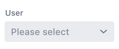
This component is based on @vaadin/combo-box
A web component for choosing a value from a filterable list of options presented in an overlay.
<vaadin24-combo-box
  label="User"
  placeholder="Please select"
  item-value-path="email"
  item-label-path="email"
></vaadin24-combo-box>

<script>
  const comboBox = document.querySelector('vaadin24-combo-box');

  fetch('https://randomuser.me/api?results=100&inc=name,email')
    .then((res) => res.json())
    .then((json) => (comboBox.items = json.results));
</script>Install the component:
npm i @scoped-vaadin/combo-boxOnce installed, import the component in your application:
import '@scoped-vaadin/combo-box';Vaadin components come with two built-in themes, Lumo and Material. The main entrypoint of the package uses the Lumo theme.
To use the Material theme, import the component from the theme/material folder:
import '@scoped-vaadin/combo-box/theme/material/vaadin-combo-box.js';You can also import the Lumo version of the component explicitly:
import '@scoped-vaadin/combo-box/theme/lumo/vaadin-combo-box.js';Finally, you can import the un-themed component from the src folder to get a minimal starting point:
import '@scoped-vaadin/combo-box/src/vaadin-combo-box.js';Read the contributing guide to learn about our development process, how to propose bugfixes and improvements, and how to test your changes to Vaadin components.
Apache License 2.0
Vaadin collects usage statistics at development time to improve this product. For details and to opt-out, see https://github.com/vaadin/vaadin-usage-statistics.

