mui-color picker and other components
Preview port of Material-ui-color to MUI v5
Collections of color components for material-ui. No dependencies, small, highly customizable and theming support !
This fork differs from the original version by @mikbry just with one extra prop closeOnSelect that closes the picker upon selecting color
Contents
Why another ColorPicker ?
- Fully compatible with Material-UI : theming and low level components
- Highly customizable ColorPicker : gradient picker, palette, input format, deferred mode
- Small in size (<30kb) without any direct dependencies
- Use modern React hook and coding conventions
- Documentation made with Storybook, using Component Story Format and MDX
Documentation
Full documentation is available here :
https://secretwpn.github.io/mui-color/
Examples
Also in codesanbox
-
Javascript : https://codesandbox.io/s/mui-color-qb4vm?file=/src/App.jsx
-
Typescript : https://codesandbox.io/s/mui-color-picker-qvcg3?file=/src/App.tsx
Requirements
- Works on modern browsers supporting ES6+ (Not compatible with IE)
- React and Material-UI frameworks
Install
yarn add mui-colorOr using npm
npm install mui-colorUsage
you need to have in your dependencies:
    "@mui/material": "^4.11.2",
    "material-ui-popup-state": "^1.7.1",
    "prop-types": "^15.7.2",
    "react": "^17.0.1",
    "react-dom": "^17.0.1",
mui-color bring 5 components.
<ColorPicker/>
A popover component to display a color tool box. It uses ColorBox and material-ui-popup-state.
import { ColorPicker } from 'mui-color';

export const Container = () => (
  <div>
    <ColorPicker defaultValue="transparent"/>
  </div>
);
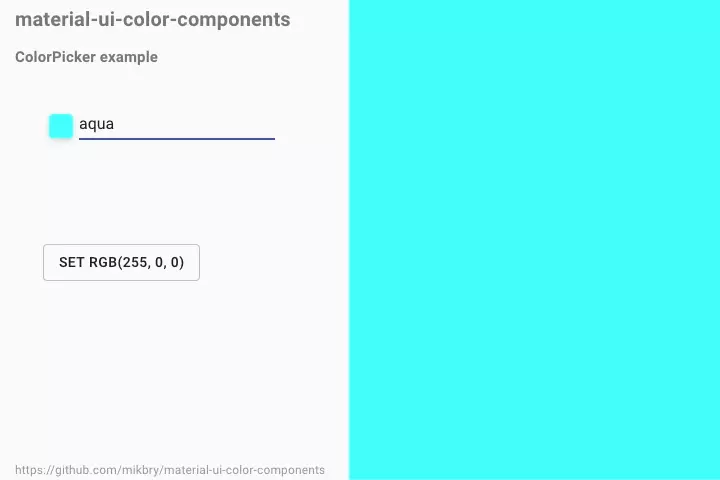
At first it display a button + an input
<ColorBox />
A component to display a color tool box
import { ColorBox } from 'mui-color';

export const Container = () => (
  <div>
    <ColorBox defaultValue="transparent"/>
  </div>
);<ColorInput />
An input component to display/edit color values in different format (plain, hex, rgb, hsl, hsv).
import { ColorInput } from 'mui-color';

export const Container = () => (
  <div>
    <ColorInput defaultValue="red"/>
  </div>
);<ColorPalette />
A component to display a grid of color buckets.
import { ColorPalette } from 'mui-color';

const palette = {
  red: '#ff0000',
  blue: '#0000ff',
  green: '#00ff00',
  yellow: 'yellow',
  cyan: 'cyan',
  lime: 'lime',
  gray: 'gray',
  orange: 'orange',
  purple: 'purple',
  black: 'black',
  white: 'white',
  pink: 'pink',
  darkblue: 'darkblue',
};

export const Container = () => (
  <div>
    <ColorPalette palette={palette} />
  </div>
);<ColorButton />
Displays a button filled with a color
import { ColorButton } from 'mui-color';

export const Container = () => (
  <div>
    <ColorButton color="red"/>
  </div>
);Roadmap
v1.0.0 - Current version
- remove
styled-componentsto have less dependencies and reduce size - display wrong color using a red checked box
- bugs fixes
Contribute
Contributions welcome! Read the contribution guidelines first.
License
Released under MIT License

