A sleek and highly customizable JavaScript library used to generate full-screen infographic popups with minimal effort.
Install popup-js with the following script tag:
<script src="https://cdn.jsdelivr.net/npm/@simondmc/popup-js@1.4.3/popup.min.js"></script>A full documentation is available here.
Create a popup by instantiating the Popup class with customization parameters.
const myPopup = new Popup({
    id: "my-popup",
    title: "My First Popup",
    content: `
        An example popup.
        Supports multiple lines.`,
});
Display the popup by calling the .show() method.
myPopup.show();Examples of a more complex popup:
/* A demo popup showing a lot of the library features. */
const popup = new Popup({
id: "demo-popup",
title: "Demo Popup",
content: `
This is a demo of the popup library.
big-margin§This line has a larger top margin.
This is an example of {a-https://example.com}[a link].
This is an example of {btn-red-button}[a red button].
This text is {red}[red] {bold green}[bold green] {blue}[blue]].
This text has a lot of spaces.
big-margin space-out§This line and the next {btn-b1}[Button 1]
space-out§are left aligned. {btn-b2}[Button 2]
big-margin§This text {shadow}[has {white}[some] shadow].`,
titleColor: "#4842f5",
backgroundColor: "#bff7ff",
showImmediately: true,
sideMargin: "15%",
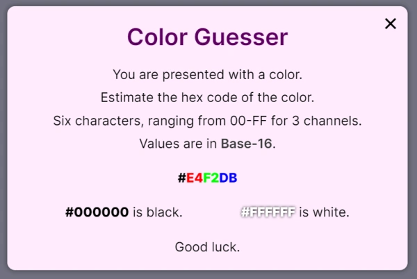
});/* A popup from one of my projects showing its usage. */
const infoPopup = new Popup({
id: "color-info",
title: "Color Guesser",
content: `
You are presented with a color.
Estimate the hex code of the color.
Six characters, ranging from 00-FF for 3 channels.
Values are in {a-https://learn.sparkfun.com/tutorials/hexadecimal/hex-basics}[Base-16].
big-margin§{bold}[#{red}[E4]{green}[F2]{blue}[DB]]
big-margin§{black bold}[#000000] is black. {white bold shadow}[#FFFFFF] is white.
big-margin§Good luck.`,
titleColor: "rgb(92, 0, 95)",
titleMargin: "0",
backgroundColor: "#ffebfe",
showImmediately: true,
showOnce: true,
});
Below is a table of all the parameters you can use to customize your popup.
| Parameter | Type | Default | Description |
|---|---|---|---|
id |
string |
popup |
The ID of the popup (must be unique). |
title |
string |
Popup Title |
The title of the popup. |
content |
string |
Popup Content |
The content of the popup. |
titleColor |
color |
#000000 |
The color of the title. |
backgroundColor |
color |
#FFFFFF |
The color of the popup background. |
textColor |
color |
#000000 |
The color of the content. |
closeColor |
color |
#000000 |
The color of the close button. |
linkColor |
color |
#383838 |
The color of links. |
fixedHeight |
boolean |
false |
Whether the popup should have a fixed height. |
widthMultiplier |
number |
1 |
How wide should the popup be relatively to the default width. |
heightMultiplier |
number |
0.66 |
How tall should the popup be relatively to the default width (only used if fixedHeight is true). |
fontSizeMultiplier |
number |
1 |
How large should the content font be relatively to the default content font size. |
font |
string |
Inter |
The popup font. |
titleMargin |
length |
2% |
The space between the popup title and content. |
sideMargin |
length |
3% |
The space between the content and the edge of the popup. |
lineSpacing |
length |
auto |
The spacing between lines in the popup body. |
buttonWidth |
length |
fit-content |
The width of buttons in the popup body. |
borderWidth |
length |
0 |
The width of the popup border. |
borderColor |
color |
#000000 |
The color of the popup border. |
borderRadius |
length |
15px |
The popup border radius (controls how rounded the corners are). |
showImmediately |
boolean |
false |
Whether the popup should be shown immediately after being created (usually on page load). |
showOnce |
boolean |
false |
Whether the popup should only be shown once. |
hideCloseButton |
boolean |
false |
Whether the popup should display without a close button. |
hideTitle |
boolean |
false |
Whether the popup should display without a title. |
disableScroll |
boolean |
true |
Whether page scrolling should be disabled while the popup is open. |
underlineLinks |
boolean |
false |
Whether links should be underlined. |
allowClose |
boolean |
true |
Whether the popup should be closeable by the user. |
textShadow |
string |
none |
The text shadow of the popup body. |
fadeTime |
time |
0.3s |
The time it should take for the popup to fade in and out. |
hideCallback |
function |
undefined |
A function to be called when the popup is closed. |
loadCallback |
function |
undefined |
A function to be called when the popup - and all its elements - are first loaded. |
css |
string |
"" |
Custom CSS to be applied to the popup. |
For a full explanation of the parameters, see the documentation.
This project is released under the MIT license.
Contributions are always welcome!
If you want a feature which currently doesn't exist, feel free to open a pull request.